| predictor | outcome | group |
|---|---|---|
| 98.21 | 98.08 | 1 |
| 90.72 | 91.64 | 0 |
| 92.16 | 89.7 | 1 |
| 83.49 | 82.5 | 1 |
| 95.92 | 95.22 | 0 |
| 89.04 | 94.64 | 0 |
A Short Guide to ggplot2
1 Why?1
A great deal of data analysis and visualization involves the same core set of steps: get some data, clean it up a little, run some descriptive statistics, run some bivariate statistics, create a graph or a visualization. ggplot2 can be an important part of a replicable, automated, documented workflow for complex projects.
\[\text{have a question} \rightarrow \text{get data} \rightarrow \text{process and clean data} \rightarrow\] \[\text{visualize data} \rightarrow \text{analyze data} \rightarrow \text{make conclusions}\]
Given the fact that we often want to apply the same core set of tasks to new questions and new data, there are ways to overcome the steep learning curve and learn a replicable set of commands that can be applied to problem after problem.2
2 The Essential Idea Of ggplot2 Is Simple
There are 3 essential elements to any ggplot call:
- A reference to the data you are using.
- An aesthetic that tells ggplot which variables are being mapped to the x axis, y axis, (and often other attributes of the graph, such as the color fill). Intuitively, the aesthetic can be thought of as what you are graphing.
- A geom or geometry that tells ggplot about the basic structure of the graph. Intuitively, the geom can be thought of as how you are graphing it.
You can also add other options, such as a graph title, axis labels and overall theme for the graph.
3 Get Started
library(ggplot2) # beautiful graphs

library(ggthemes) # nice themes for ggplot2
4 Some Examples3
4.1 One Continuous Variable
# anything that starts with a '#' is a comment

ggplot(mydata, # the data I am using
       aes(x = outcome)) + # the variable I am using
  geom_histogram() # how I am graphing it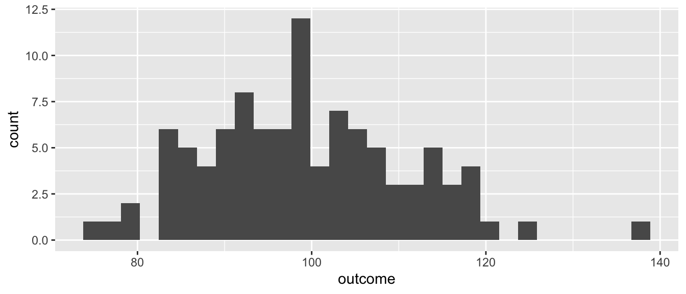
4.2 One Categorical Variable4
ggplot(mydata, # the data I am using
       aes(x = group,
           fill = group)) + # the variable I am using
  geom_bar() # how I am graphing it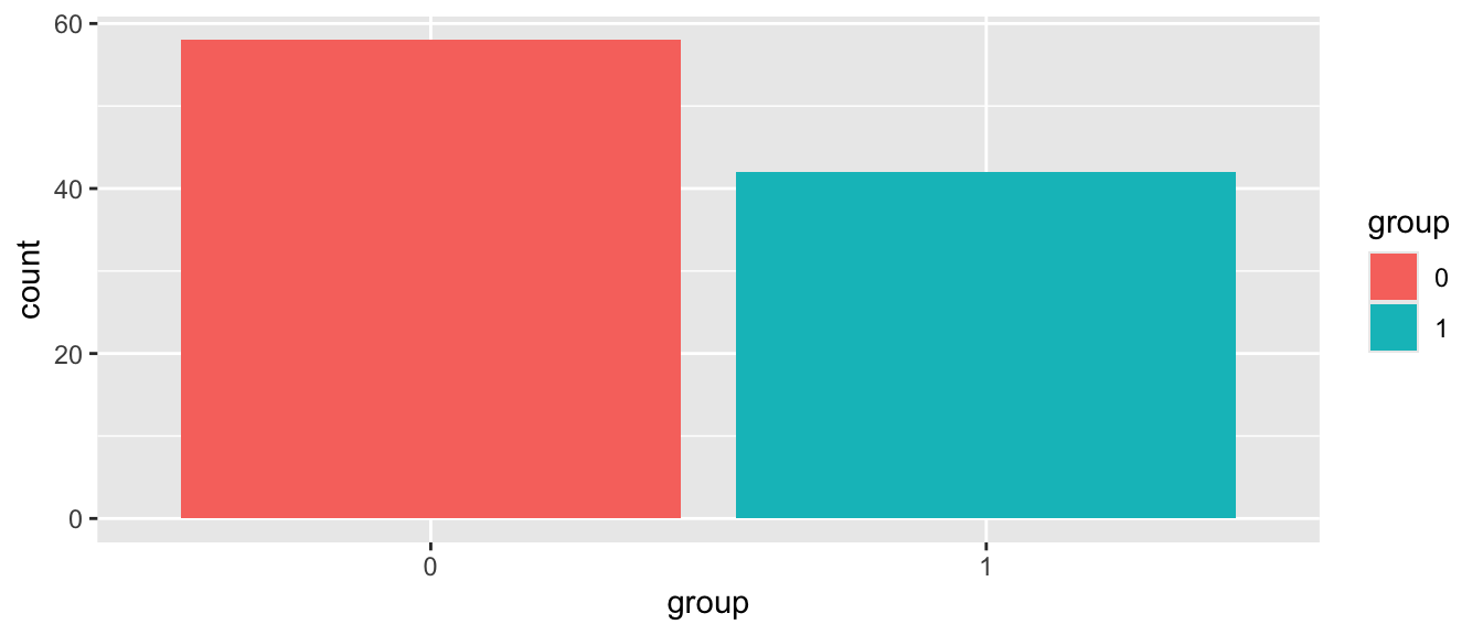
4.3 Continuous by Continuous5
ggplot(mydata, # the data I am using
       aes(x = predictor, y = outcome,
           color = group)) + # the variables I am using
  geom_point() + # how I am graphing it
  geom_smooth()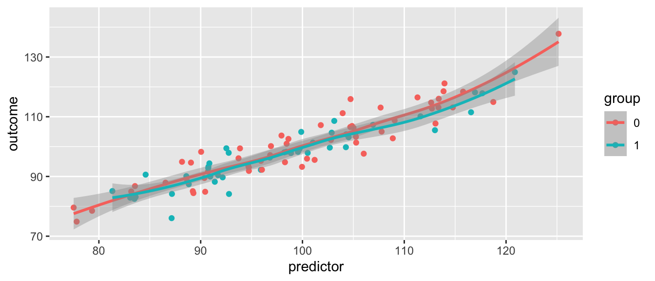
4.4 Add Some Options6
ggplot(mydata, # the data I am using
       aes(x = predictor, y = outcome,
           color = group)) + # the variables I am using
  geom_point() + # how I am graphing it
  geom_smooth() +
  labs(title = "My Title",
       x = "title for x axis",
       y = "title for y axis") +
  scale_colour_manual(name = "Group",
                      values = c("#009edb",
                                 "#000000"), # manual colors
                      labels = c("group1",
                                 "group2")) +
  theme_minimal() + # theme
  theme(plot.title = element_text(size = 20, # add to theme
color = "#009edb")) 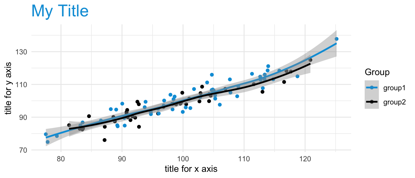
Footnotes
More information can be found here: https://agrogan1.github.io/R/introduction-to-ggplot2/introduction-to-ggplot2.html↩︎
The same 5 to 10 lines of ggplot2 code can often be tweaked over and over again for multiple projects.↩︎
Changing variables from factor to numeric (e.g.
aes(x = as.numeric(outcome))), and vice versa can sometimes be a simple solution that solves a lot of problems when you are trying to graph your variables.↩︎Notice how the use of
fillin the aesthetic generates a legend.↩︎Notice how the use of
colorin the aesthetic generates a legend.↩︎Notice how use of
scale_ ...governs both the use of color in the graph below, as well as the legend that is produced in the graph. This graph uses official UN colors to illustrate this idea. The graph below usesscale...manual...to manually choose the colors, but there are many other options, particularly when usinglibrary(ggthemes).scale_..._viridis_...are especially good color palettes.↩︎