Code
library(WDI) # for accessing World Bank data
library(dplyr) # data wrangling
library(ggplot2) # beautiful graphs
library(plotly) # for updated version of cool Hans Rosling style visualizations
library(DT) # data tableThe World Bank collects statistical information from countries around the world. A particularly useful data set is the World Development Indicators (WDI) which are country level statistical information from around the world.
R is unique in that using library(WDI) you can download indicator data directly from the World Bank, read it into a data set, and put it to use. Using library(plotly) you can even make cool looking motion charts, somewhat reminiscent of those popularized by Hans Rosling.
While the code below is seemingly arcane, it is important to recognize that it is simple in structure. It is very possible to re-purpose the code below using some of the many 1,000’s of WDI indicators that are of interest to you.
library(WDI) # for accessing World Bank data
library(dplyr) # data wrangling
library(ggplot2) # beautiful graphs
library(plotly) # for updated version of cool Hans Rosling style visualizations
library(DT) # data table# get names of specific indicators from WDI Data Catalog
mydata <- WDI(country="all",
indicator=c("SI.POV.GINI", # Gini
"NY.GDP.PCAP.CD", # GDP
"SE.ADT.LITR.ZS", # adult literacy
"SP.DYN.LE00.IN", # life expectancy
"SP.POP.TOTL", # population
"SN.ITK.DEFC.ZS"), # undernourishment
start = 1980,
end = 2021,
extra = TRUE)
save(mydata, file="WorldBankData.RData")# think about renaming some variables with more intuitive names
# e.g....
# rename some variables with dplyr (just copy and paste your indicators)
mydata <- dplyr::rename(mydata,
GDP = NY.GDP.PCAP.CD,
adult_literacy = SE.ADT.LITR.ZS,
life_expectancy = SP.DYN.LE00.IN,
population = SP.POP.TOTL,
Gini = SI.POV.GINI,
undernourishment = SN.ITK.DEFC.ZS)
mydata$country_name <- mydata$country
mydata$country <-as.factor(mydata$country)
save(mydata, file="WorldBankData.RData")# head(mydata) # look at the data
mydata %>%
select(country,
region,
year,
GDP,
adult_literacy,
life_expectancy,
population,
Gini,
undernourishment) %>%
datatable(rownames = FALSE,
filter = 'top',
extensions = 'Buttons',
options = list(
dom = 'Bfrtip',
buttons = c('copy', 'csv', 'excel', 'pdf', 'print')),
caption = 'World Bank Data')p1 <- ggplot(mydata,
aes(x = GDP,
y = life_expectancy,
color = region)) +
geom_point() +
geom_smooth() +
scale_color_viridis_d() +
labs(title = "Life Expectancy by GDP",
x = "GDP",
y = "Life Expectancy")
p1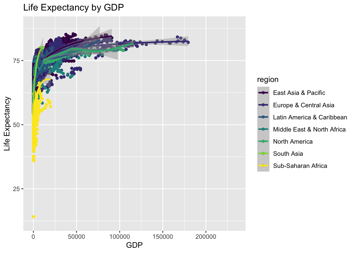
p1 + facet_wrap(~region)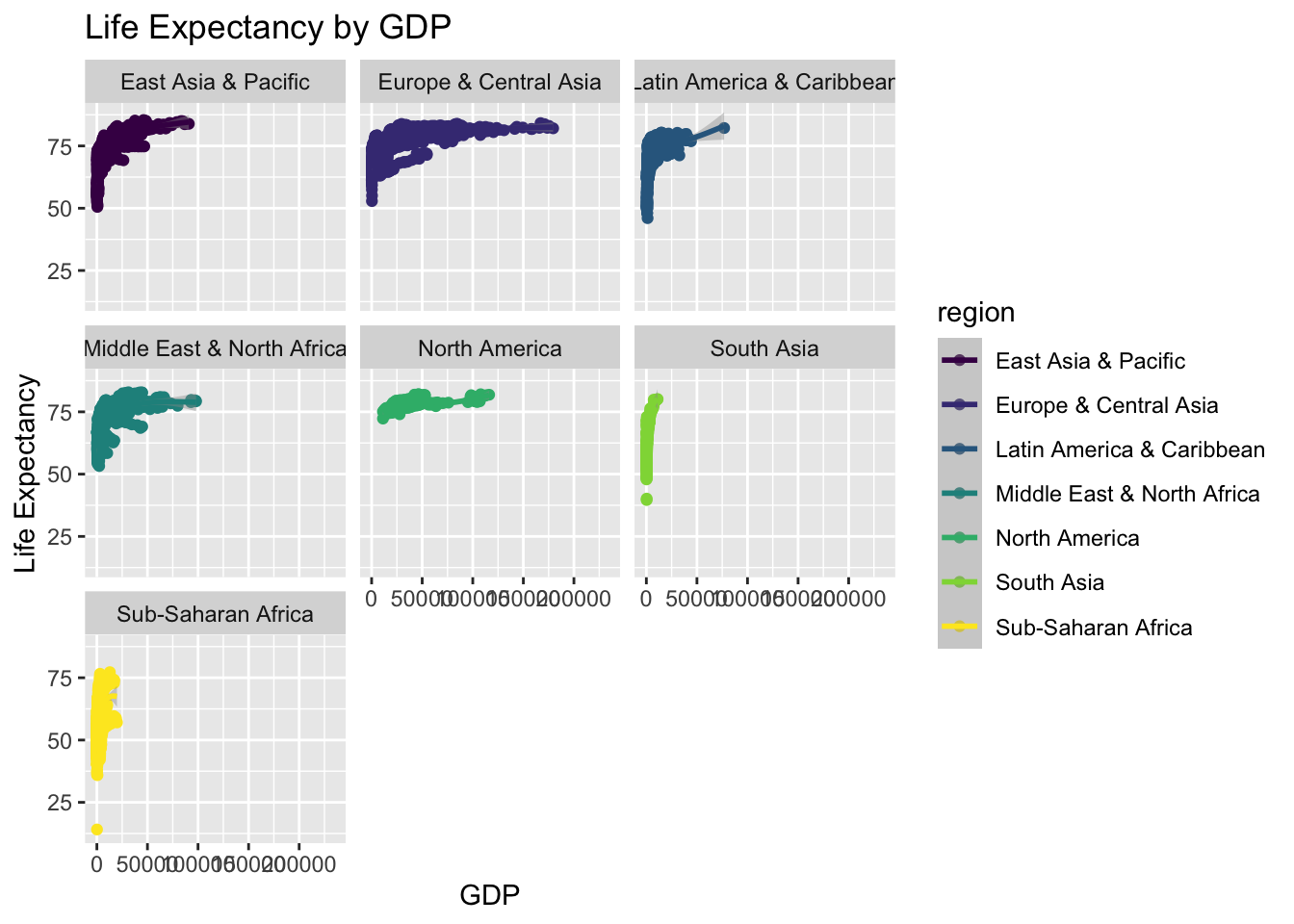
mymap <- mydata %>%
filter(year == 2015) %>%
plot_geo(locations = ~iso3c,
color = ~life_expectancy,
z = ~life_expectancy,
text = ~country) %>%
layout(title = "Countries by Life Expectancy in 2015",
geo = list(showland = FALSE,
showcountries = TRUE)) %>%
colorbar(title = 'life expectancy')
mymapmyglobe <- mydata %>%
filter(year == 2015) %>%
plot_geo(locations = ~iso3c,
color = ~life_expectancy,
z = ~life_expectancy,
text = ~country) %>%
layout(title = "Countries by Life Expectancy in 2015",
geo = list(showland = FALSE,
showcountries = TRUE,
projection = list(type = 'orthographic',
rotation = list(lon = -30,
lat = 10,
roll = 0)))) %>%
colorbar(title = 'life expectancy')
myglobemydata <- mydata %>%
filter(region != "Aggregates") # remove aggregatesggplot with ggplotlyp0 <- ggplot(mydata,
aes(x = year,
y = life_expectancy,
color = region,
size = population,
frame = year)) +
geom_point() +
labs(title = "Life Expectancy by Year",
x = "Year",
y = "Life Expectancy") +
scale_color_discrete(name = "Region")
ggplotly(p0)plotlyp1 <- plot_ly(mydata,
x = ~year,
y = ~life_expectancy,
size = ~population,
color = ~region,
frame = ~year,
text = ~country,
hoverinfo = "text",
type = 'scatter',
mode = 'markers',
showlegend = FALSE) %>%
layout(title = "Life Expectancy by Year",
yaxis = list(title = "life expectancy"))
p1p2 <- mydata %>%
# filter(!is.na(GDP)) %>%
# filter(is.finite(GDP)) %>%
plot_ly(x = ~GDP,
y = ~life_expectancy,
size = ~population,
color = ~region,
frame = ~year,
text = ~country,
hoverinfo = "text",
type = 'scatter',
mode = 'markers',
showlegend = FALSE) %>%
layout(title = "Life Expectancy by GDP",
yaxis = list(title = "life expectancy"))
p2Using logged GDP on the x axis means that we are looking at relative, instead of absolute changes in GDP.
p2 %>%
layout(xaxis = list(type = "log")) p2 <- plot_ly(mydata,
x = ~year,
y = ~GDP,
z = ~life_expectancy,
size = ~population,
color = ~region,
text = ~country,
# hoverinfo = "text",
# type = 'scatter',
# mode = 'markers',
theta = 45,
showlegend = FALSE) %>%
layout(title = "Life Expectancy by Year",
yaxis = list(title = "life expectancy"))
p2