Choosing the right chart to represent your data can be a daunting process. I believe that a starting point for this thinking is some basic statistical thinking about the type of variables that you have. At the broadest level, variables may be conceptualized as categorical variables, or continuous variables.
categorical variables represent unordered categories like gender, or religious affiliation.
continuous variables represent a continuous scale like a mental health scale, or a measure of neighborhood quality.
Once we have discerned the type of variable that have, there are two followup questions we may ask before deciding upon a chart strategy:
Is our graph about one thing at a time?
How much of x is there?
What is the distribution of x?
Is our graph about two things at a time?
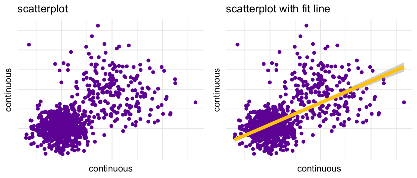
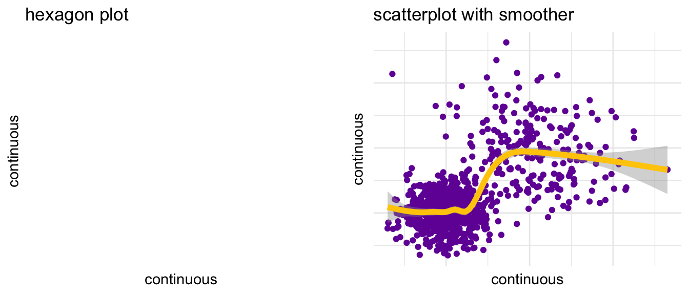
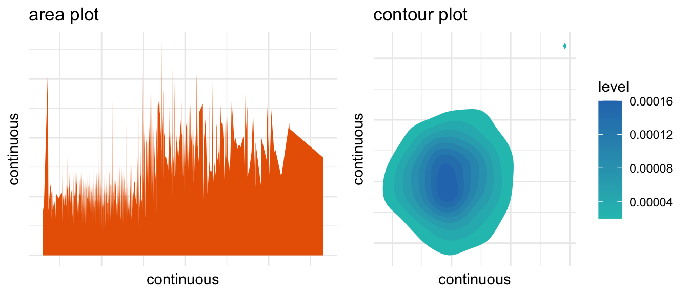
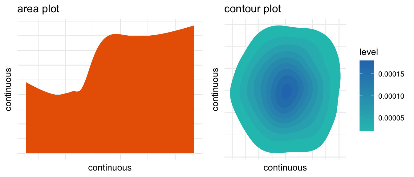
What is the relationship of x and y?
How are x and y associated?
2 A Few Notes
2.1 A Note About Graph Labels
Graphs should have clear titles and labels.
2.2 A Note About Software
The principles of graphing discussed in this document transcend any particular software package, and could be implemented in many different software packages, such as SPSS, SAS, Stata, or R.
The graphs in these particular examples use ggplot2(Wickham, 2016), a graphing library in R. ggplot2 graph syntax can be formidably complex, with a steep learning curve. More information about ggplot can be found here.
2.3 A Note About The Code In This Document
Note that ggplot2 can be MUCH simpler than these examples make it look.
For example,
ggplot(mydata, aes(x = x)) +geom_histogram()
will produce a perfectly serviceable histogram.
Much of the complication of the code in this document is simply the result of formatting tweaks to get the graphs EXACTLY the way I wanted them.
Observe also, that for layout purposes, I am reading each ggplot call into an object, e.g.
p1 <-ggplot(mydata, aes(x = x)) +geom_histogram()
so that I can later use plot_grid to lay out the graphs.
In your own work, you do not need to do this, and it may be simpler to simply say:
ggplot(...) + ...
2.4 A Note About Graph Colors
This document uses colors based upon official University of Michigan colors. Using colors that match the design scheme of your organization may be helpful.
Show the code
# michigan colorsmichigan_colors=c("#00274c", # blue"#ffcb05", # maize"#a4270b", # tappan red"#e96300", # ross school orange"#beb300", # wave field green"#21c1bc", # taubman teal"#2878ba", # arboretum blue"#7207a5") # ann arbor amethyst# name individual colorsmichigan_blue <-"#00274c"michigan_maize <-"#ffcb05"tappan_red <-"#a4270b"ross_school_orange <-"#e96300"wave_field_green <-"#beb300"taubman_teal <-"#21c1bc"arboretum_blue <-"#2878ba"ann_arbor_amethyst <-"#7207a5"
3 A Simulated Data File of Continuous and Categorical Data
A few randomly selected observations…
x
y
z
u
v
w
s
q
758
228.7
234.3
112.9
Group B
Group A
Group B
Group 3
258.7
749
116
131.8
69.6
Group B
Group A
Group A
Group 3
146
314
80.7
83.28
128.9
Group A
Group B
Group A
Group 3
110.7
208
76.67
128
103.2
Group B
Group B
Group A
Group 2
96.67
67
78.78
124.7
98.39
Group A
Group A
Group A
Group 4
118.8
340
98.07
89.93
102.9
Group A
Group B
Group A
Group 3
128.1
234
181.6
132.8
112.6
Group B
Group B
Group B
Group 2
201.6
255
81.2
135.1
82.61
Group B
Group B
Group A
Group 2
101.2
563
86.79
122.4
119.1
Group A
Group A
Group A
Group 2
106.8
791
228
229.6
106.4
Group B
Group A
Group B
Group 3
258
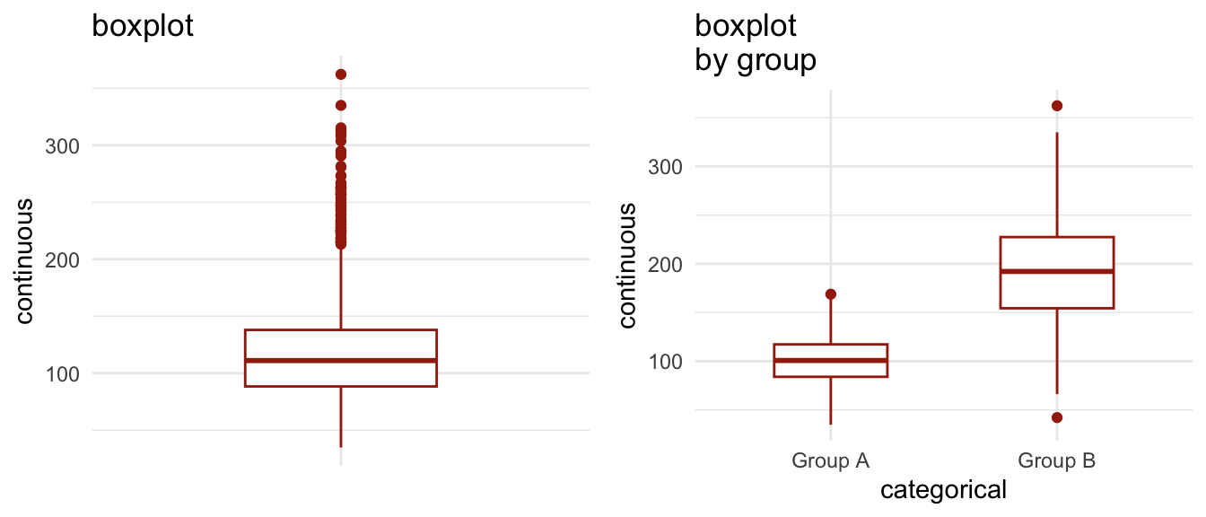
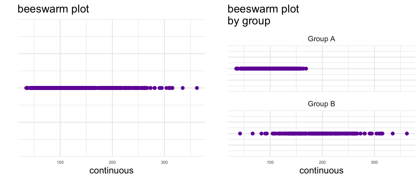
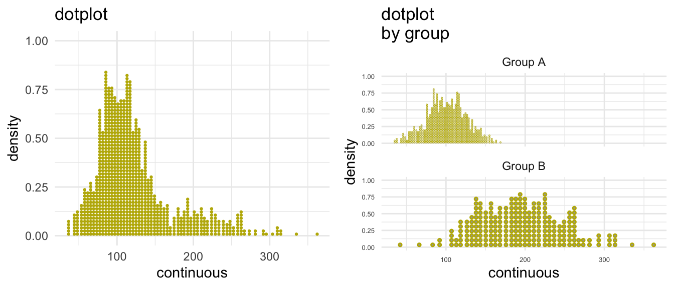
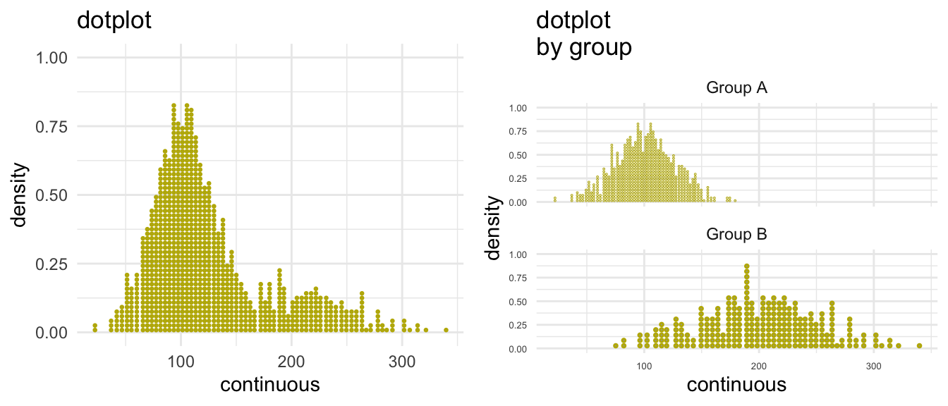
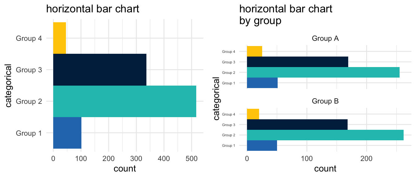
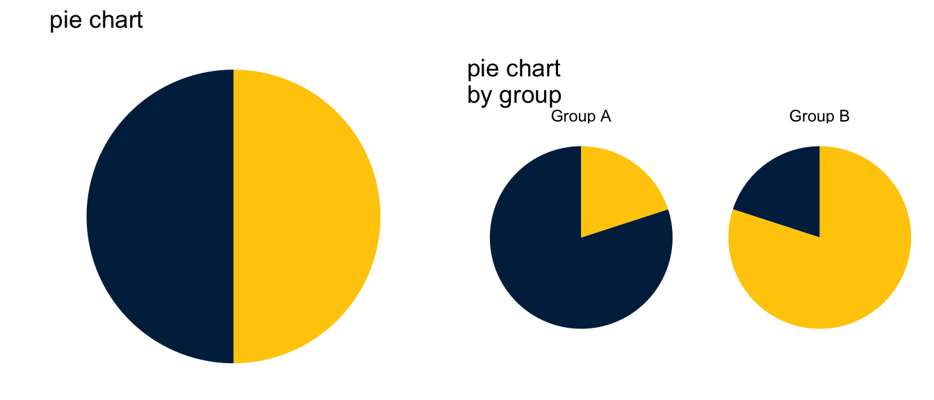
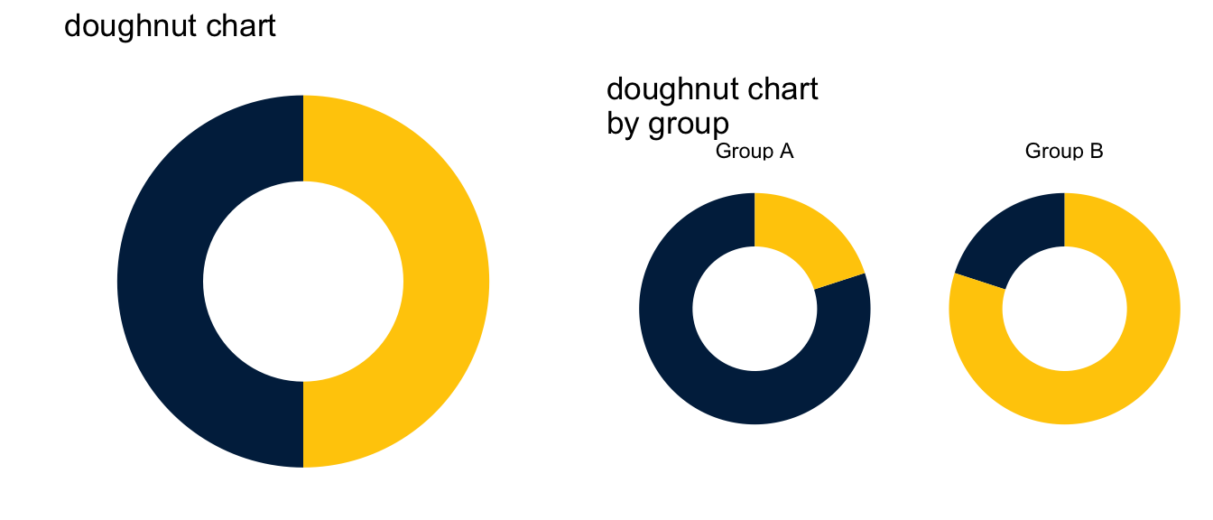
4 One Thing At A Time Two Things At A Time
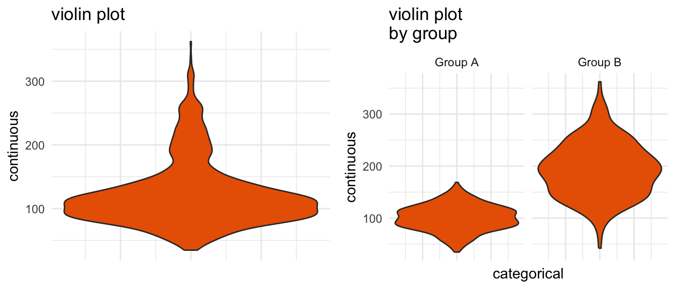
5 Continuous Continuous By Categorical
Show the code
my_histogram <-ggplot(mydata, aes(x = x)) +geom_histogram(fill = arboretum_blue) +ggtitle("histogram") +xlab("continuous") +ylab("count") +theme_minimal()my_facet_histogram <-ggplot(mydata, aes(x = x)) +geom_histogram(fill = arboretum_blue) +facet_wrap(~w, nrow =2) +ggtitle("histogram by group") +xlab("continuous") +ylab("count") +theme_minimal() +theme(axis.text =element_text(size =5)) # small font size for axisplot_grid(my_histogram, my_facet_histogram, ncol=2)
Show the code
my_density <-ggplot(mydata, aes(x = y)) +geom_density(fill = michigan_maize) +ggtitle("density") +xlab("continuous") +ylab("density") +theme_minimal()my_facet_density <-ggplot(mydata, aes(x = y)) +geom_density(fill = michigan_maize) +facet_wrap(~w, nrow =2) +ggtitle("density by group") +xlab("continuous") +ylab("density") +theme_minimal() +theme(axis.text =element_text(size =5)) # small font size for axisplot_grid(my_density, my_facet_density, ncol =2)
Show the code
my_m_barchart <-ggplot(mydata, aes(x =1, y = q, fill =factor(1))) +stat_summary(fun = mean, geom ="bar") +scale_fill_manual(values =c(arboretum_blue)) +ggtitle("barchart of mean") +guides(fill="none") +xlab(" ") +ylab("mean of continuous") +theme_minimal() +theme(axis.text.x =element_blank()) +theme(axis.ticks.x =element_blank())my_facet_m_barchart <-ggplot(mydata, aes(x =factor(s), y = q, fill = s)) +stat_summary(fun = mean, geom ="bar") +scale_fill_manual(values =c(arboretum_blue, taubman_teal, michigan_blue, michigan_maize)) +ggtitle("barchart of mean \nby group") +guides(fill="none") +xlab("categorical") +ylab("mean of continuous") +theme_minimal()plot_grid(my_m_barchart, my_facet_m_barchart, ncol =2)
Show the code
my_horiz_m_barchart <-ggplot(mydata, aes(x =1, y = q, fill =factor(1))) +stat_summary(fun = mean, geom ="bar") +coord_flip() +scale_fill_manual(values =c(arboretum_blue)) +ggtitle("horizontal barchart of mean") +guides(fill=FALSE) +xlab(" ") +ylab("mean of continuous") +theme_minimal() +theme(axis.text.y =element_blank()) +theme(axis.ticks.y =element_blank())my_facet_horiz_m_barchart <-ggplot(mydata, aes(x =factor(s), y = q, fill = s)) +stat_summary(fun = mean, geom ="bar") +coord_flip() +scale_fill_manual(values =c(arboretum_blue, taubman_teal, michigan_blue, michigan_maize)) +ggtitle("horizontal barchart of mean \nby group") +guides(fill=FALSE) +xlab(" ") +ylab("mean of continuous") +theme_minimal() +theme(axis.text.y =element_blank()) +theme(axis.ticks.y =element_blank())plot_grid(my_horiz_m_barchart, my_facet_horiz_m_barchart)
Show the code
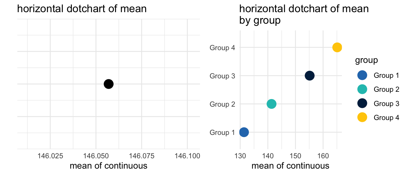
my_horiz_m_dotchart <-ggplot(mydata, aes(x =1, y = q, fill =factor(1))) +stat_summary(fun = mean, geom ="point", size =5) +coord_flip() +scale_color_manual(values =c(arboretum_blue)) +ggtitle("horizontal dotchart of mean") +guides(fill =FALSE) +xlab(" ") +ylab("mean of continuous") +theme_minimal() +theme(axis.text.y =element_blank(),axis.ticks.y =element_blank()) my_facet_horiz_m_dotchart <-ggplot(mydata, aes(x =factor(s), y = q, color = s)) +stat_summary(fun = mean, geom ="point", size =5) +coord_flip() +scale_color_manual(name ="group",values =c(arboretum_blue, taubman_teal, michigan_blue, michigan_maize)) +ggtitle("horizontal dotchart of mean \nby group") +guides(fill=FALSE) +xlab(" ") +ylab("mean of continuous") +theme_minimal() +theme(axis.title.y =element_blank(),axis.ticks =element_blank())plot_grid(my_horiz_m_dotchart, my_facet_horiz_m_dotchart)
Show the code
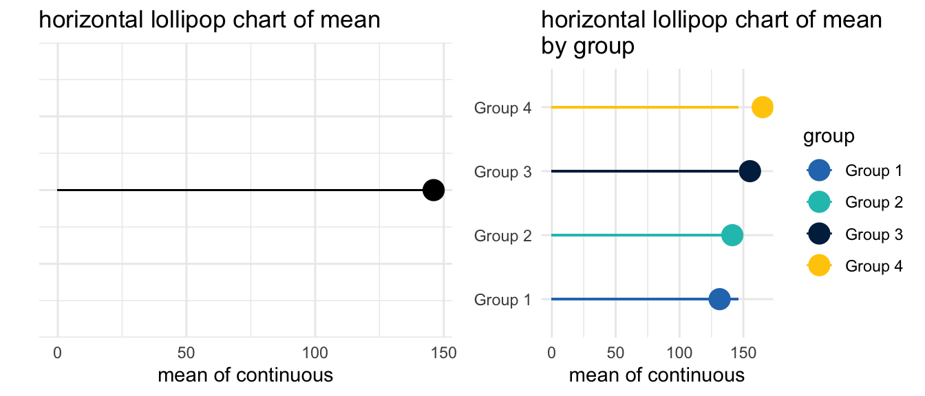
my_horiz_m_lollipop_chart <-ggplot(mydata, aes(x =1, y = q, fill =factor(1))) +stat_summary(fun = mean, geom ="point", size =5) +geom_segment(aes(x =1,xend =1,y =0,yend =mean(q))) +coord_flip() +scale_color_manual(values =c(arboretum_blue)) +ggtitle("horizontal lollipop chart of mean") +guides(fill =FALSE) +xlab(" ") +ylab("mean of continuous") +theme_minimal() +theme(axis.text.y =element_blank(),axis.ticks.y =element_blank()) my_facet_horiz_m_lollipop_chart <-ggplot(mydata, aes(x =factor(s), y = q, color = s)) +stat_summary(fun = mean, geom ="point", size =5) +geom_segment(aes(x =factor(s),xend =factor(s),y =0,yend =mean(q))) +coord_flip() +scale_color_manual(name ="group",values =c(arboretum_blue, taubman_teal, michigan_blue, michigan_maize)) +ggtitle("horizontal lollipop chart of mean \nby group") +guides(fill=FALSE) +xlab(" ") +ylab("mean of continuous") +theme_minimal() +theme(axis.title.y =element_blank(),axis.ticks =element_blank())plot_grid(my_horiz_m_lollipop_chart, my_facet_horiz_m_lollipop_chart)
Show the code
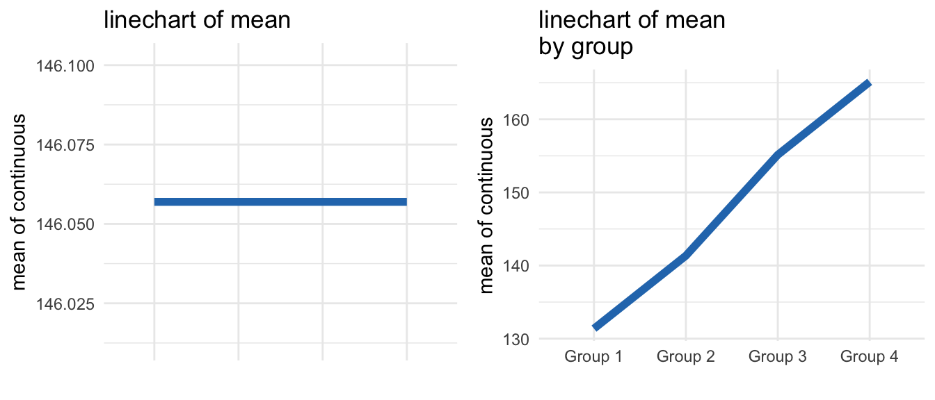
my_m_linechart <-ggplot(mydata, aes(x =factor(s), y =mean(q), group =1)) +stat_summary(fun = mean, geom ="line", size =2, color = arboretum_blue) +geom_blank() +ggtitle("linechart of mean") +xlab(" ") +ylab("mean of continuous") +theme_minimal() +theme(axis.text.x =element_blank()) +theme(axis.ticks.x =element_blank())my_facet_m_linechart <-ggplot(mydata, aes(x =factor(s), y = q, group =1)) +stat_summary(fun = mean, geom ="line", size =2, color = arboretum_blue) +ggtitle("linechart of mean \nby group") +xlab(" ") +ylab("mean of continuous") +theme_minimal() plot_grid(my_m_linechart, my_facet_m_linechart)
How to Choose a Chart by Andrew Grogan-Kaylor is licensed under a Creative Commons Attribution-ShareAlike 4.0 International License. You are welcome to download and use this handout in your own classes, or work, as long as the handout remains properly attributed.
References
Wickham, H. (2016). ggplot2: Elegant graphics for data analysis. Springer-Verlag New York. https://ggplot2.tidyverse.org