Show the code
library(lme4) # MLM

library(ggplot2) # beautiful graphs

library(gganimate) # animated ggplots

library(plotly) # animated graphs

# library(broom)

library(pander) # nice tables

library(sjPlot) # nice tables for MLMlibrary(lme4) # MLM
library(ggplot2) # beautiful graphs
library(gganimate) # animated ggplots
library(plotly) # animated graphs
# library(broom)
library(pander) # nice tables
library(sjPlot) # nice tables for MLMBland and Altman (1994) suggested the following procedure for simulating some data:
“The data were generated from random numbers, and there is no relation between X and Y at all. Firstly, values of X and Y were generated for each ‘subject,’ then a further random number was added to make the individual observation.” (Bland and Altman 1994)
So… we follow their procedure.
set.seed(3846) # random seed

g <- seq(1, 5) # number of groups

x <- rnorm(5, 100, 10) # group x

y <- rnorm(5, 100, 10) # group y

# 5 obs / group

id <- seq(1, 25)

group_num <- rep(g, 1, each=5)

x_group <- rep(x, each = 5) # x for the group

y_group <- rep(y, each = 5) # y for the group

x_noise <- rnorm(25, 0, 1) # random noise

y_noise <- rnorm(25, 0, 1) # random noise

x_individual <- x_group + x_noise # individual = group + noise

y_individual <- y_group + y_noise # individual = group + noise

mydata <- data.frame(id,
                     group_num,
                     x_group,
                     y_group,
                     x_individual,
y_individual)The animation below illustrates the process of simulating the data.
ggplot(mydata,
       aes(color = factor(group_num),
           label = group_num)) +
  geom_point(aes(x = x_group,
                 y = y_group),
             size = 10,
             show.legend = FALSE) +
  geom_text(aes(x = x_group,
                y = y_group),
            color = "white",
            size = 9,
            show.legend = FALSE) +
  geom_point(aes(x = x_individual,
                y = y_individual),
             size = 3,
             show.legend = FALSE) +
  transition_layers(layer_length = 1,
                    transition_length = 7) +
  enter_fade() +
  enter_grow() +
  exit_fade() +
  exit_shrink() +
  labs(title = "Illustrating the Process of Simulating Clustered Data",
       x = "x",
       y = "y") +
  theme_minimal() +
  scale_color_viridis_d(name = "group")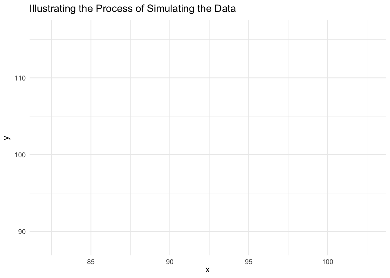
myOLS <- lm(y_individual ~ x_individual, data = mydata)

# summary(myOLS)

sjPlot::tab_model(myOLS,
                  dv.labels = c("OLS"),
                  show.se = TRUE,
                  show.ci = FALSE,
show.stat = TRUE)| OLS | ||||
|---|---|---|---|---|
| Predictors | Estimates | std. Error | Statistic | p |
| (Intercept) | 4.49 | 12.44 | 0.36 | 0.722 |
| x individual | 1.05 | 0.14 | 7.75 | <0.001 |
| Observations | 25 | |||
| R2 / R2 adjusted | 0.723 / 0.711 | |||
# pander(tidy(myOLS))myMLM <- lmer(y_individual ~ x_individual + (1 | group_num),
data = mydata)
# summary(myMLM)
sjPlot::tab_model(myMLM,
dv.labels = c("MLM"),
show.se = TRUE,
show.ci = FALSE,
show.stat = TRUE)| MLM | ||||
|---|---|---|---|---|
| Predictors | Estimates | std. Error | Statistic | p |
| (Intercept) | 98.71 | 15.74 | 6.27 | <0.001 |
| x individual | 0.02 | 0.16 | 0.12 | 0.903 |
| Random Effects | ||||
| σ2 | 0.62 | |||
| τ00 group_num | 97.39 | |||
| ICC | 0.99 | |||
| N group_num | 5 | |||
| Observations | 25 | |||
| Marginal R2 / Conditional R2 | 0.000 / 0.994 | |||
# pander(tidy(myMLM))tab_model(myOLS, myMLM,
dv.labels = c("OLS", "MLM"),
show.se = TRUE,
show.ci = FALSE,
show.stat = TRUE)| OLS | MLM | |||||||
|---|---|---|---|---|---|---|---|---|
| Predictors | Estimates | std. Error | Statistic | p | Estimates | std. Error | Statistic | p |
| (Intercept) | 4.49 | 12.44 | 0.36 | 0.722 | 98.71 | 15.74 | 6.27 | <0.001 |
| x individual | 1.05 | 0.14 | 7.75 | <0.001 | 0.02 | 0.16 | 0.12 | 0.903 |
| Random Effects | ||||||||
| σ2 | 0.62 | |||||||
| τ00 | 97.39 group_num | |||||||
| ICC | 0.99 | |||||||
| N | 5 group_num | |||||||
| Observations | 25 | 25 | ||||||
| R2 / R2 adjusted | 0.723 / 0.711 | 0.000 / 0.994 | ||||||