24 Oct 2023 12:46:27
Visualizing categorical data presents its own unique challenges. Creating graphs may be easy, but creating graphs that effectively tell a story, or impart a message, may require additional effort.
There are multiple commands that may be useful,
spineplot, graph bar, and
graph pie.
The general useage of these commands is hopefully fairly simple, and is as follows:
spineplot y xgraph bar, over(y) by(x)graph pie, over(y) by(x)Our graphing task is made a little bit more complicated–in this
particular example–because this example uses weighted data
where every row of data represents multiple observations, so we
need to include [fweight = Count] in order to let Stata
know that we have weighted data.
We also add options to various graphs to make them more informative.
We use the French Skiiers data.
. use "FrenchSkiiers.dta", clear
. list

     ┌─────────────────────────────────┐
     │            Tx   Outcome   Count │
     ├─────────────────────────────────┤
  1. │ Ascorbic Acid      Cold      17 │
  2. │ Ascorbic Acid   No Cold     122 │
  3. │       Placebo      Cold      31 │
  4. │       Placebo   No Cold     109 │
     └─────────────────────────────────┘
A 2 X 2 Table may be helpful
. tabulate Outcome Tx [fweight=Count], row col

┌───────────────────┐
│ Key               │
├───────────────────┤
│     frequency     │
│  row percentage   │
│ column percentage │
└───────────────────┘

           │          Tx
   Outcome │   Placebo  Ascorbic  │     Total
───────────┼──────────────────────┼──────────
   No Cold │       109        122 │       231
           │     47.19      52.81 │    100.00
           │     77.86      87.77 │     82.80
───────────┼──────────────────────┼──────────
      Cold │        31         17 │        48
           │     64.58      35.42 │    100.00
           │     22.14      12.23 │     17.20
───────────┼──────────────────────┼──────────
     Total │       140        139 │       279
           │     50.18      49.82 │    100.00
           │    100.00     100.00 │    100.00
We note from the column percentages that allocation to the placebo or treament (ascorbic acid) was roughly 50% in each group (1 subject dropped out of the study). We further note from the within column percentages that 22.14% of those receiving the placebo got colds while only 12.23% of those receiving ascorbic acid got colds.
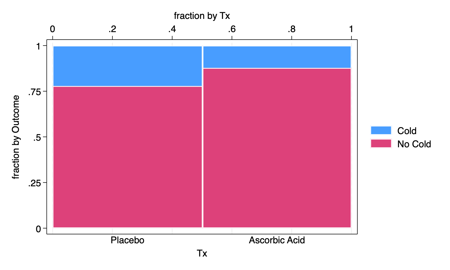
A Spineplot, more often called a Mosaic Plot is illustrative of these 2 X 2 relationships. A basic spineplot demonstrates the spineplot idea, but perhaps not as informative as it might be.
. spineplot Outcome Tx [fweight=Count]

.
. graph export myspineplot1.png, width(1500) replace
file
    /Users/agrogan/Desktop/GitHub/newstuff/categorical/visualizing-categorical-data/myspineplo
    > t1.png saved as PNG format

We add options to clarify the spineplot, which have the unfortunate
effect of making the syntax more complicated and less intuitive.
Hopefully, however we still see the core syntax of
spineplot Outcome Tx is still there, and everything after
the , is just options.
Observe especially that we have added note()’s to the
graph to clarify the meaning of the spineplot.
. spineplot Outcome Tx [fweight=Count], ///
> bar2(fintensity(%100)) /// set intensity for bar 2
> title("Fewer Colds Among Those Recieving Ascorbic Acid") /// title
> note("Allocation to Treament vs. Placebo is Roughly Equal" ///
> "Fewer Colds Among Those Recieving Treatment") /// note
> xtitle("Treatment Allocation", axis(2)) /// xtitle on axis(2)
> xtitle(" ", axis(1)) /// blank x title on axis(1)
> ytitle("Outcome", axis(2)) /// ytitle on axis(2)
> text(Count, mlabcolor(black)) /// add Count variable to boxes
> scheme(michigan) // Michigan graph scheme
(note:  named style % 100 not found in class intensity, default attributes used)

.
. graph export myspineplot2.png, width(1500) replace
file
    /Users/agrogan/Desktop/GitHub/newstuff/categorical/visualizing-categorical-data/myspineplo
    > t2.png saved as PNG format
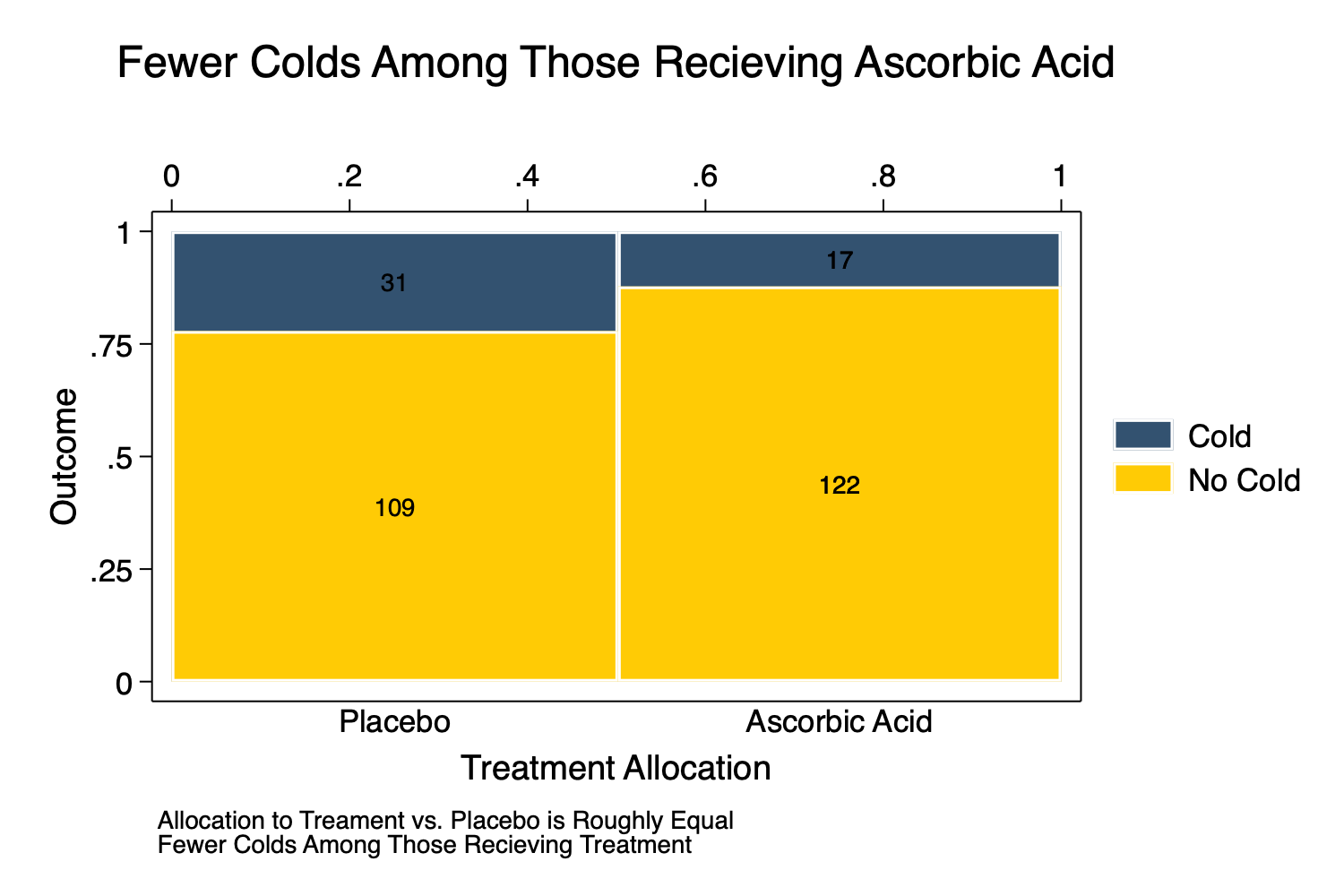
The spineplot makes clear that the allocation to the treatment vs. placebo was roughly 50/50. Note, that if the allocation had not been 50/50 the spineplot would have made this clear as well.
With enough annotations, the spineplot may make it clear that the treatment appears to result in a lower rate of colds than the placebo.
We try a bar graph.
First with some simpler syntax:
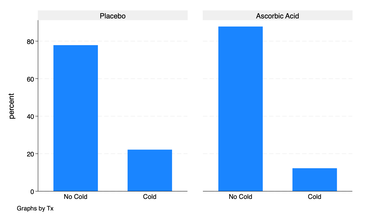
. graph bar [fweight = Count], over(Outcome) by(Tx)

.
. graph export mybargraph0.png, width(1500) replace
file
    /Users/agrogan/Desktop/GitHub/newstuff/categorical/visualizing-categorical-data/mybargraph
    > 0.png saved as PNG format

.
Then with some more complex graphing options:
. graph bar [fweight = Count], over(Outcome) ///
> asyvars /// different colors for bars
> blabel(bar, format(%9.4g) size(medium)) /// bars labelled with bar height
> yscale(range(0 100)) /// y scale from 0 to 100
> by(Tx, title("Fewer Colds Among Those Recieving Ascorbic Acid")) /// title (inside by command)
> scheme(michigan) // Michigan graph scheme

.
. graph export mybargraph1.png, width(1500) replace
file
    /Users/agrogan/Desktop/GitHub/newstuff/categorical/visualizing-categorical-data/mybargraph
    > 1.png saved as PNG format
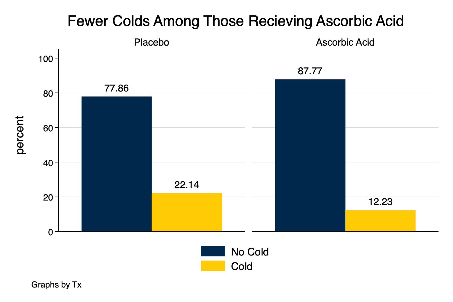
The bar graph tells a very clear story about outcomes. However, this version of a bar graph does not make clear what percentage was allocated to treatment and what percentage was allocated to control, which might be an important part of our story.
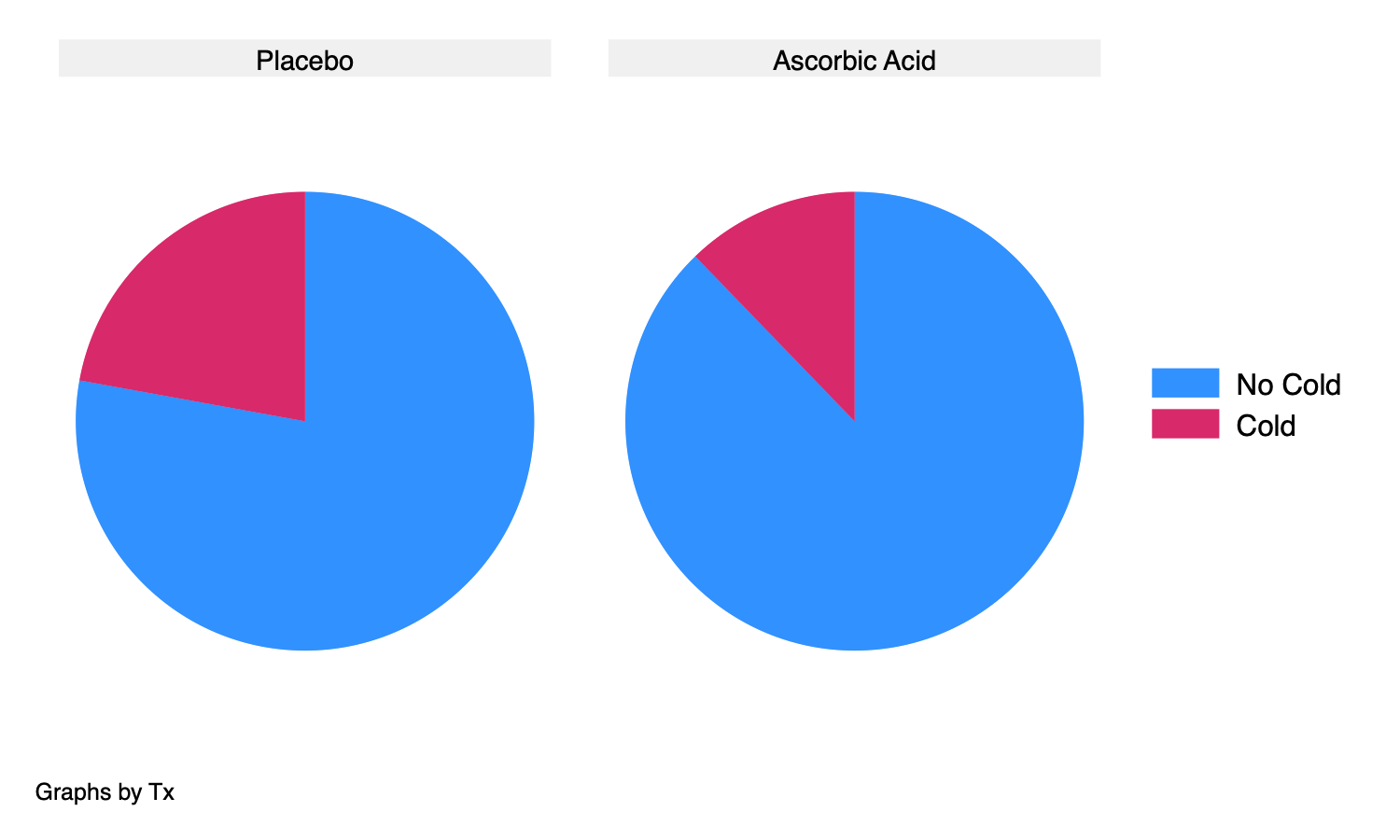
. graph pie [fweight = Count], over(Outcome) by(Tx)

.
. graph export mypie1.png, width(1500) replace
file
    /Users/agrogan/Desktop/GitHub/newstuff/categorical/visualizing-categorical-data/mypie1.png
    saved as PNG format
. graph pie [fweight = Count], over(Outcome) ///
> by(Tx, title("Fewer Colds Among Those Recieving Ascorbic Acid")) /// title (inside by command)
> plabel(1 percent, place(0) color(white)) /// label with percentages; placed in center of slice
> plabel(2 percent, place(0)) /// label with percentages; placed in center of slice
> scheme(michigan) // Michigan graph scheme

.
. graph export mypie2.png, width(1500) replace
file
    /Users/agrogan/Desktop/GitHub/newstuff/categorical/visualizing-categorical-data/mypie2.png
    saved as PNG format
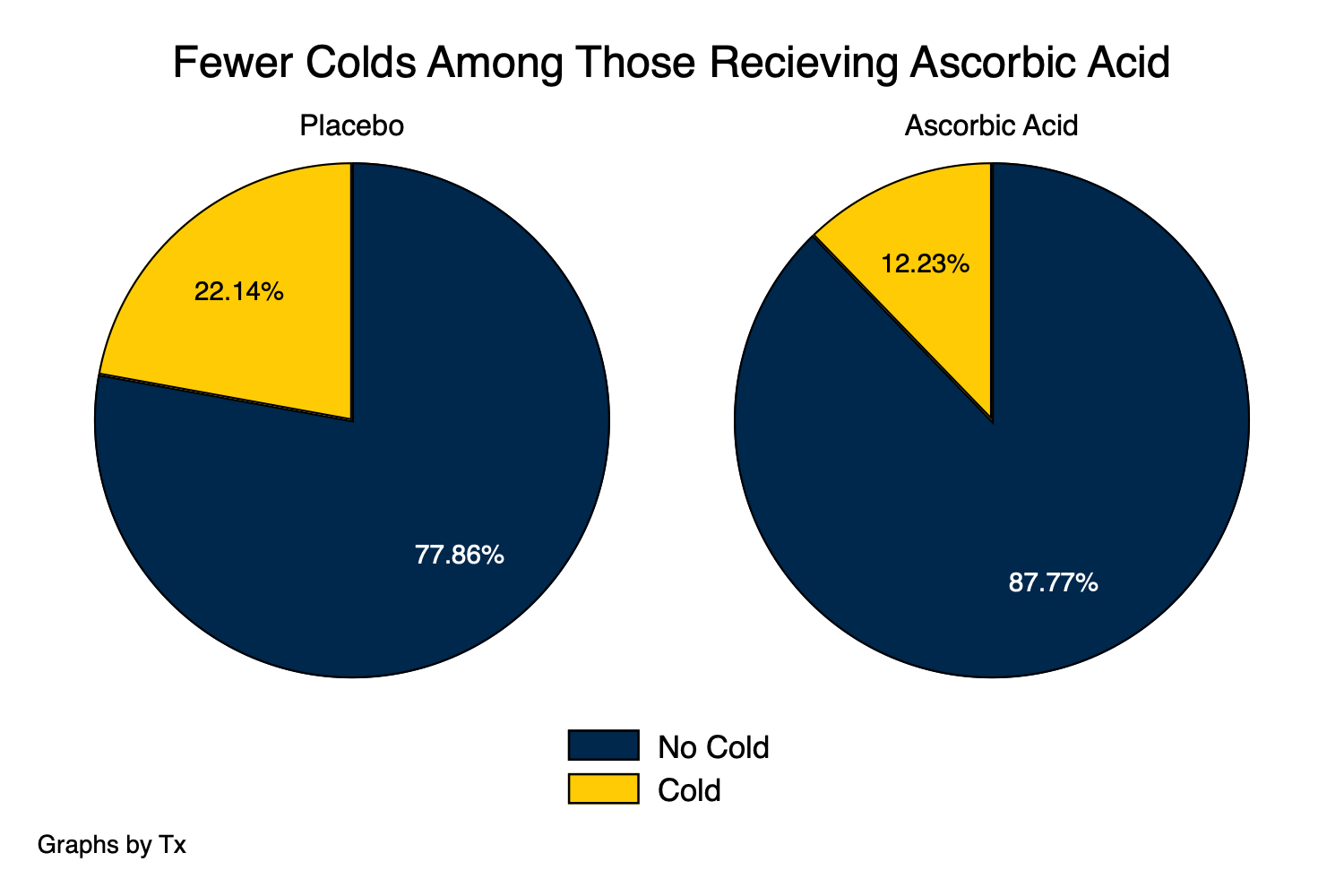
The pie chart also tells a very clear story about outcomes. Similar to the bar plot, however, the pie chart does not make clear what percentage was allocated to treatment and what percentage was allocated to control, which might be an important part of our story.
Then, we try a waffle chart, which requires the use of R and the
waffle library. The R script used to generate the figure
below is here.
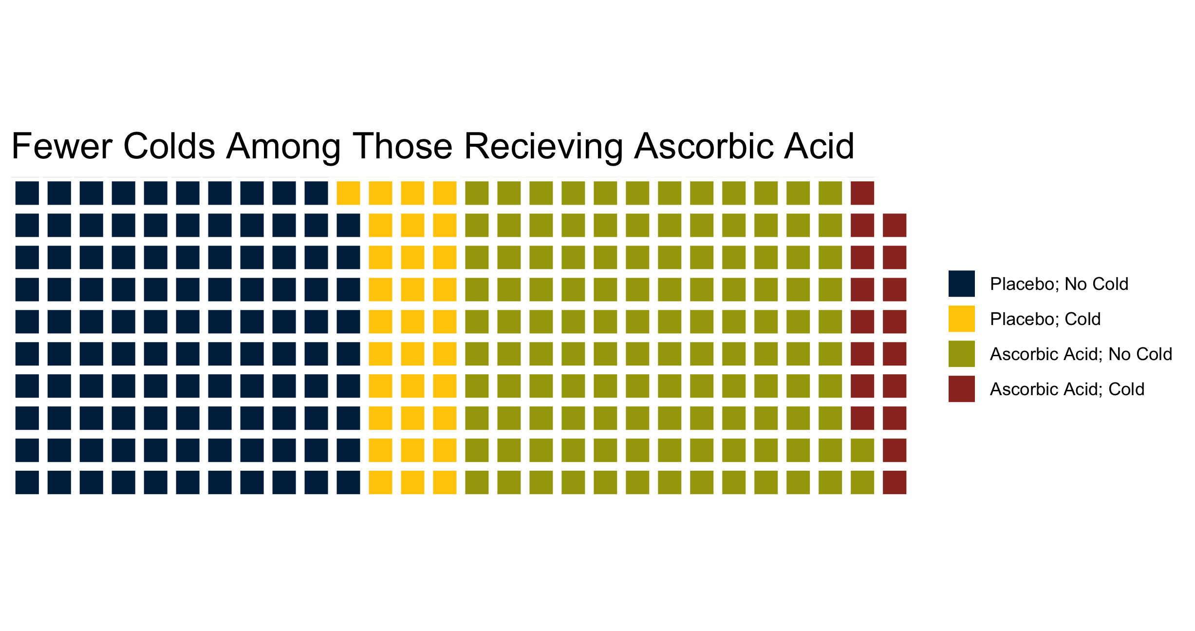
The waffle chart is very visually appealing. With enough inspection, the waffle chart may make clear that the allocation to the treatment vs. placebo was roughly 50/50. Note, that if the allocation had not been 50/50 the waffle chart would have made this clear as well. As with the spineplot (mosaic plot), with enough annotations, the waffle chart may make it clear that the treatment appears to result in a lower rate of colds than the placebo.
Finally, we try an alluvial diagram, which requires the use of R and
the ggalluvial library. The R script used to generate the
figure below is here.
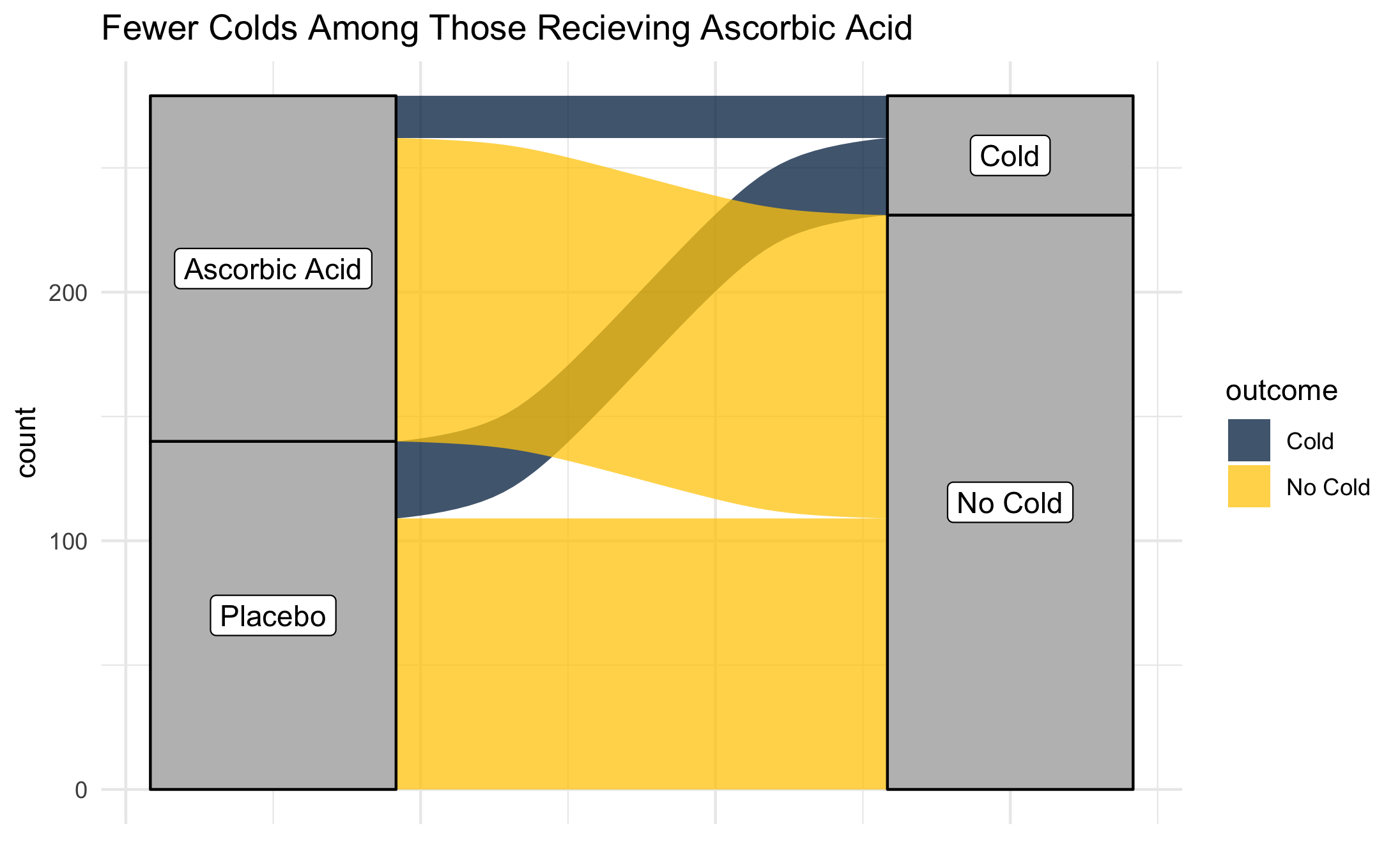
The alluvial diagram is also very visually appealing, but may also not be the most clear presentation of information. With enough inspection, the alluvial chart may make clear that the allocation to the treatment vs. placebo was roughly 50/50. Note, that if the allocation had not been 50/50 the alluvial chart would have made this clear as well. As with the spineplot (mosaic plot), with enough annotations, the alluvial chart may make it clear that the treatment appears to result in a lower rate of colds than the placebo. Using
ggalluvialit is difficult to add annotations for counts or percentages to the alluvial diagram, but these could be added in post-production with software like Adobe Illustrator.