| count | treatment | status | group |
|---|---|---|---|
| 4 | untreated | alive | A |
| 3 | untreated | dead | A |
| 8 | treated | alive | A |
| 5 | treated | dead | A |
| 2 | untreated | alive | B |
| 3 | untreated | dead | B |
| 12 | treated | alive | B |
| 15 | treated | dead | B |
Introduction
Simpson’s Paradox (Simpson, 1951) is the idea that associations between variables that are found between two variables in the sample as a whole, can be very different (or even reversed) when a third variable is introduced.
There are specific mathematical conditions under which Simpson’s Paradox applies. However, thinking through these mathematical conditions may not be helpful to develop intuitions about Simpson’s Paradox.
Careful inspection of visualizations can help us to develop some understanding of Simpson’s Paradox.
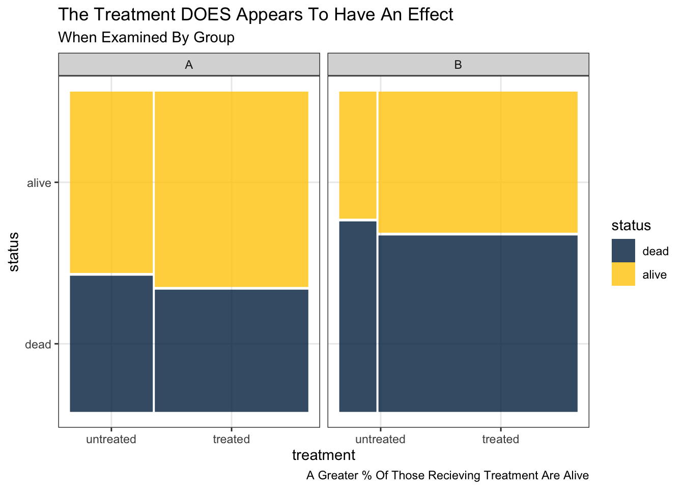
The key substantive idea is that models of the data that only account for two variables may provide very different–or even opposite–conclusions about a treatment or intervention than models of the data that account for many variables.
Some Hypothetical Data
These data are based on the hypothetical data provided by Simpson (1951).
Sample As A Whole
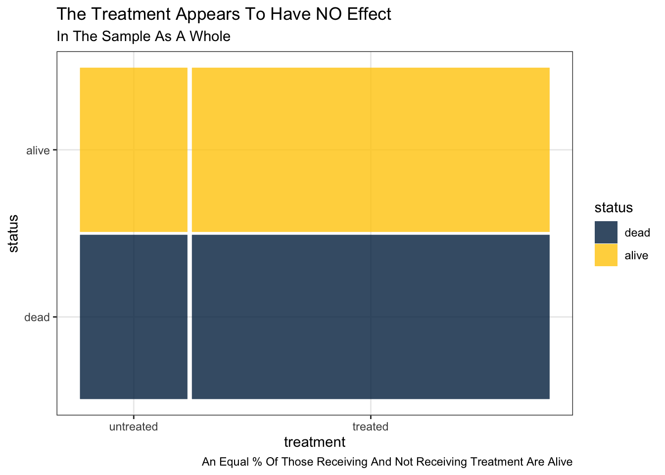
The treatment appears to have NO effect. An equal percentage of those receiving and not receiving treatment are alive.
Cross Tabulation
| dead | alive | |
|---|---|---|
| untreated | 6 | 6 |
| treated | 20 | 20 |
Mosaic Plot
Mosaic plots are a little bit counterintuive at first. However, I believe that–after a little bit of study–Mosaic plots provide the best visual representation of these relationships.
Pie Chart
A pie chart sometimes is more intuitive at first, but actually has less information than a mosaic chart.
These trade offs need to be carefully considered, and each approach has its advantages.
Sample Divided By Groups
The treatment appears to have an effect. A greater percentage of those receiving treatment are alive.
Cross Tabulation
| A | B | |||
| untreated | dead | 3 | 3 | |
| alive | 4 | 2 | ||
| treated | dead | 5 | 15 | |
| alive | 8 | 12 |


