Introduction
Simpson’s Paradox is the idea that associations that are found between two variables in the sample as a whole, can be very different (or even reversed) when we analyze the data by subgroups.
There are specific mathematical conditions under which Simpson’s Paradox applies. However, thinking through these mathematical conditions may not be helpful to develop intuitions about Simpson’s Paradox.
Looking at a simple visualization may help us to develop some understanding of Simpson’s Paradox.
Visualization
What Do We See?
Even when presented visually, it is difficult to think through Simpson’s Paradox.
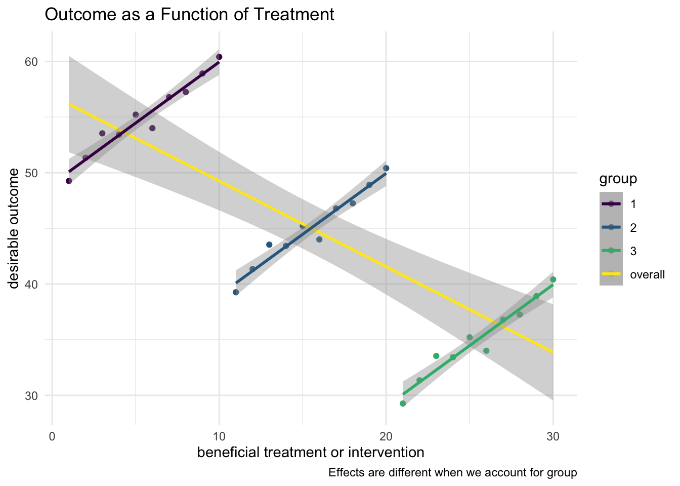
What do we see?
- For the sample overall, the regression line slopes downward: more treatment appears to be associated with less of the desirable outcome.
- When we control for group–when we start to think in multivariate terms–the individual group regression lines slope upward: more treatment appears to be associated with more of the desirable outcome.
- Thus, a more complex multivariate analysis gives very different results: graphing outcomes only against treatment or intervention suggests that the treatment or intervention is harmful; graphing outcomes against treatment or intervention, but accounting for group membership, suggests that the treatment is helpful.
- The crucial understanding is points (1)-(3) above, but why might this be? The discrepancy results from the fact that treatment provision is correlated with the outcome. Those with lower levels of the desirable outcome are getting higher levels of the treatment or intervention, a common enough situation if we think about it. This leads to the seeming paradox of finding quite different results depending upon what factors we account for.