Background
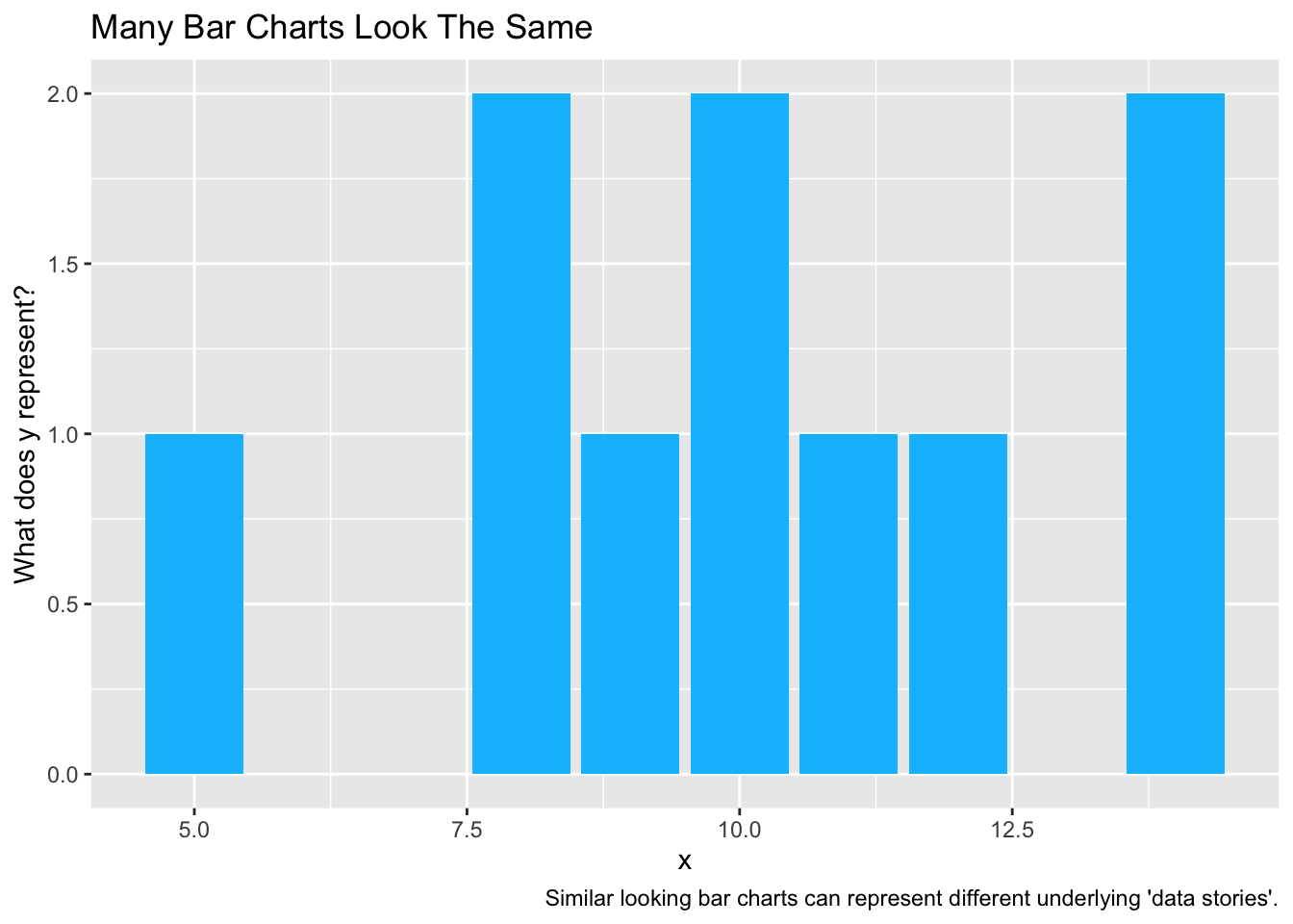
While ggplot2, and the ideas of an underlying “grammar of graphics”, make some kinds of graphing easier, ggplot2 can make other types of graphing more difficult.
One often tricky type of graph is the bar chart. I have come to think that part of the difficulty with thinking about bar charts in ggplot2 is that sometimes three very different types of bar charts look similar.
Introduction
Many bar charts look something like the bar chart below.
However, there are actually three slightly separate underlying “grammars of graphics” that might underlie a bar chart:
- Bar charts where the height of the bars is the number of observations in each category.
- Bar charts where the height of the bars is the average value of the y variable for that category.
- Bar charts where the height of the bars is the actual value of the y variable for that individual observation.
Let’s look at each situation in turn, since each situation demands a slightly different syntax.
Our Data
| x | y |
|---|---|
| 1 | 10 |
| 2 | 5 |
| 2 | 9 |
| 3 | 8 |
| 3 | 9 |
| 3 | 10 |
Bar charts where the height of the bars is the number of observations in each category.
Show the code
library(ggplot2)Show the code
ggplot(mydata, # the data that I am using
       aes(x = x)) + # 'aesthetic' only includes x
  geom_bar(fill = "deepskyblue") # using bars to graph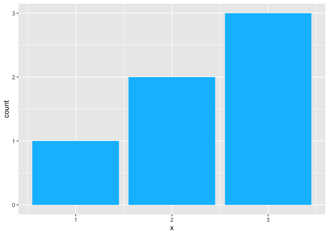
Stacked Bar Chart
A simple change to the above aesthetic yields a stacked bar chart.
Note that fill now becomes part of the aesthetic so that color fill differentiates the parts of the bar.
Show the code
ggplot(mydata, # the data that I am using
       aes(x = 1, # x is 1
           fill = factor(x))) + # fill is x as a factor
  geom_bar() + # using bars to graph
  scale_fill_discrete(name = "x") # modify name of legend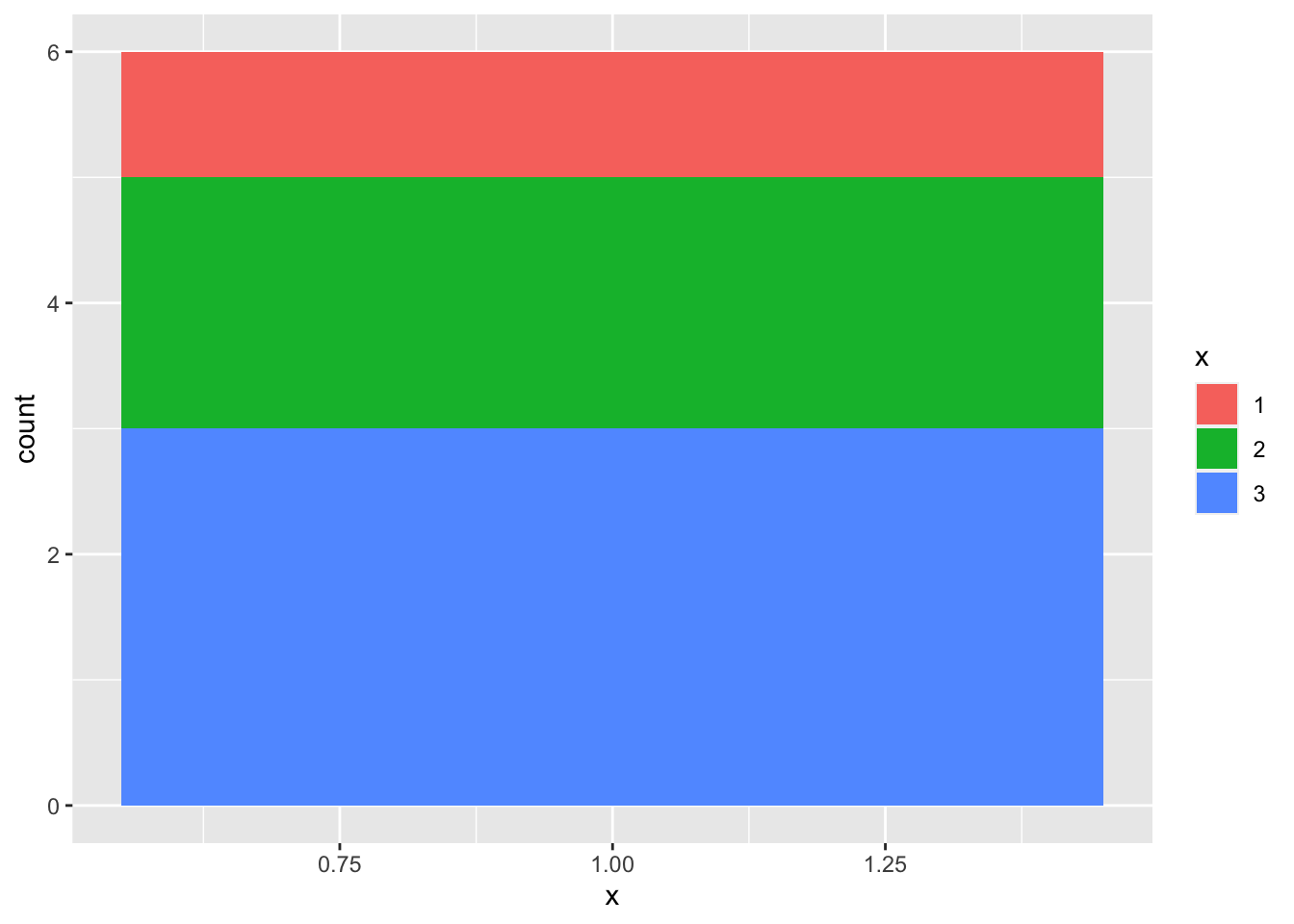
Note
We then return to an unstacked bar chart to consider the syntax for adding labels.
Add Labels
Adding labels requires adding an extra geom, geom_text. We have to add a new, non-intuitive aesthetic to geom_text to tell it where the labels are located, and that they represent the count of observations in each category. This aesthetic uses the special variable ..count.. to tell us how many observations are in each category.
Show the code
ggplot(mydata, # the data that I am using
       aes(x = x)) + # 'aesthetic' only includes x
  geom_bar(fill = "deepskyblue") + # using bars to graph
  geom_text(stat = "count",
            aes(label = ..count.., # text of the label
                y = ..count.. + .5), # location of the label
            size = 5) # size of the label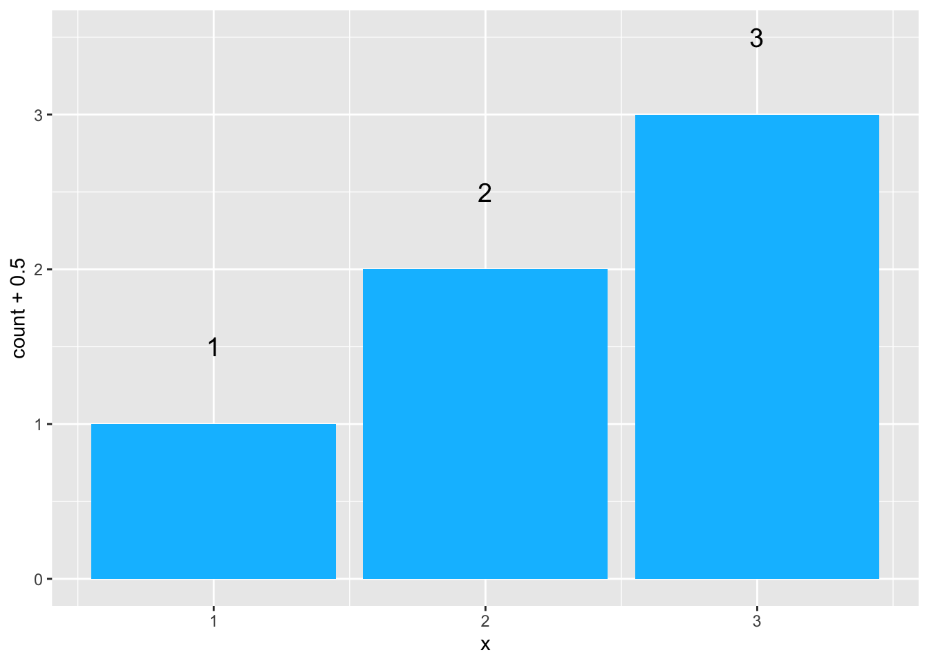
Alternatively, we could use ..prop.. to calculate and display proportions.
Show the code
ggplot(mydata, # the data that I am using
       aes(x = x)) +
  geom_bar(aes(y = ..prop..), # using bars to graph
           stat = "count",
           fill = "deepskyblue") +
  geom_text(aes(label = round(..prop.., digits = 2), # text of the label
                y = ..prop.. ), # location of the label
            stat = "count",
            size = 5, # size of the label
            vjust = -1) + # vertical justification
  ylim(0, .7)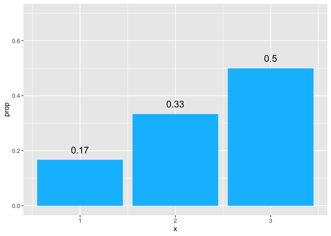
Bar charts where the height of the bars is the average value of the y variable for that category.
Note
For this kind of bar chart, we need ask R to summarize the value of y for different categories of x. The syntax is–shall we say–not very intuitive, but does make sense.
Show the code
library(ggplot2)

ggplot(mydata, # the data that I am using
       aes(x = x, # 'aesthetic' includes x
           y = y)) + # and y
  stat_summary(fun = mean, # summarizing y
               geom = "bar", # with bars
               fill = "deepskyblue") +
labs(y = "average y") 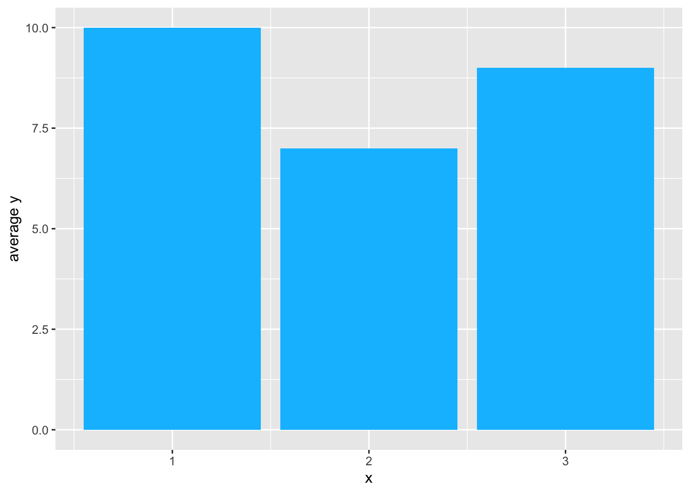
What About a Line Chart?
A line chart requires the addition of group to the aesthetic, and the use of a different geometry.
Show the code
ggplot(mydata, # the data that I am using
       aes(x = x,
           y = y,
           group = 1)) + # add 'group'
   stat_summary(geom = "line", # with line
                fun = mean,
                color = "deepskyblue")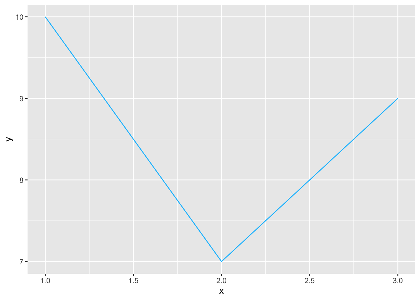
Bar charts where the height of the bars is the actual value of the y variable for that category.
Here is where things get complicated. We try something we’ve tried before, but now adding y to the aesthetic.
Show the code
library(ggplot2)

ggplot(mydata, # the data that I am using
       aes(x = x, # 'aesthetic' includes x
           y = y)) + # and y
  geom_bar()
This generates the following error message:
Error: stat_count() must not be used with a y aesthetic.
The reason that we are getting this error is that, by default, geom_bar() is trying to count up the number of x values, and in counting up the number of x values, geom_bar() does not know what to do with the y value.
So we change this using a different geometry, geom_col(), whose default behavior is defined to fit this situation: y = height of bars.
Show the code
library(ggplot2)

ggplot(mydata, # the data that I am using
       aes(x = x, # 'aesthetic' includes x
           y = y)) + # and y
  geom_col(fill = "deepskyblue") # use ACTUAL y for bar height
Alternatively, we could also use stat = "identity" within geom_bar() to indicate that y represents the actual height of the bars …
Show the code
library(ggplot2)

ggplot(mydata, # the data that I am using
       aes(x = x, # 'aesthetic' includes x
           y = y)) + # and y
  geom_bar(stat = "identity",  # use ACTUAL y for bar height
           fill = "deepskyblue")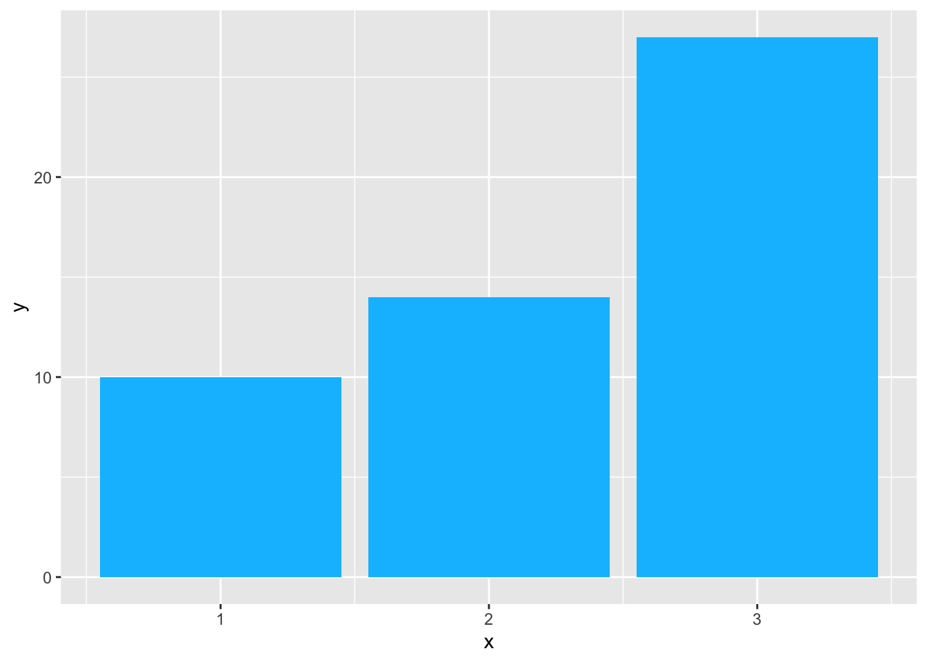
A Potential Problem
If we go back and look at our data, we remember that we have some duplicate x’s,
1, 2, 2, 3, 3 and 3
so some of the bars are actually over-printing.
We can see this if we make the bars semi-transparent, and outline the bars with a different color.
Show the code
library(ggplot2)

ggplot(mydata, # the data that I am using
       aes(x = x,
           y = y)) + # 'aesthetic' only includes x
  geom_bar(stat="identity", # use ACTUAL y for bar height
           fill = "deepskyblue", # fill
           color = "red", # outline
           alpha = .5) # transparency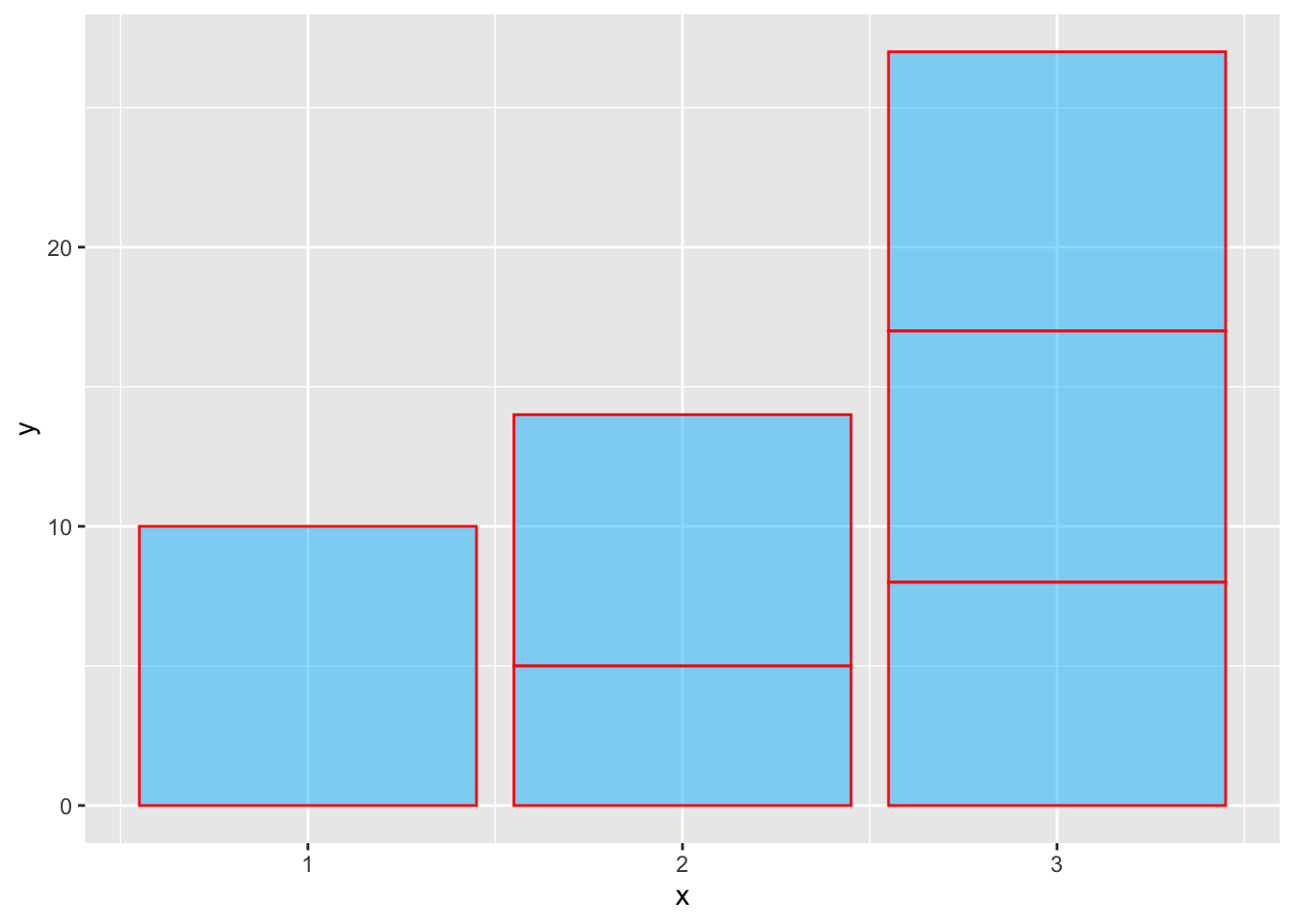
Thinking Through The Issue
What is the solution? We may want to go back and look at our data to ensure that if we are using the actual y value for the height of the bars that we do not have duplicate values of x in our data.
Or, we may want to have the bars represent the average value of y rather than the actual values of y, as we did in one of the examples above.
Of Course The Problem Wouldn’t Come Up If We Had Different Data, Without Those Duplicate x Observations
| xREVISED | yREVISED |
|---|---|
| 1 | 10 |
| 2 | 5 |
| 3 | 8 |
And Then A Bar Chart Is Easy
Show the code
library(ggplot2)

ggplot(mydataREVISED, # the data that I am using
       aes(x = xREVISED, # 'aesthetic' includes x
           y = yREVISED)) + # and y
  geom_bar(stat = "identity", # use ACTUAL y for bar height
           fill = "deepskyblue")
A Line Chart Is Easy Too
Show the code
library(ggplot2)

ggplot(mydataREVISED, # the data that I am using
       aes(x = xREVISED, # 'aesthetic' includes x
           y = yREVISED)) + # and y
  geom_line(stat = "identity", # use ACTUAL y for bar height
           color = "deepskyblue")
And Then There Are Pie Charts
In some ways it is confusing, and in some ways it is helpful, that according to the underlying grammar of graphics in ggplot2, pie charts can be seen as bar charts that use polar coordinates. With that in mind, we take some of our earlier code, and add coord_polar().
In the code below, I need to ensure that ggplot2 sees x as a factor, and to use x as a fill. Fill is a crucial piece of information in a pie chart.
I also need to change x= in the aesthetic to 1 so that ggplot locates all the slices at the same place in terms of polar coordinates.
Show the code
library(ggplot2)

ggplot(mydata, # the data that I am using
       aes(x = 1, # all the slices have the same x
           fill = factor(x))) + # x is now the fill
  geom_bar() + # using bars to graph
  coord_polar(theta = "y") + # polar coordinates
  theme_void() # get rid of distracting numbers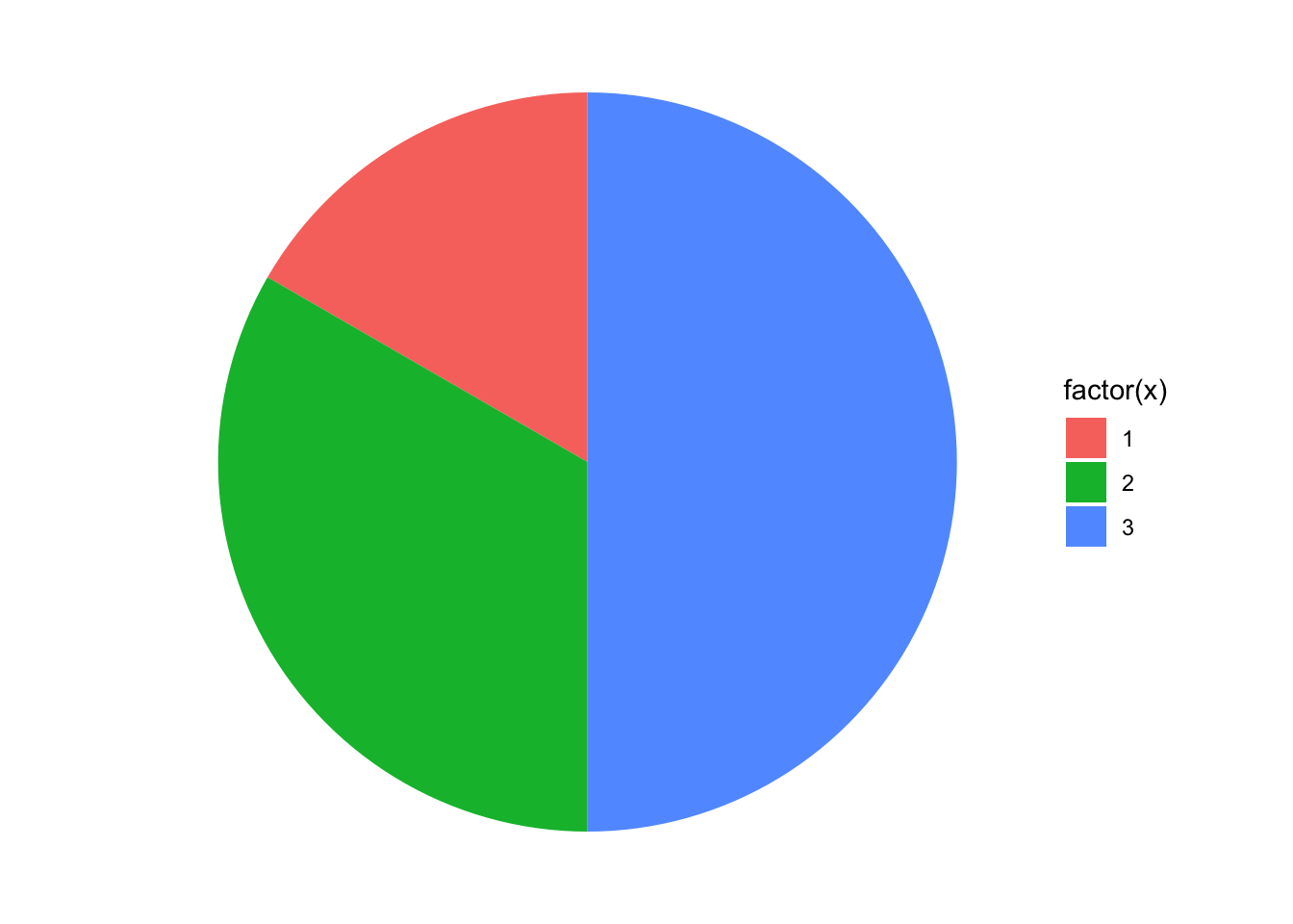
Note
Unfortunately, pie charts are deprecated in some circles, so support for pie charts is not very strong in ggplot. It is certainly possible to create a pie chart in ggplot, but adding labels to a pie chart ends up being very very difficult.
Pie Chart With Better Colors
Show the code
library(ggplot2)

ggplot(mydata, # the data that I am using
       aes(x = 1,
           fill = factor(x))) +
  geom_bar() + # using bars to graph
  coord_polar(theta = "y") + # polar coordinates
  scale_fill_viridis_d(name = "x") + # beautiful colors; named legend
  theme_void() # get rid of distracting numbers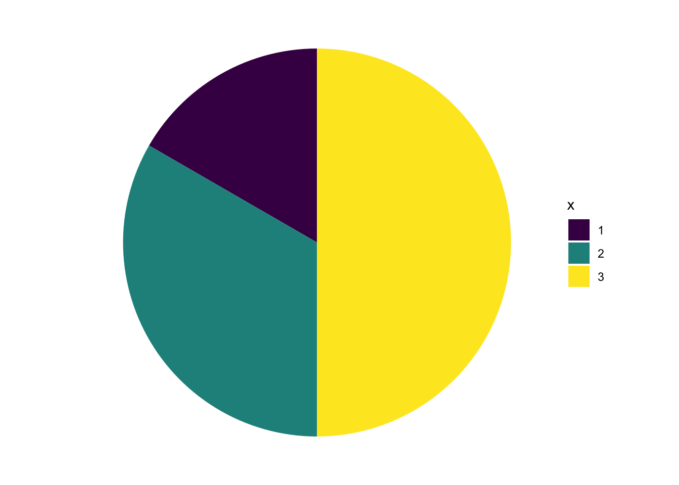
Bar Chart With Better Colors
Up until now, we have had a minimalist vision of bar charts, where every bar is the same color, because color would not add additional information, over and above the information contained in the position on the x axis. However, for the sake of design, we may also choose to add some color to our bar charts. ggthemes, ggthemr and viridis are all ways of adding color to ggplot graphs.
Show the code
library(ggplot2)

library(viridis) # wonderful colors

ggplot(mydata, # the data that I am using
       aes(x = x, # x is on the x axis
           fill = factor(x))) + # x is also a factor for fill
  geom_bar() + # using bars to graph
  scale_fill_viridis_d(name = "x") # colors; named legend