Show the code
load("social-service-agency.RData") # simulated dataggplot2 is a powerful graphing library that can make beautiful graphs. ggplot2 can also help us to understand ideas of an underlying “grammar of graphics”.
However, ggplot can be difficult to learn. I am thinking that one way to better understand ggplot2 might be to see how this graphing library could be applied to a concrete example of comparing program outcomes.
In this example, program is a factor and mental health at time 2 is numeric.
library(ggplot2) # beautiful graphsThere is a lot of code below. This is where we are setting up the grammatical logic of the graphing approach.
Devoting some time to setting up the initial logic of the plot will pay dividends in terms of exploring multiple geometries later on.
Note that I am adding optional
scale_...andtheme...arguments just to make the graphs look a little nicer, but these are not an essential part of the code.
myplot1 <- ggplot(clients, # the data I am using
                 aes(x = program, # x is program
                     y = mental_health_T2, # y is mental health
                     color = program, # color is also program
                     fill = program)) + # fill is also program
  labs(y = "mental health at time 2") + # labels
  scale_color_viridis_d() + # beautiful colors
  scale_fill_viridis_d() + # beautiful fills
  theme_minimal() + # minimal theme
theme(axis.text.x = element_text(size = rel(.75))) # smaller labelsNow that we have devoted a lot of code to setting up the grammar of the graph, it is a relatively simple matter to try out different geometries. The geometries show the average value.
myplot1 +
  stat_summary(fun = "mean", # summarize at mean
               geom = "bar") + # bar geometry
  labs(title = "Bar Chart")
myplot1 +
  stat_summary(fun = "mean", # summarize at mean
               geom = "bar") + # bar geometry
  coord_flip() + # flip coordinates
  labs(title = "Horizontal Bar Chart")
myplot1 +
  stat_summary(fun = "mean", # summarize at mean
               geom = "point", size = 5) + # point geometry
  labs(title = "Point Chart") +
  ylim(90, 105) # manually adjust y limits
The segments connecting the x axis with the points, require their own geometry that has its own aesthetic.
myplot1 +
  stat_summary(fun = "mean",
               geom = "point",
               size = 5) +
  geom_segment(aes(x = program, # x starts at
                   xend = program, # x ends at
                   y = 0, # y starts at
                   yend = mean(mental_health_T2))) + # y ends at
  labs(title = "Lollipop Chart") +
  ylim(0, 105) # manually adjust y limits
An extra element of the aesthetic is required for lines.
myplot1 +
  stat_summary(aes(group = 1), # line geom needs group aesthetic
               color = "black", # consistent color
               fun = "mean",
               geom = "line") +
  labs(title = "Line Chart")
A line chart is likely not an appropriate way to show these program outcomes as a line chart is more appropriate when the x axis represents some kind of time trend.
Now that we have devoted a lot of code to setting up the grammar of the graph, it is a relatively simple matter to try out different geometries. The geometries show the distribution of all values.
myplot1 +
  geom_boxplot(fill="white") + # boxplot geometry
  labs(title = "Boxplot")
myplot1 +
  geom_violin() + # violinplot geometry
  labs(title = "Violin Plot")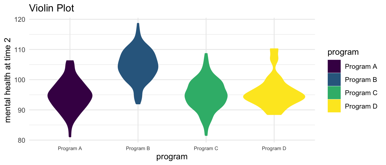
myplot1 +
  geom_point() + # point geometry
  labs(title = "Points")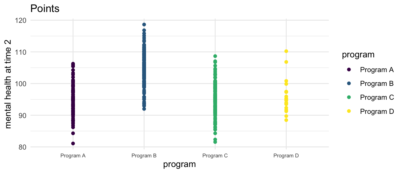
myplot1 +
  geom_jitter() + # jittered point geometry
  labs(title = "Jittered Points")
library(ggbeeswarm) # beeswarm geometry

myplot1 +
  geom_beeswarm() + # beeswarm geometry
  labs(title = "Beeswarm Plot")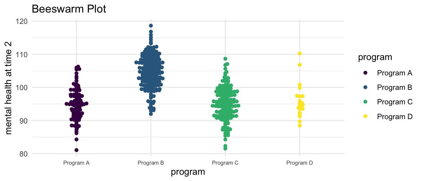
library(ggdist) # dotplot geometry

myplot1 +
  stat_dots() + # dotplot geometry
  labs(title = "Dotlot")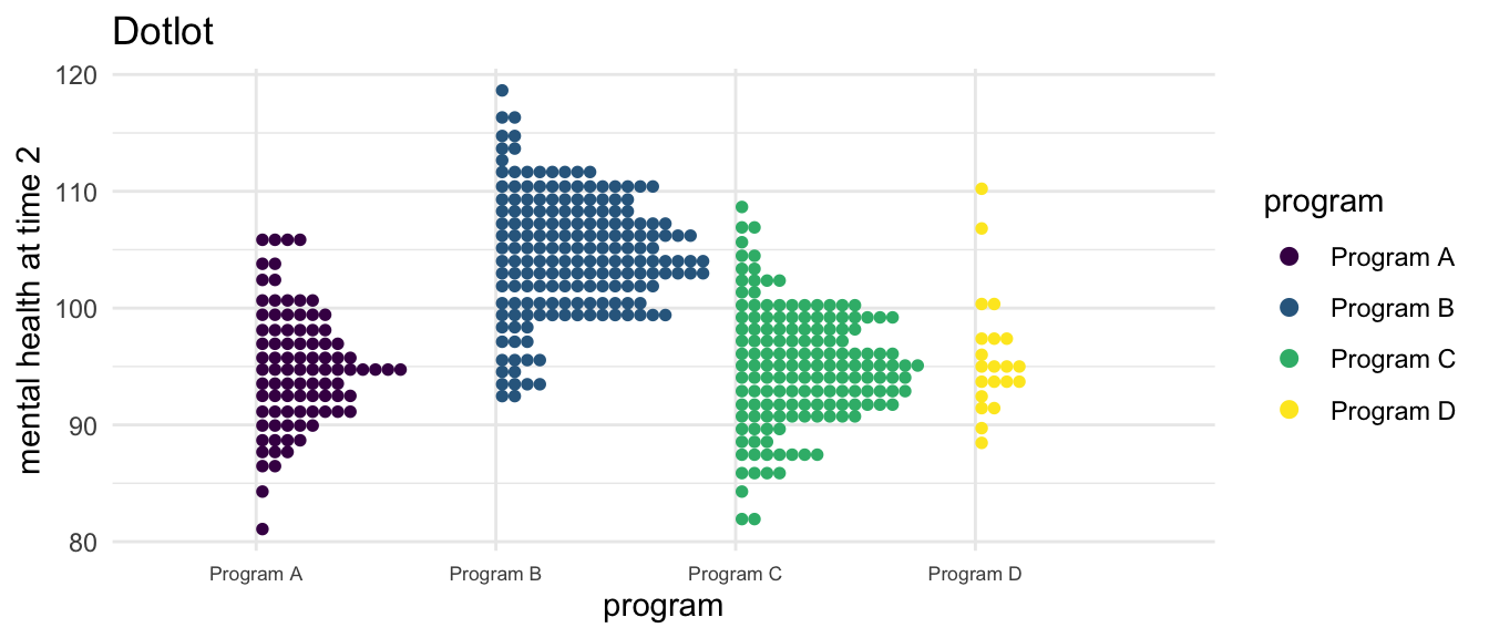
Again, there is a lot of code below. This is where we are setting up the grammatical logic of the graphing approach.
myplot2 <- ggplot(clients, # the data I am using
                  aes(x = mental_health_T2, # x is mental health
                      fill = program)) + # fill is program
  facet_wrap(~program) + # facet on this variable
  labs(x = "mental health at time 2") + # labels
  scale_color_viridis_d() + # beautiful colors
  scale_fill_viridis_d() + # beautiful fills
theme_bw() # bw theme makes facets more clearHowever, now that we have devoted a lot of code to setting up the grammar of the graph, it is again a relatively simple matter to try out different geometries.
myplot2 +
  geom_histogram() + # histogram geometry
  labs(title = "Histogram")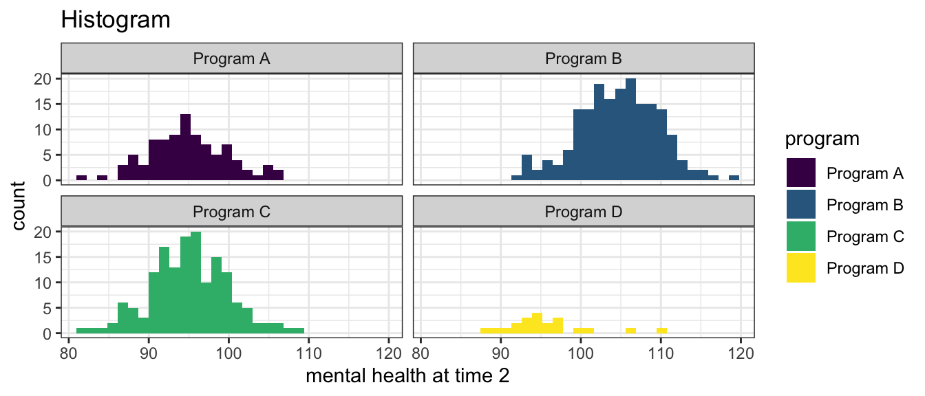
myplot2 +
  geom_density() + # density geometry
  labs(title = "Density")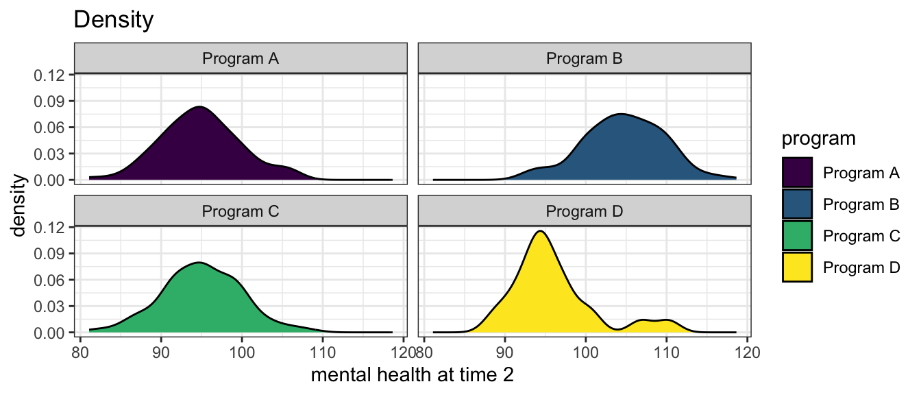
One last time, there is a lot of code below. This is where we are setting up the grammatical logic of the graphing approach.
myplot3 <- ggplot(clients, # the data I am using
                  aes(x = mental_health_T2, # x is mental health
                      fill = program)) + # fill is program
  labs(x = "mental health at time 2") + # labels
  scale_color_viridis_d() + # beautiful colors
  scale_fill_viridis_d() + # beautiful fills
theme_minimal() # minimal themeAnd again, now that we have devoted a lot of code to setting up the grammar of the graph, it is again a relatively simple matter to try out different geometries.1
myplot3 +
  geom_histogram(alpha = .5) + # histogram geometry (transparent)
  labs(title="Histogram")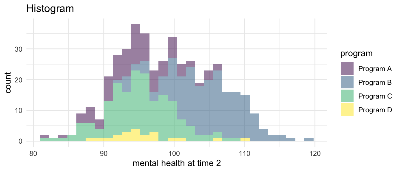
myplot3 +
  geom_density(alpha = .5) + # density geometry (transparent)
  labs(title = "Density")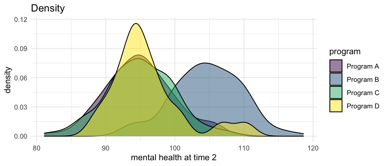
It is important to use (alpha = ...) to create transparency with these geoms.↩︎