Show the code
library(haven) # read Stata data

library(psych) # useful routines for psych dataFor a few recent projects, I have had to quickly get up to speed on new data. If I’m focusing on a relatively small number of variables–perhaps a subset of a much larger dataset–I have found the pairs plot an incredibly useful tool for learning about new data, and getting a visual sense of the distributions of the variables and their relationships. After experimenting with a few different libraries, I have come to really like pairs.panels in the psych (Revelle, 2025) library. I provide an example of pairs.panels below, but I also sometimes use what seems to me to be the quite similar in spirit corrgram (Wright, 2021) library.
For this example, I use the data from my Multilevel Workshop site.
library(haven) # read Stata data
library(psych) # useful routines for psych datamydata <- read_dta("simulated_multilevel_data.dta")labelled::look_for(mydata) # look at variables and variable labels pos variable label col_type missing values
1 country country id dbl 0
2 HDI Human Development Index dbl 0
3 family family id dbl 0
4 id unique country family id chr 0
5 identity hypothetical identity group v~ dbl 0
6 intervention recieved intervention dbl 0
7 physical_punishment physical punishment in past w~ dbl 0
8 warmth parental warmth in past week dbl 0
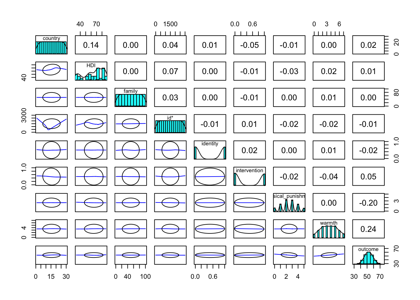
9 outcome beneficial outcome dbl 0 Here I set show.points to FALSE for two reasons: by design, most of the variables in my simulated data are uncorrelated, showing the points seemed to somehow create more confusion than clarity; there are a lot of data points, and for that reason as well, showing the points seemed to create more confusion than clarity. You of course can experiment with setting show.points to TRUE
In the diagonal panel, I see the distribution of each variable by itself. In the bottom panel, there are are smoother plots of each variable against each other. Here I am looking for lines that are not flat–in part or in whole–because this indicates that one variable has a relationship with another. In the top panel, I see the correlations of each variable with each other, and I am looking for either negative or positive numbers that depart significantly from zero.
It seems in this example, that parental warmth and physical punishment have the biggest association with outcome. In regression models, it turns out that intervention also has a relationship with outcome, but that is harder to see here. It is worth investigating even smaller correlations further!
pairs.panels(mydata, # pairs plot
             show.points = FALSE) # don't show data points