Code
import delimited "clients.csv", clear // import data

graph bar mental_health_t2, /// bar graph of mean outcome
over(program) /// over program
asyvars // bars that have colorBoth R and Stata are programs with strong data visualization and analysis capabilities. However, Stata’s capabilities as a data visualization program are sometimes under-rated. The intent of the post is to show that Stata can often perform the same graphing task as R, with much simpler, and much more intuitive, command syntax.
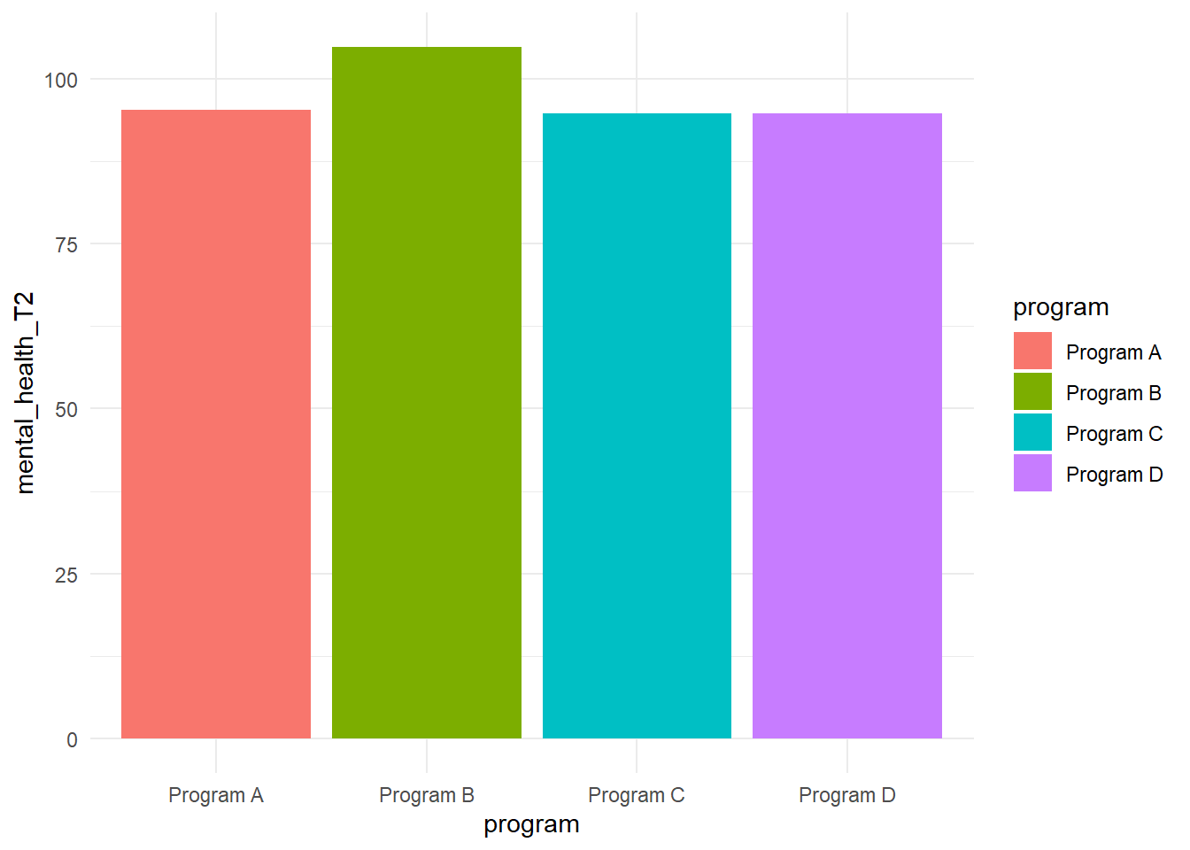
This post uses simulated social service agency data clients. In each program, I am going to graph mental health of clients (at Time 2) by program.
import delimited "clients.csv", clear // import data
graph bar mental_health_t2, /// bar graph of mean outcome
over(program) /// over program
asyvars // bars that have color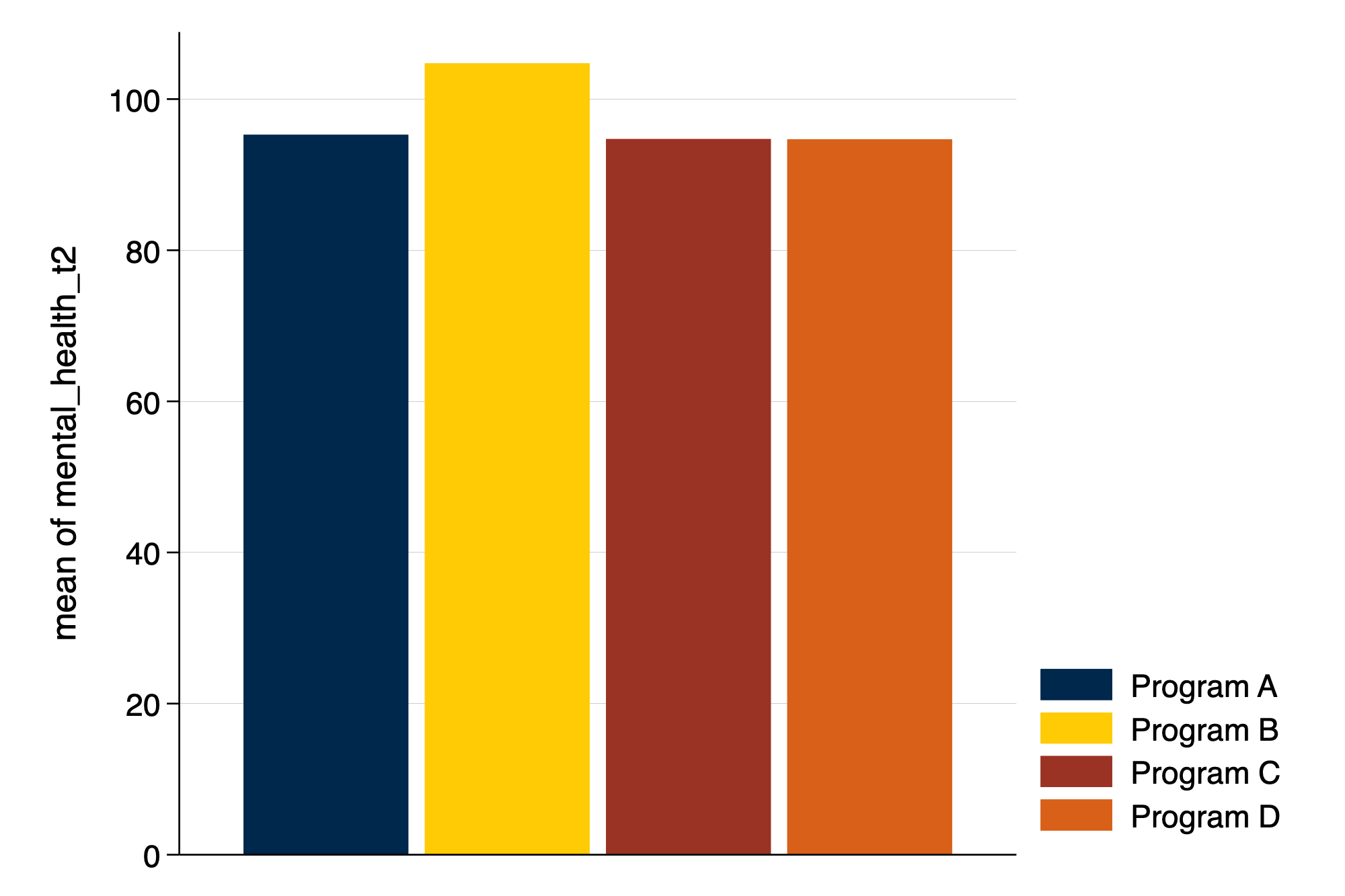
library(readr) # library to import data

clients <- read_csv("clients.csv") # import data

library(ggplot2) # library for graphs

ggplot(clients, # the data that I am using
       aes(x = program, # 'aesthetic' includes x
           y = mental_health_T2, # and y
           fill = program)) + # and fill by program
  stat_summary(fun = mean, # summarizing y
               geom = "bar") + # with bars
  theme_minimal() # minimal theme