A big number, enclosed by a circular bar graph, can be a compelling data visualization.
This post provides code for creating such data visualizations. The use of code initially makes this work more difficult than if using a drag-and-drop interface, but ultimately automates the work and makes it auditable and replicable.
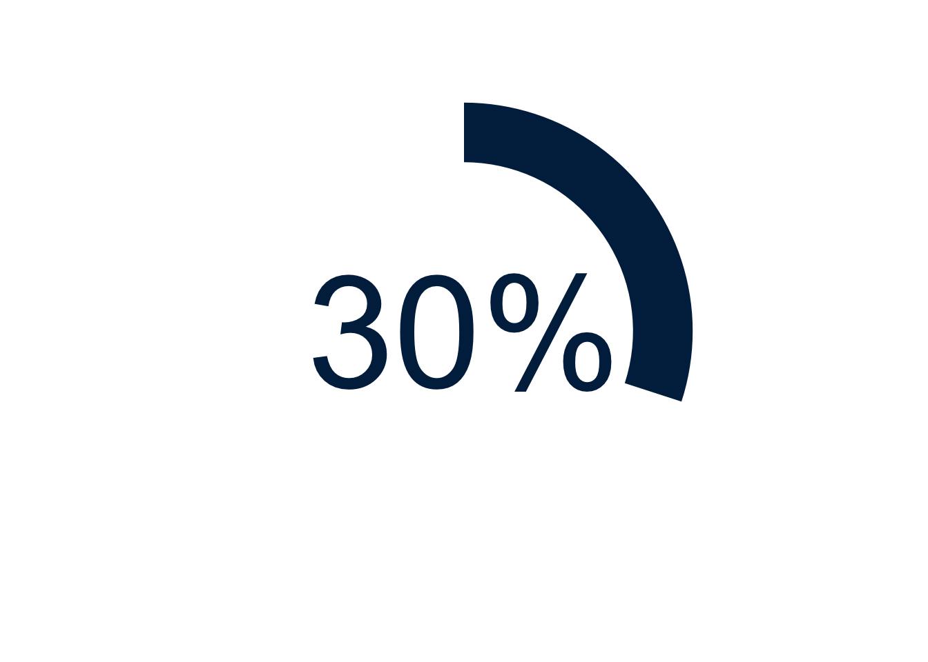
Example Using 30% and Michigan Blue
Show the code
library(ggplot2) # beautiful graphsggplot(data =NULL, # NULL data setaes(x =3, # arbitrary x; 3 is goody =30)) +# y value to be graphedgeom_col(fill ="#00274C") +# column & column colorcoord_polar(theta ="y") +# polar coordinatesxlim(0, 4) +# xlimits create a doughnutylim(0, 100) +# ylimits govern the circumferencegeom_text(aes(x =0, # text in centery =0,label ="30%"), # label for textsize =30, # text sizecol ="#00274C") +# text colortheme_void() # empty theme
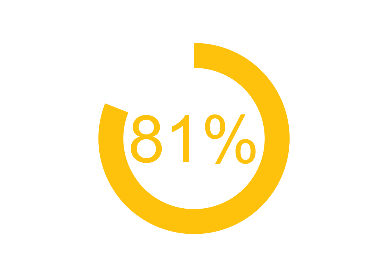
Example Using 81% And Michigan Maize
Show the code
library(ggplot2) # beautiful graphsggplot(data =NULL, # NULL data setaes(x =3, # arbitrary x; 3 is goody =81)) +# y value to be graphedgeom_col(fill ="#ffcb05") +# column & column colorcoord_polar(theta ="y") +# polar coordinatesxlim(0, 4) +# xlimits create a doughnutylim(0, 100) +# ylimits govern the circumferencegeom_text(aes(x =0, # text in centery =0,label ="81%"), # label for textsize =30, # text sizecol ="#ffcb05") +# text colortheme_void() # empty theme