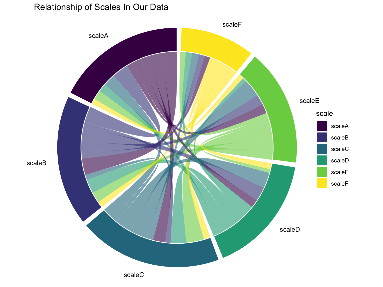
In other earlier posts, I have looked at some ways to get an idea of what scales and demographic variables in my data are related to other scales and demographic variables in my data. One way of visualizing these relationships is a chord diagram.
In this post, I try creating a chord diagram using the fantastic new ggchord2(Rennie, 2026a, 2026b).
For ggchord to work, I need data on the correlations of different scales, but need this correlation data to be formatted as a list of sources and destinations.
I therefore first create a correlation matrix of my data, and then reformat this correlation matrix as a data frame of sources, destinations, and correlations.
cor_mat <-cor(mydata, # correlation matrixuse ="complete.obs")diag(cor_mat) <-0# set diagonal to 0# thanks tutorialspoint.com!mychorddata <-as.data.frame(as.table(cor_mat))head(mychorddata) # look at the data
Using ggchord is then relatively straightforward. I use geom_chord_diagram which adds all of the required geometries of a chord diagram, but could use other geoms to add each geometry separately.
Show the code
# pal_viridis()(5) # 5 viridis colorsggplot(data = mychorddata, mapping =aes(source = Var1,target = Var2,freq = Freq,fill = Var1)) +geom_chord_diagram() +# add all the chord geoms# geom_chord_arcs() + # selecting specific # geom_chord_sectors() + # chord geoms allows # geom_chord_labels() + # for more customizationscale_fill_viridis_d(name ="scale") +# nice colorslabs(title ="Relationship of Scales In Our Data") +theme_void() +coord_fixed(clip ="off") # fixed coordinates; don't clip labels