Graphs
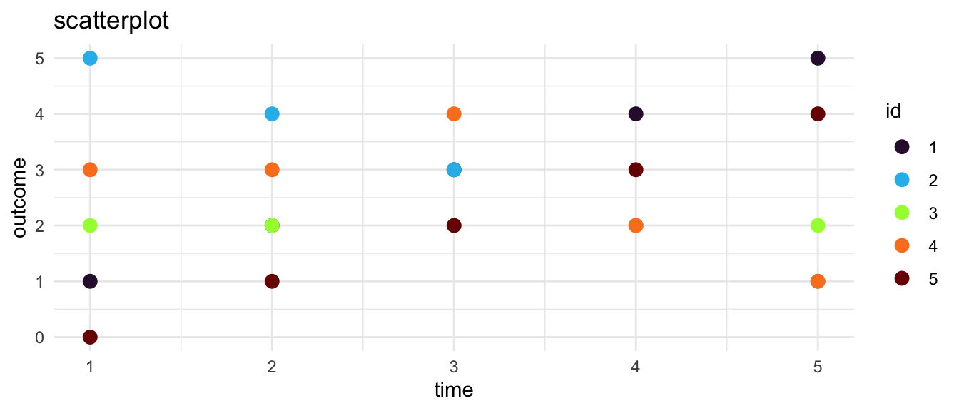
Scatterplot
We start in thinking about graphing change over time with a scatterplot.1 2
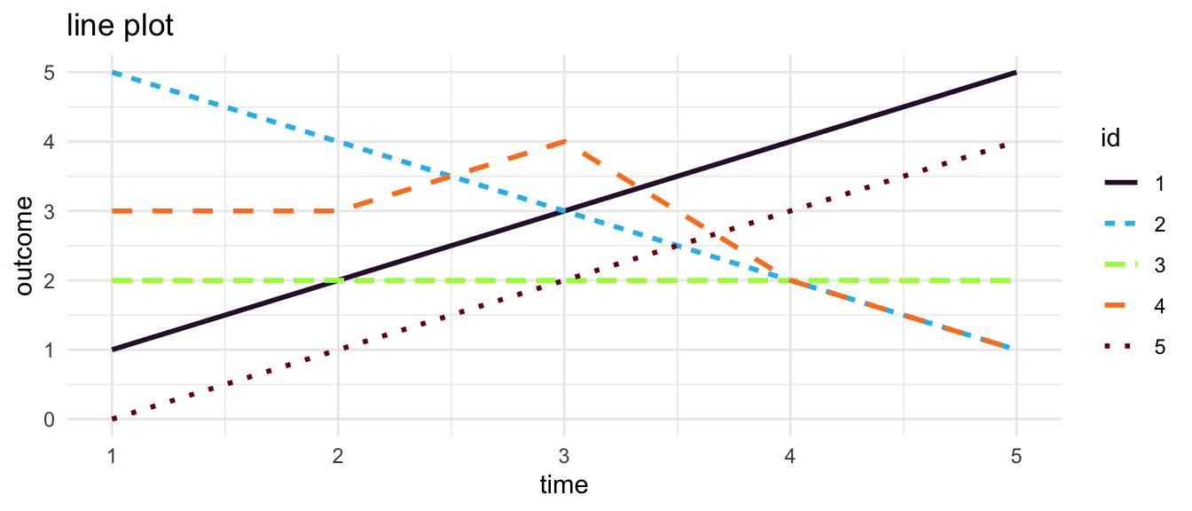
Line Plot
A natural next step is to connect the dots of a scatterplot with straight line segments to form a line plot. 3
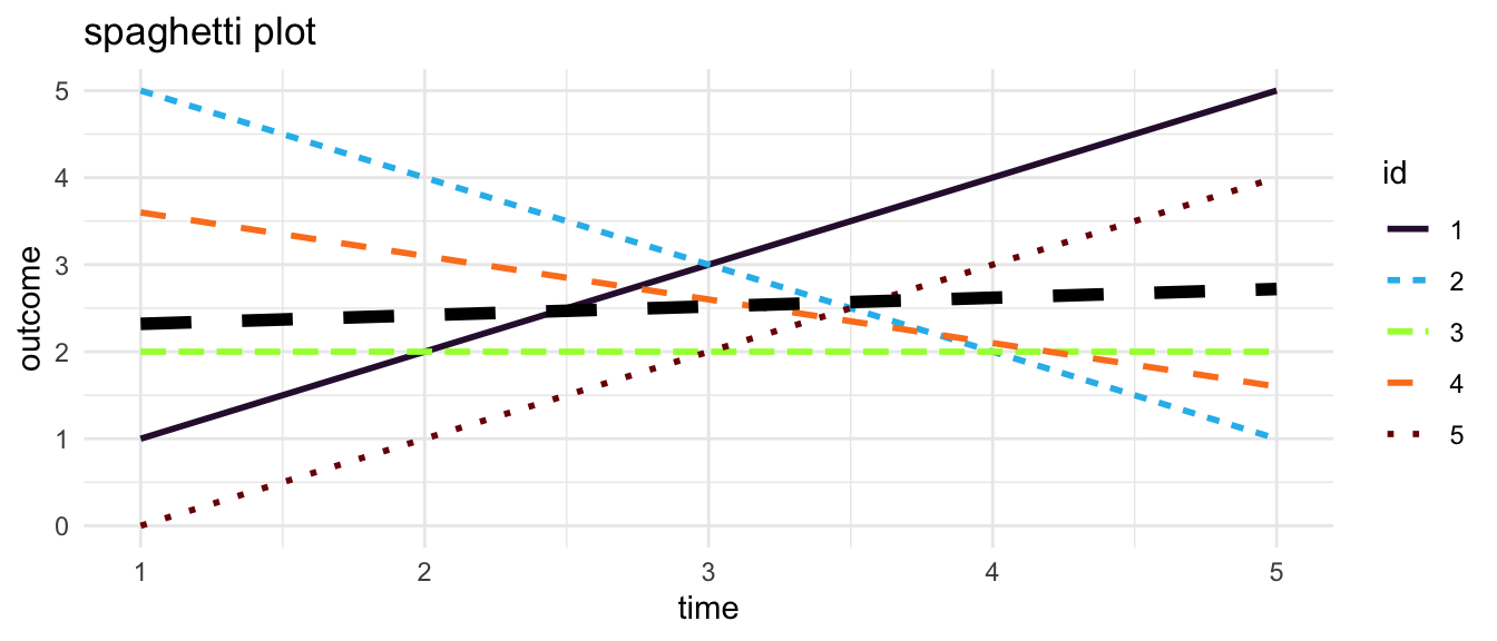
Spaghetti Plot
Instead of simply connecting the observations, one may estimate an individual linear trajectory. In multilevel modeling these line plots showing individual estimated linear trajectories are sometimes called spaghetti plots.
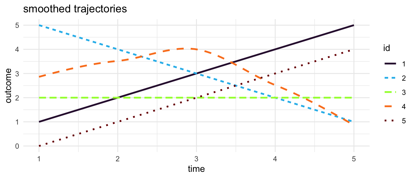
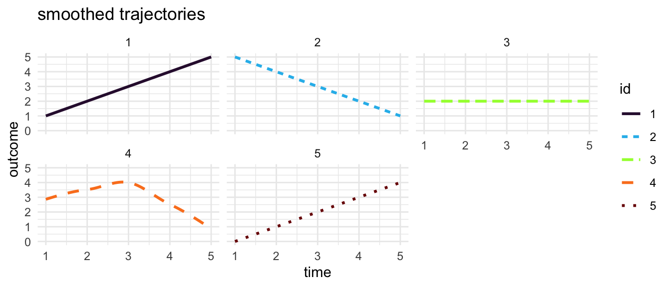
Smoothed Trajectories
Alternatively, rather than connecting observations with straight lines, or estimating an overall straight line trajectory for each individual, it may be useful to smooth the trajectories by drawing curved lines between individual observations.4
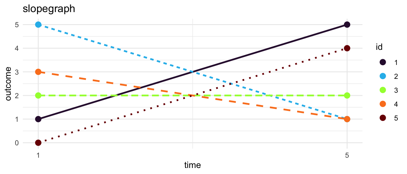
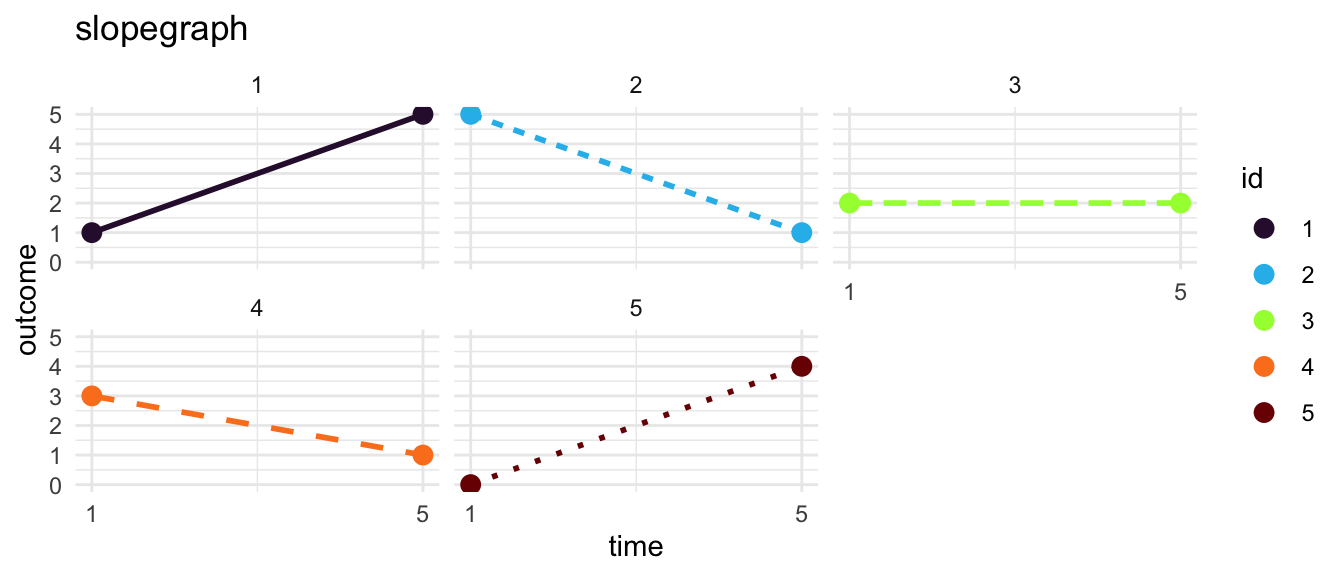
Slopegraph
An increasingly popular option is a slope graph.5
These Graphs Require Data In Long Format
The data used in this example are simulated.
Generally, for graphing change over time, it is most appropriate to have data that are in a long format, as shown in Figure 9. In long data every row represents a particular measurement occasion for a particular individual. Each individual in the data set thus has multiple rows. Ideally, every row in data in the long format is uniquely identified by the combination of an id number and a study wave.
Many data sets, but not all, are originally created in the wide format–as shown in Figure 10–where every row of data is an individual, and an individual only has a single row. Ideally, every row in wide data is uniquely identified by an individual id number.
TipKey Idea: Data In Long Format
| id | t | outcome |
|---|---|---|
| 1 | 1 | 1 |
| 1 | 2 | 2 |
| 1 | 3 | 3 |
| 1 | 4 | 4 |
| 1 | 5 | 5 |
| 2 | 1 | 5 |
| 2 | 2 | 4 |
| 2 | 3 | 3 |
| 2 | 4 | 2 |
| 2 | 5 | 1 |
| 3 | 1 | 2 |
| 3 | 2 | 2 |
| 3 | 3 | 2 |
| 3 | 4 | 2 |
| 3 | 5 | 2 |
| 4 | 1 | 3 |
| 4 | 2 | 3 |
| 4 | 3 | 4 |
| 4 | 4 | 2 |
| 4 | 5 | 1 |
| 5 | 1 | 0 |
| 5 | 2 | 1 |
| 5 | 3 | 2 |
| 5 | 4 | 3 |
| 5 | 5 | 4 |
TipKey Idea: Data In Wide Format
| id | outcome.1 | outcome.2 | outcome.3 | outcome.4 | outcome.5 |
|---|---|---|---|---|---|
| 1 | 1 | 2 | 3 | 4 | 5 |
| 2 | 5 | 4 | 3 | 2 | 1 |
| 3 | 2 | 2 | 2 | 2 | 2 |
| 4 | 3 | 3 | 4 | 2 | 1 |
| 5 | 0 | 1 | 2 | 3 | 4 |
TipReshaping Data
Graphics made with ggplot2 (Wickham, 2016).
References
Wickham, H. (2016). ggplot2: Elegant graphics for data analysis. Springer-Verlag New York. https://ggplot2.tidyverse.org
Footnotes
Scatterplots show every data point. However, with many data points, scatterplots may become overcomplicated, and difficult to interpret. Points may even be plotted over other data points.↩︎
Note that we are using color and line type to distinguish different individuals. This may not always be possible, especially when there are a large number of individuals in the data.↩︎
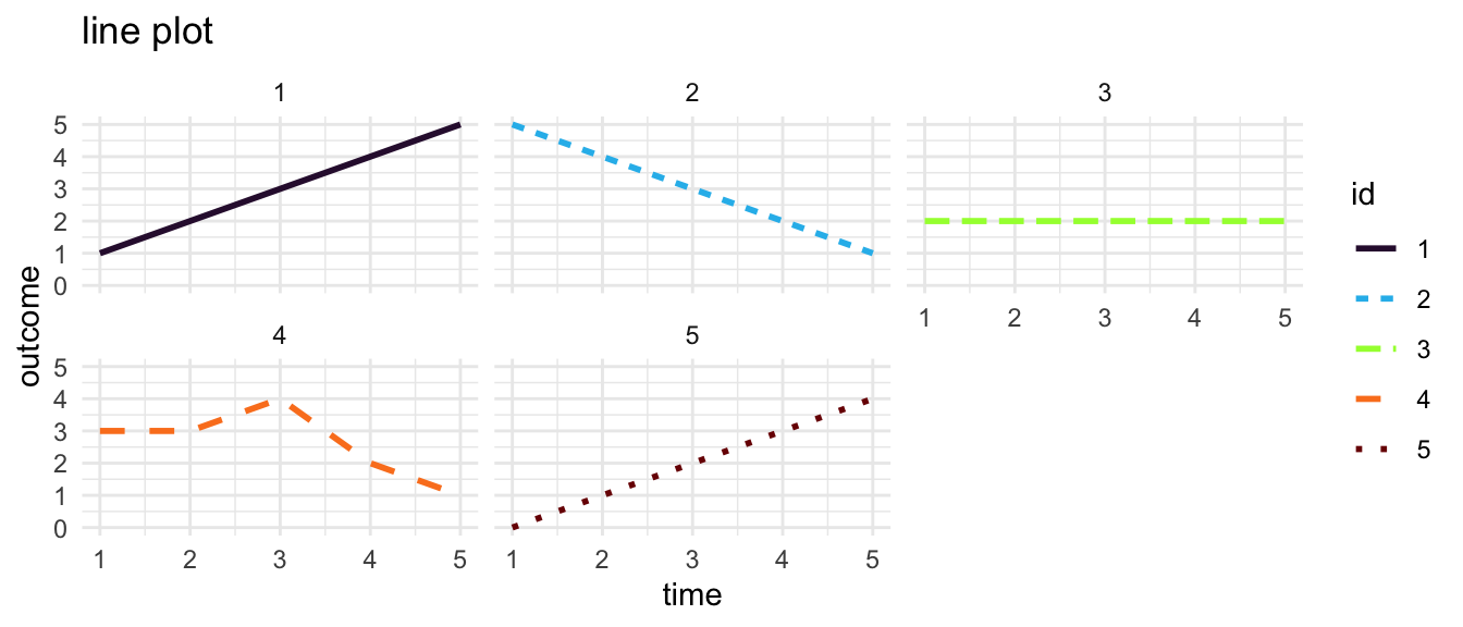
With any of the options discussed, one may consider small multiples where each individual trajectory is placed in its own sub-graph.↩︎
One needs to be careful, however, as the smoothed trajectories may give the impression of having more data points than one actually has.↩︎
In order to be clear and effective, a slope graph may often only show the outcome at the beginning point, and at the end point. A slope graph may be less satisfactory when there are multiple timepoints, unless the slopegraph shows all the timepoints. The small multiple idea works with a slopegraph as well.↩︎