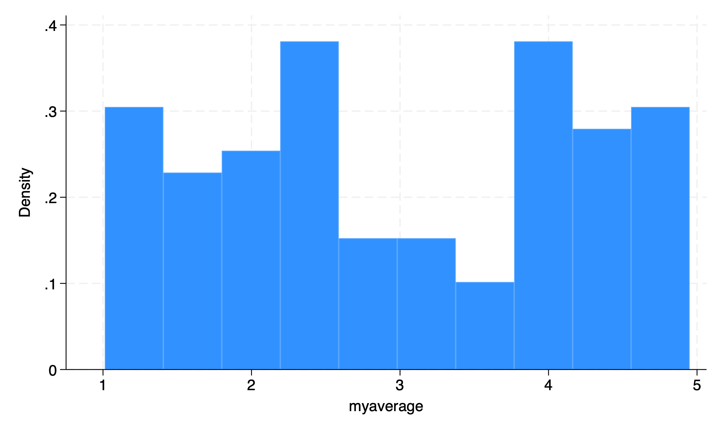
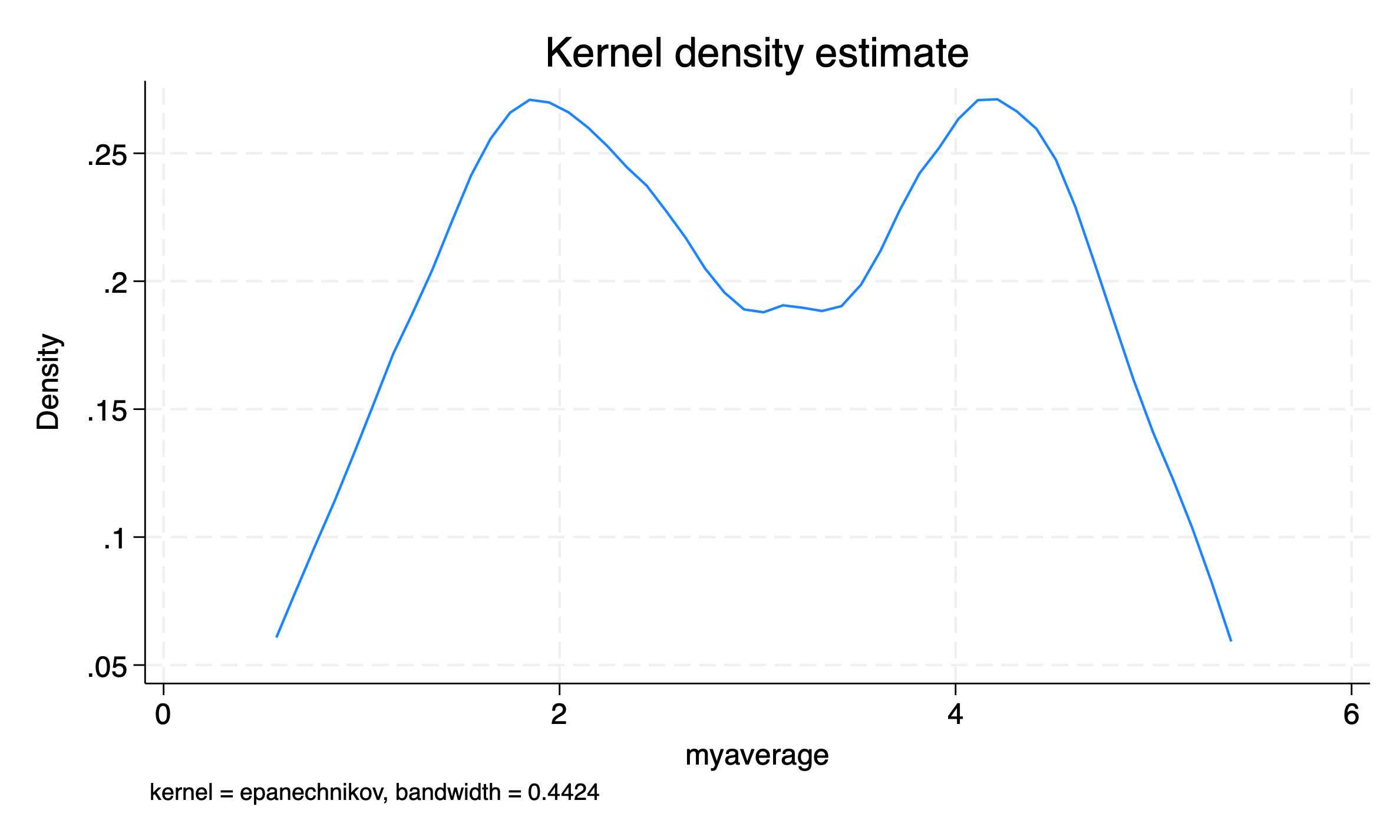
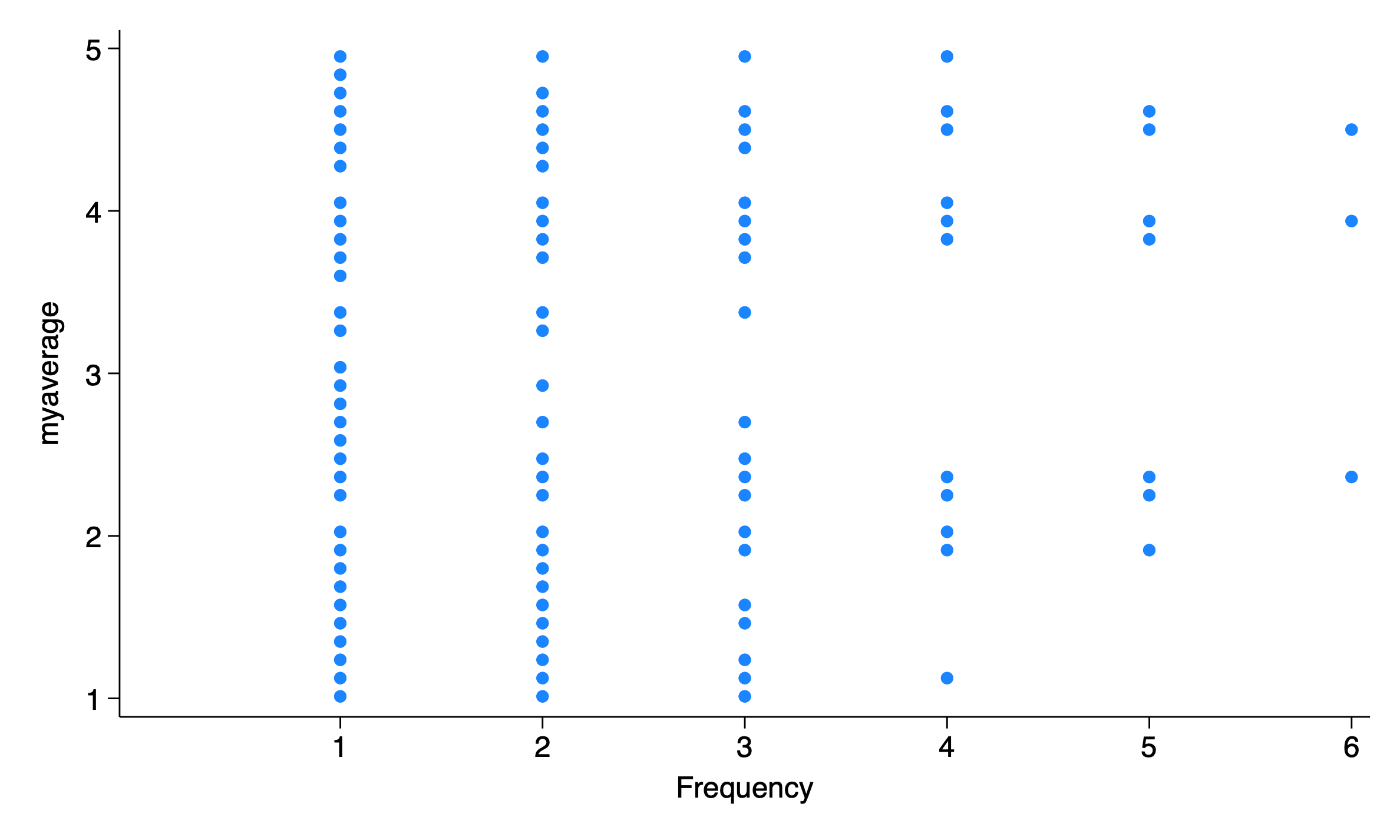
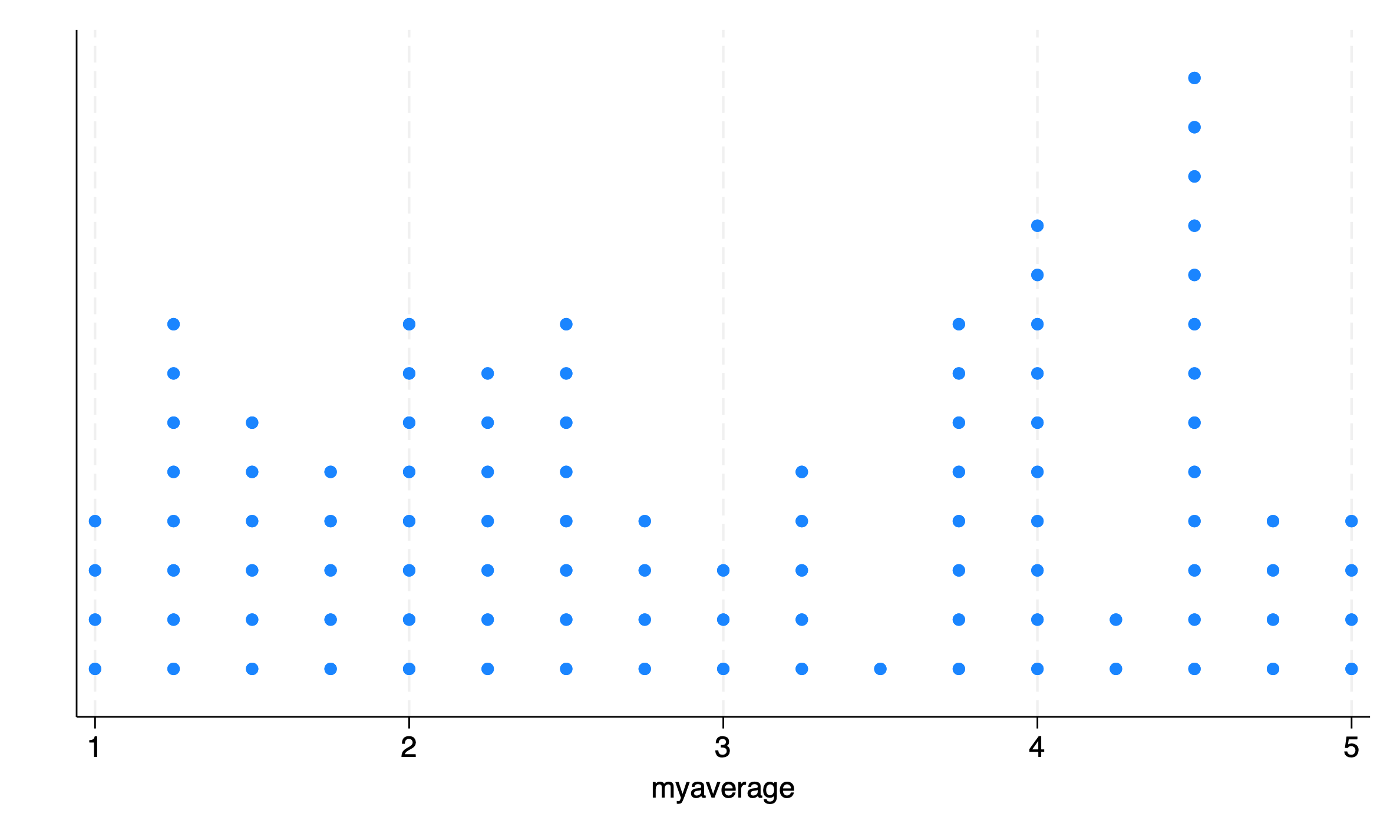
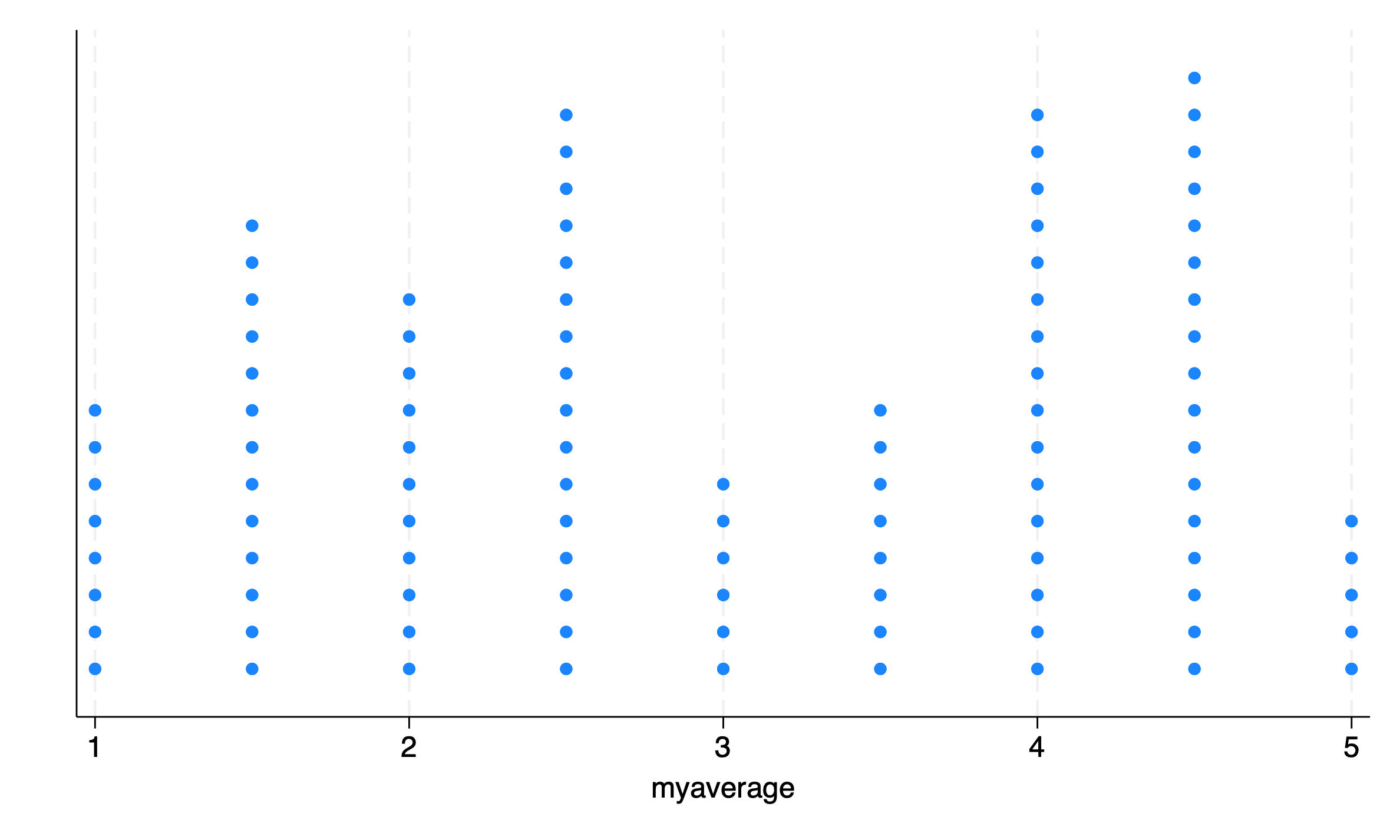
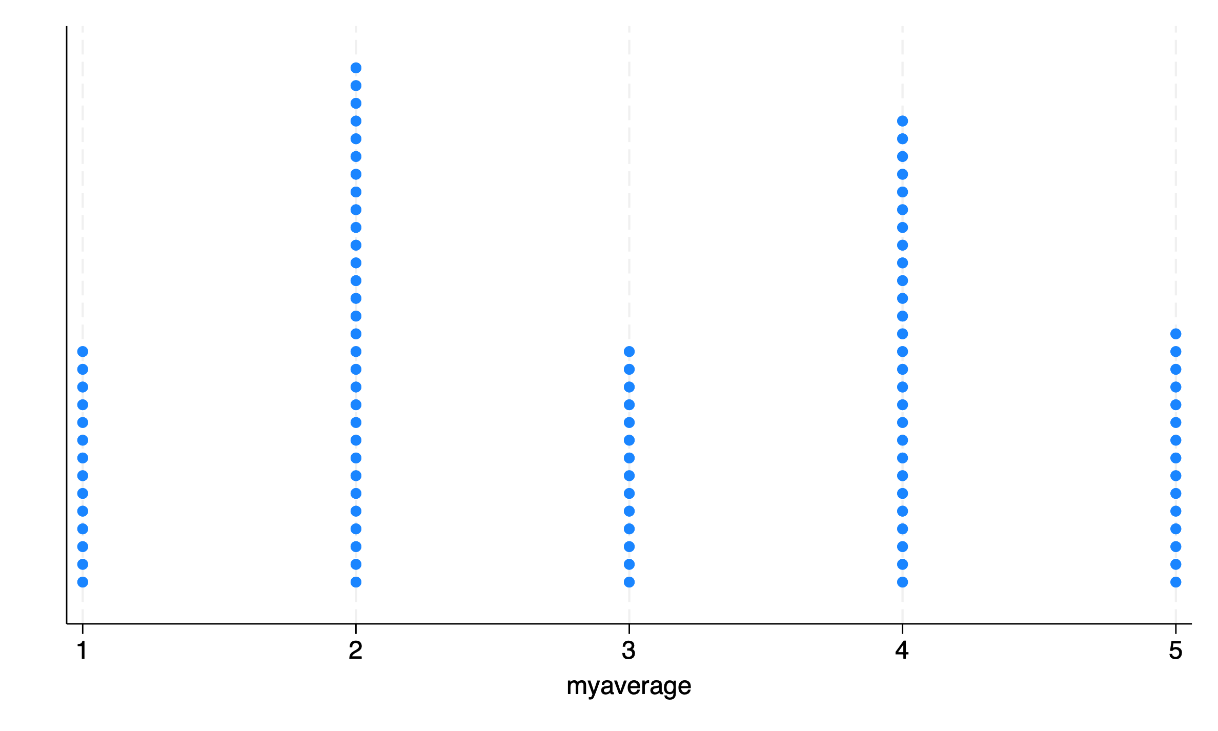
For a recent project, we have been working with a lot of Likert scale data (e.g. “strongly disagree”, “disagree”, “neutral”, “agree”, “strongly agree”). Many times we are averaging several questionnaire items into a summary score e.g. generate myaverage = (Q1 + Q2 + Q3)/3.
I’ve been thinking about the best way to visualize these distributions of scale scores. Stata offers histograms, kernel densities and dotplots, none of which seem 100% intuitive or satisfactory. dotplots are intuitive in that every person is represented by a dot, but the fact that they are turned sideways in Stata seems unsatisfactory and counter-intuitive to me.
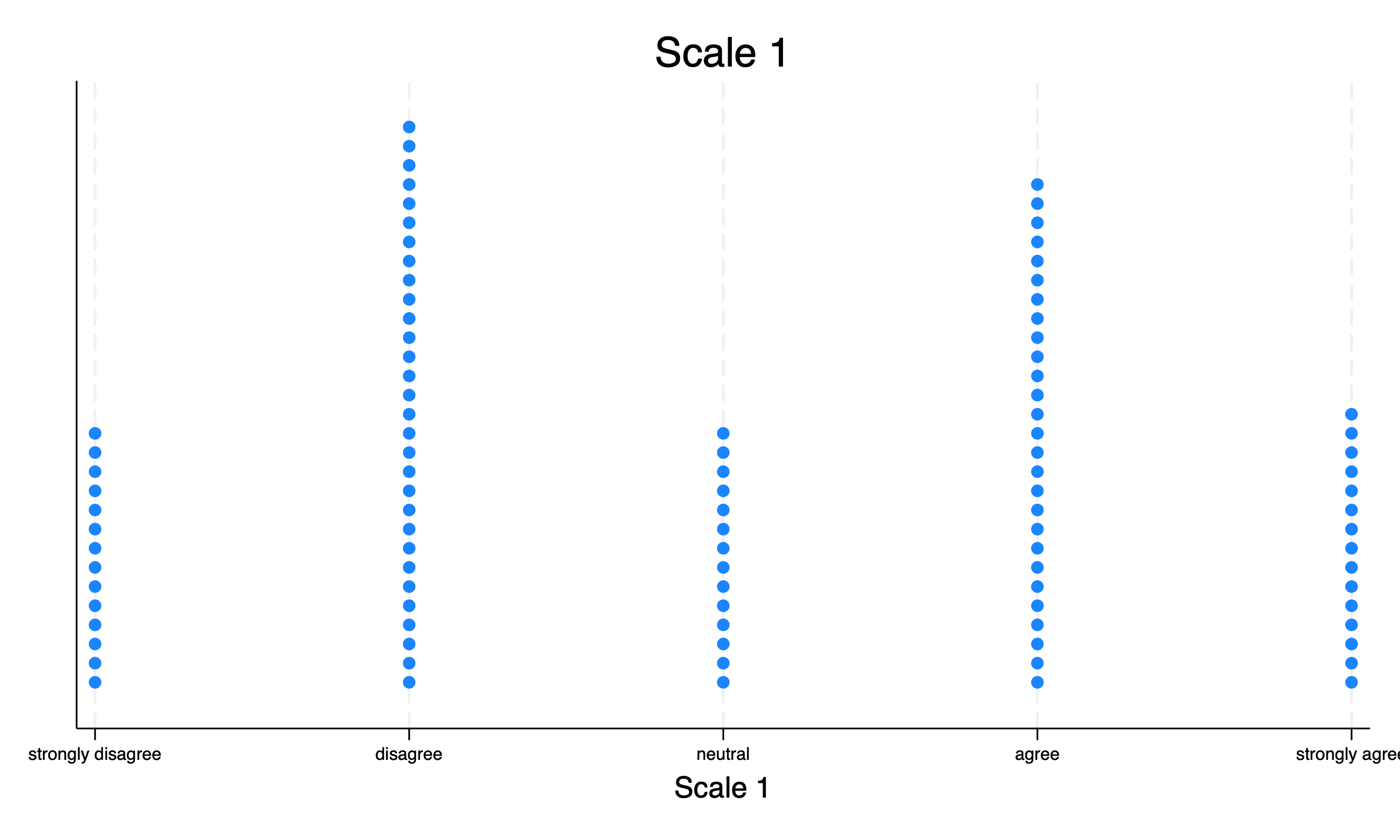
I’ve come to like stripplot(Cox, 2003) as a more intuitive alternative to the above plots. stripplot requires a few options to make the plot I want, but is very useful.
Show the code
stripplot myaverage, ///stack/// stack the dotswidth(1) /// bin with width 1msymbol(circle) /// symbols are circlesmsize(medium) /// larger markerstitle("Scale 1") /// titlextitle("Scale 1") /// title for x axisxlabel(1 "strongly disagree" 2 "disagree" 3 "neutral" 4 "agree" 5 "strongly agree", labsize(vsmall)) // customize labelsgraphexport"mystripplot.png", replace
stripplot
Adjusting the Bin Width
The width of the bins that stripplot uses can be changed with the width() option to adjust the resolution of the graph.