Show the code
library(MASS) # simulate multivariate data

library(pander) # nice tables

library(corrgram) # corrgrams

library(GGally) # pairs plots

library(psych) # useful routines for psych data

library(igraph) # network analysisIn some recent projects, I have had to get a quick idea of what scales and demographic variables in my data are related to other scales and demographic variables in my data.
It seems to me that one of the quickest ways to do this is with the corrgram (Wright, 2021) library. I also like pairs.panels in the psych (Revelle, 2025) library, and ggpairs in the GGally (Schloerke et al., 2025) library.
Lastly, a network graph using igraph (Csardi et al., 2025; Csardi & Nepusz, 2006) requires substantially more programming, and produces a quite different looking visualization that may or may not be useful in some situations.
library(MASS) # simulate multivariate data
library(pander) # nice tables
library(corrgram) # corrgrams
library(GGally) # pairs plots
library(psych) # useful routines for psych data
library(igraph) # network analysisI simulate some data.
Of particular note are that the strongest correlation is between scaleA and scaleB, and that scaleA and scaleC are negatively correlated.
set.seed(54321)

# simulate data

mu <- c(scaleA = 10, scaleB = 25, scaleC = 100) # means

Sigma <- matrix(c(1.0, 0.75, -0.3, # variance covariance
                  0.75, 1.0, 0.4,
                  -0.3, 0.4, 1.0),
                nrow = 3, ncol = 3)

mydata <- mvrnorm(n = 500,
                  mu = mu,
Sigma = Sigma) # variance covariancepander(head(mydata)) # nicely formatted table| scaleA | scaleB | scaleC |
|---|---|---|
| 9.291 | 25.14 | 101.2 |
| 8.853 | 24.3 | 100.4 |
| 9.186 | 24.35 | 99.86 |
| 7.81 | 23.8 | 101.4 |
| 9.734 | 24.54 | 99.8 |
| 8.603 | 24.16 | 100.9 |
skimr::skim(mydata) # descriptive statisticsVariable type: numeric
| skim_variable | n_missing | complete_rate | mean | sd | p0 | p25 | p50 | p75 | p100 | hist |
|---|---|---|---|---|---|---|---|---|---|---|
| scaleA | 0 | 1 | 10.00 | 1.04 | 7.14 | 9.30 | 9.97 | 10.68 | 13.30 | ▁▅▇▃▁ |
| scaleB | 0 | 1 | 24.94 | 1.00 | 22.12 | 24.27 | 24.92 | 25.62 | 27.97 | ▁▅▇▅▁ |
| scaleC | 0 | 1 | 99.91 | 1.00 | 97.20 | 99.25 | 99.92 | 100.56 | 102.82 | ▁▅▇▃▁ |
corrgram(mydata,
         order=TRUE,
         lower.panel = panel.pie, # lower panel is pie charts
         upper.panel = panel.cor, # upper panel is correlations
         text.panel = panel.txt, # text panel is variable
         diag.panel=panel.minmax, # minimum and maximum
main = "Correlation of Scales in Our Data") 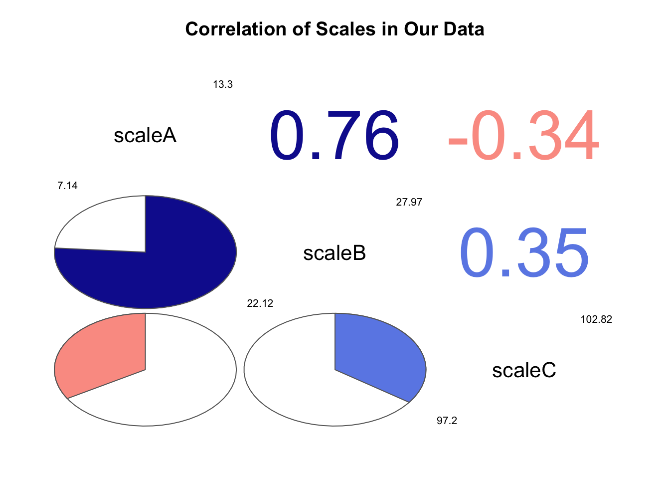
# ggpairs(mydata) # simple default plot

ggpairs(mydata, # pairs plot
        lower = list(continuous = wrap("points",
                                       color = "blue",
                                       alpha = 0.5)),
        diag = list(continuous = wrap("densityDiag",
                                      color = "blue")),
        upper = list(continuous = wrap("cor",
                                       color = "black"))) +
  labs(title = "Correlation of Scales in Our Data")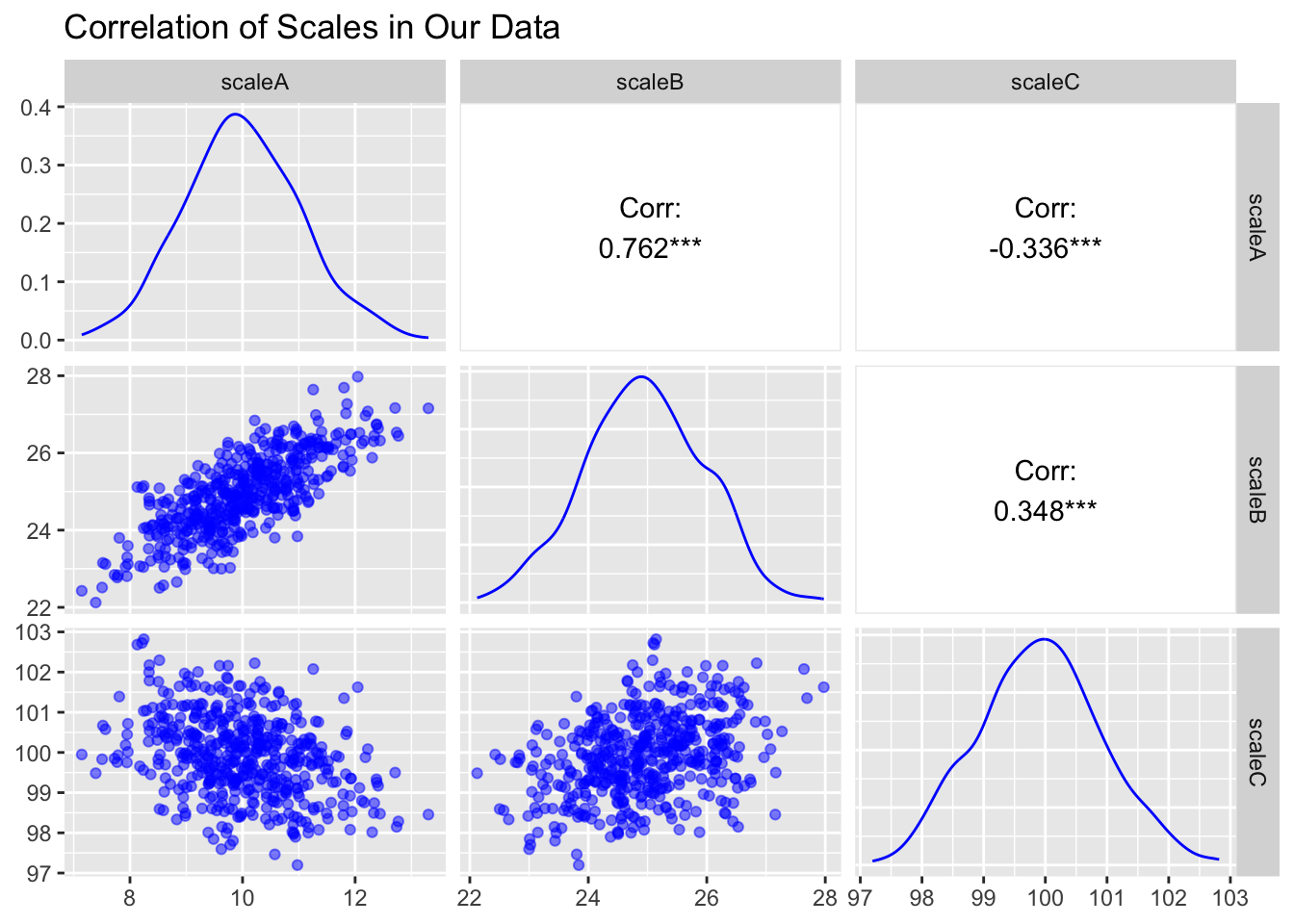
pairs.panels(mydata, # pairs plot
             show.points = FALSE, # don't show data points
main="Correlation of Scales in Our Data") 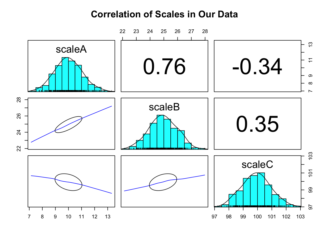
cor_mat <- cor(mydata, use = "complete.obs")

diag(cor_mat) <- 0 # set diagonal to 0

g <- graph_from_adjacency_matrix(cor_mat, # make network graph
                                 mode = "undirected",
                                 weighted = TRUE)

# par(mar=c(0, 0, 1, 0) + 1.5) # plot margins

absweight <- abs(E(g)$weight) # absolute value of weight

plot(g,
     margin = 0.5,
     edge.width = absweight * 20, # absolute value
     vertex.size = 15,
     vertex.label.dist = 3.5,
     vertex.shape = "circle",
     vertex.color = "dodgerblue",
     edge.label.color = "red",
     edge.label = round(E(g)$weight, 2),
     edge.label.dist = 1,
     # layout = coords,
     edge.curved = 0,
     main = "Correlation of Scales in Our Data")