Show the code
library(faux) # simulated data

library(pander) # nice tables

library(skimr) # descriptive statistics

library(circlize) # circular graphs and chord diagrams

library(scales) # viridis color palettesIn previous posts, I looked at some ways to get an idea of what scales and demographic variables in my data are related to other scales and demographic variables in my data.
In this post, I try using a chord diagram using chordDiagram from the circlize library (Gu et al., 2014).
library(faux) # simulated data
library(pander) # nice tables
library(skimr) # descriptive statistics
library(circlize) # circular graphs and chord diagrams
library(scales) # viridis color palettesI simulate some data.
set.seed(54321) # random seed

# simulate data

cmat <- c(1.00, 0.30, 0.25, 0.15, 0.15, 0.15,
          0.30, 1.00, 0.00, 0.50, 0.10, 0.15,
          0.25, 0.00, 1.00, 0.50, 0.50, 0.15,
          0.15, 0.50, 0.50, 1.00, 0.00, 0.15,
          0.15, 0.10, 0.50, 0.00, 1.00, 0.15,
          0.15, 0.15, 0.15, 0.15, 0.15, 1.00)

mydata <- rnorm_multi(n = 100,
                   mu = c(0, 20, 100, 100, 100, 100),
                   sd = c(1, 5, 5, 5, 5, 5),
                   r = cmat, # correlation matrix
                   varnames = c("scaleA",
                                "scaleB",
                                "scaleC",
                                "scaleD",
                                "scaleE",
                                "scaleF"),
empirical = FALSE)pander(head(mydata)) # nicely formatted table| scaleA | scaleB | scaleC | scaleD | scaleE | scaleF |
|---|---|---|---|---|---|
| 1.602 | 23.34 | 99.84 | 97.63 | 102.1 | 101.5 |
| 1.452 | 28.85 | 101.6 | 99.86 | 105.9 | 99.57 |
| 0.5092 | 20.43 | 105.6 | 101.7 | 102.4 | 101 |
| 1.974 | 21.07 | 108.3 | 106.9 | 102 | 106.1 |
| -0.9652 | 17.06 | 102 | 106.7 | 101.5 | 95.6 |
| 0.7906 | 22.49 | 104 | 111.2 | 96.67 | 98.47 |
skim(mydata) # descriptive statisticsVariable type: numeric
| skim_variable | n_missing | complete_rate | mean | sd | p0 | p25 | p50 | p75 | p100 | hist |
|---|---|---|---|---|---|---|---|---|---|---|
| scaleA | 0 | 1 | -0.05 | 1.09 | -2.65 | -0.80 | -0.08 | 0.65 | 2.84 | ▂▆▇▅▁ |
| scaleB | 0 | 1 | 20.13 | 4.70 | 7.58 | 16.83 | 20.32 | 23.44 | 29.89 | ▁▅▇▆▃ |
| scaleC | 0 | 1 | 100.11 | 4.84 | 88.04 | 96.77 | 100.35 | 102.94 | 111.84 | ▂▃▇▃▂ |
| scaleD | 0 | 1 | 100.75 | 4.86 | 88.29 | 97.52 | 100.31 | 103.65 | 113.34 | ▁▆▇▆▁ |
| scaleE | 0 | 1 | 100.14 | 4.95 | 82.39 | 97.41 | 100.81 | 103.05 | 112.10 | ▁▂▅▇▁ |
| scaleF | 0 | 1 | 100.24 | 5.77 | 86.48 | 95.77 | 100.42 | 103.80 | 113.96 | ▁▇▇▅▂ |
# pal_viridis()(5) # 5 viridis colors
grid.col = c(scaleA = "#440154FF",
scaleB = "#3B528BFF",
scaleC = "#21908CFF",
scaleD = "#5DC863FF",
scaleE = "#FDE725FF")
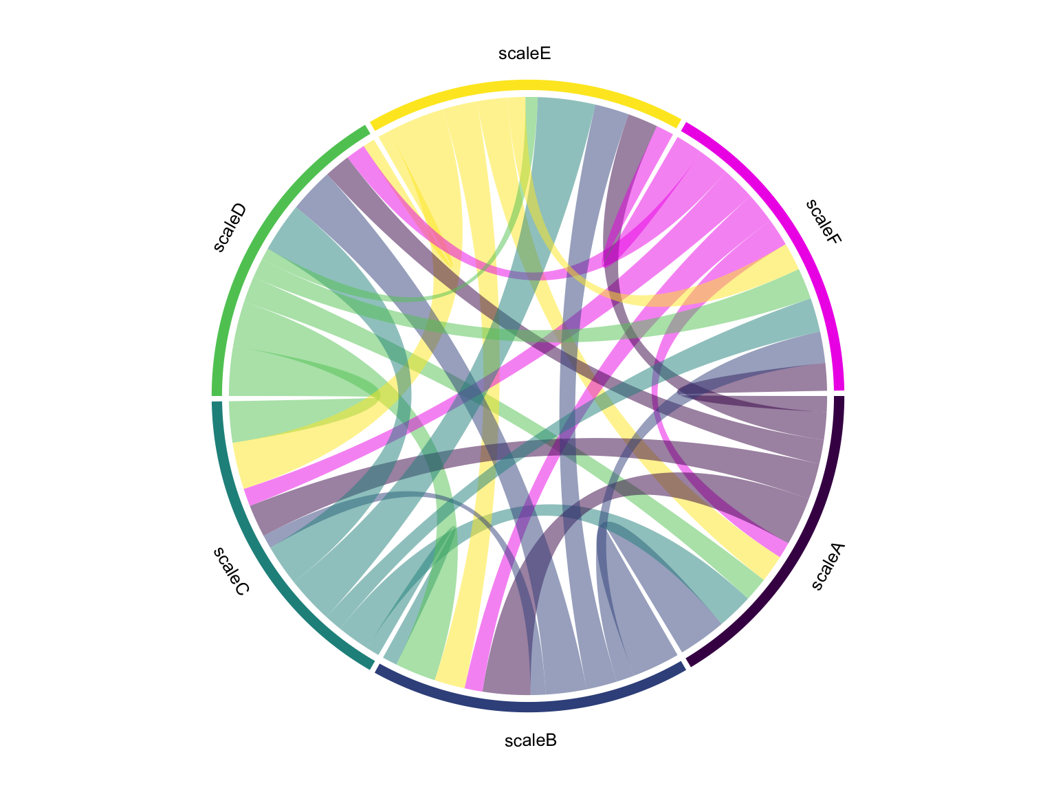
cor_mat <- cor(mydata, use = "complete.obs") # correlation matrix
diag(cor_mat) <- 0 # set diagonal to 0
chordDiagram(cor_mat,
annotationTrack = c("name", "grid"),
big.gap = 25,
scale = TRUE, # scale equivalently
grid.col = grid.col)
title(main = "Relationship of Scales In Our Data")