Show the code
load("../network-graph/mydata.RData")In earlier posts, I have been looking at different ways to get an idea of what scales and demographic variables in my data are related to other scales and demographic variables in my data.
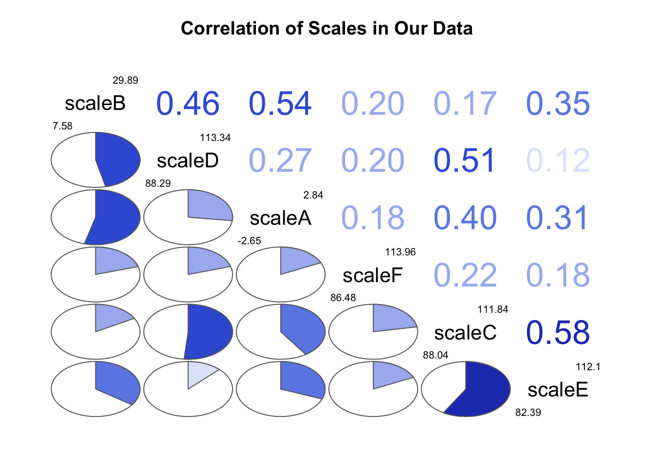
In a post from a while back, I looked at corrgrams (Wright, 2021). I think that there are many ways to explore data visually, but have come to like the simplicity of both the code for, and the visual presentation of, corrgrams for many purposes.
Here I use the data from a post on making a network graph.
load("../network-graph/mydata.RData")library(corrgram) # corrgrams
corrgram(mydata,
order=TRUE,
lower.panel = panel.pie, # lower panel is pie charts
upper.panel = panel.cor, # upper panel is correlations
text.panel = panel.txt, # text panel is variable
diag.panel=panel.minmax, # minimum and maximum
main = "Correlation of Scales in Our Data")