Show the code
library(igraph) # network analysis

library(ggplot2) # beautiful graphs

library(ggraph) # network graphs for ggplot

library(faux) # simulated data

library(pander) # nice tables

library(skimr) # descriptive statisticsIn a previous post, I looked at some ways to get an idea of what scales and demographic variables in my data are related to other scales and demographic variables in my data.
Among several methods, I looked at a network graph using igraph (Csardi et al., 2025; Csardi & Nepusz, 2006). However, the network graph in my previous post was less than satisfactory because of the limited number of scales in my data.
Below, I provide an example of a network graph with data with more scales.
library(igraph) # network analysis
library(ggplot2) # beautiful graphs
library(ggraph) # network graphs for ggplot
library(faux) # simulated data
library(pander) # nice tables
library(skimr) # descriptive statisticsI simulate some data.
set.seed(54321) # random seed

# simulate data

cmat <- c(1.00, 0.30, 0.25, 0.15, 0.15, 0.15,
          0.30, 1.00, 0.00, 0.50, 0.10, 0.15,
          0.25, 0.00, 1.00, 0.50, 0.50, 0.15,
          0.15, 0.50, 0.50, 1.00, 0.00, 0.15,
          0.15, 0.10, 0.50, 0.00, 1.00, 0.15,
          0.15, 0.15, 0.15, 0.15, 0.15, 1.00)

mydata <- rnorm_multi(n = 100,
                   mu = c(0, 20, 100, 100, 100, 100),
                   sd = c(1, 5, 5, 5, 5, 5),
                   r = cmat, # correlation matrix
                   varnames = c("scaleA",
                                "scaleB",
                                "scaleC",
                                "scaleD",
                                "scaleE",
                                "scaleF"),
empirical = FALSE)pander(head(mydata)) # nicely formatted table| scaleA | scaleB | scaleC | scaleD | scaleE | scaleF |
|---|---|---|---|---|---|
| 1.602 | 23.34 | 99.84 | 97.63 | 102.1 | 101.5 |
| 1.452 | 28.85 | 101.6 | 99.86 | 105.9 | 99.57 |
| 0.5092 | 20.43 | 105.6 | 101.7 | 102.4 | 101 |
| 1.974 | 21.07 | 108.3 | 106.9 | 102 | 106.1 |
| -0.9652 | 17.06 | 102 | 106.7 | 101.5 | 95.6 |
| 0.7906 | 22.49 | 104 | 111.2 | 96.67 | 98.47 |
skim(mydata) # descriptive statisticsVariable type: numeric
| skim_variable | n_missing | complete_rate | mean | sd | p0 | p25 | p50 | p75 | p100 | hist |
|---|---|---|---|---|---|---|---|---|---|---|
| scaleA | 0 | 1 | -0.05 | 1.09 | -2.65 | -0.80 | -0.08 | 0.65 | 2.84 | ▂▆▇▅▁ |
| scaleB | 0 | 1 | 20.13 | 4.70 | 7.58 | 16.83 | 20.32 | 23.44 | 29.89 | ▁▅▇▆▃ |
| scaleC | 0 | 1 | 100.11 | 4.84 | 88.04 | 96.77 | 100.35 | 102.94 | 111.84 | ▂▃▇▃▂ |
| scaleD | 0 | 1 | 100.75 | 4.86 | 88.29 | 97.52 | 100.31 | 103.65 | 113.34 | ▁▆▇▆▁ |
| scaleE | 0 | 1 | 100.14 | 4.95 | 82.39 | 97.41 | 100.81 | 103.05 | 112.10 | ▁▂▅▇▁ |
| scaleF | 0 | 1 | 100.24 | 5.77 | 86.48 | 95.77 | 100.42 | 103.80 | 113.96 | ▁▇▇▅▂ |
cor_mat <- cor(mydata, use = "complete.obs")

diag(cor_mat) <- 0 # set diagonal to 0

g <- graph_from_adjacency_matrix(cor_mat, # make network graph
                                 mode = "undirected",
                                 weighted = TRUE)

coords <- layout_in_circle(g) # get circular layout

par(mar=c(0, 0, 1, 0) + 1.5) # plot margins

absweight <- abs(E(g)$weight) # absolute value of weight

plot(g,
     margin = 0.5,
     edge.width = absweight * 20, # absolute value
     vertex.size = 15,
     vertex.label.dist = 2.5,
     vertex.shape = "circle",
     vertex.color = "navy",
     edge.label.color = "red",
     edge.label = round(E(g)$weight, 2),
     edge.label.dist = 1,
     layout = coords, # layout
     edge.curved = 0,
     main = "Correlation of Scales in Our Data")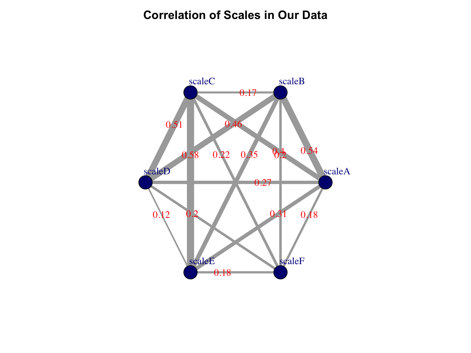
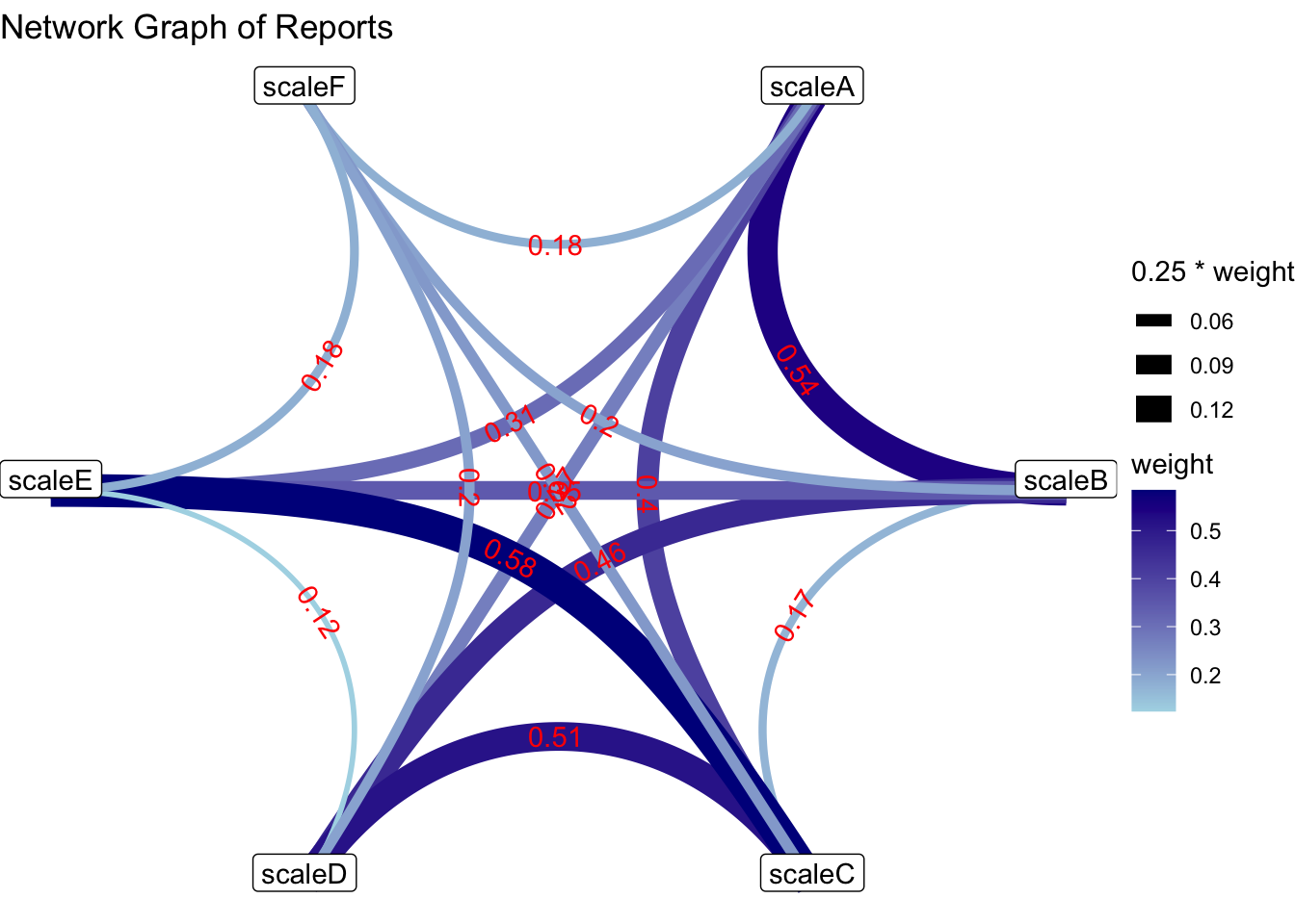
ggraph(g, layout = 'linear', circular = TRUE) +
  geom_edge_link(aes(width = .25 * weight,
                    color = weight,
                    label = round(weight, 2)),
                label_colour = "red",
                strength = .1,
                angle_calc = 'along',
                show.legend = FALSE) +
  geom_node_point() +
  geom_node_label(aes(label = name),
                  nudge_y = .025,
                  fill = "white") +
  scale_edge_color_gradient(name = "weight",
                            low = "lightgrey",
                            high = "darkgrey") +
  labs(title = "Network Graph of Reports") +
  theme_void()