use "gutten.dta", clearIntroduction
TipStata Is A Powerful And Intuitive Data Analysis Program
Learning how to graph in Stata is an important part of learning how to use Stata. Yet, until recently, the default graphs in Stata have been less than optimal. However, recent versions of Stata have a very professional looking and aesthetically appealing default graph scheme.
This document is an introduction to (a) basic graphing ideas in Stata; and (b) a quick note on the use of schemes to customize your Stata graphs.
What are Variables?
- By variables, I simply mean the columns of data that you have.
- For our purposes, you may think of variables as synonymous with questionnaire items, or columns of data.
| Column 1 | Column 2 | Column 3 | |
|---|---|---|---|
| Row 1 | |||
| Row 2 | |||
| Row 3 |
Variable Types
- Categorical variables represent unordered categories like race, ethnicity, neighborhood, religious affiliation, or place of residence.
- Continuous variables represent a continuous scale like income, a mental health scale, or a measure of life expectancy.
A Data Visualization Strategy
Once we have discerned the type of variable that have, there are two followup questions we may ask before deciding upon a graphing strategy:
- Is our graph about one thing at a time?
- How much of x is there?
- What is the distribution of x?
- Is our graph about two things at a time?
- What is the relationship of x and y?
- How are x and y associated?
Data Source
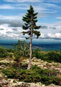
Image Source: https://ec.europa.eu/jrc/en/research-topic/forestry/qr-tree-project/norway-spruce
The data used in this example are derived from the R package Functions and Datasets for “Forest Analytics with R” (Robinson & Hamann, 2020).
According to the documentation, the source of these data are: “von Guttenberg’s Norway spruce (Picea abies [L.] Karst) tree measurement data.”
The documentation goes on to further note that:
“The data are measures from 107 trees. The trees were selected as being of average size from healthy and well stocked stands in the Alps.”
Variables
site Growth quality class of the tree’s habitat. 5 levels.
location Distinguishes tree location. 7 levels.
tree An identifier for the tree within location.
age_base The tree age taken at ground level.
height Tree height, m.
dbh_cm Tree diameter, cm.
volume Tree volume.
age_bh Tree age taken at 1.3 m.
tree.ID A factor uniquely identifying the tree.
Graphs
One Continuous Thing At A Time (histogram x)
histogram height, title("Tree Height")

graph export myhistogram.png, width(2000) replace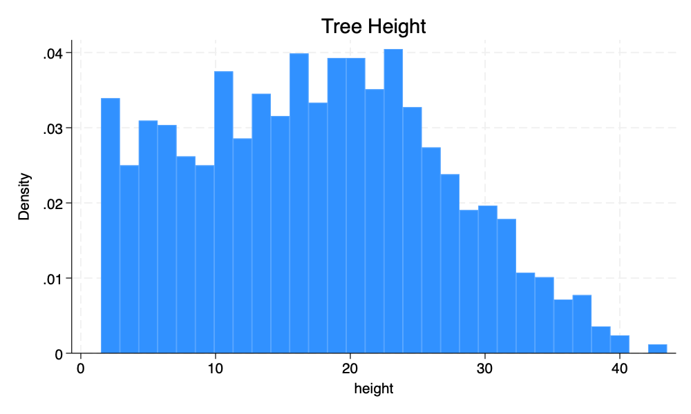
One Categorical Thing At A Time (graph bar, over(x))
graph bar, over(location) title("Tree Location")

graph export mybargraph.png, width(2000) replace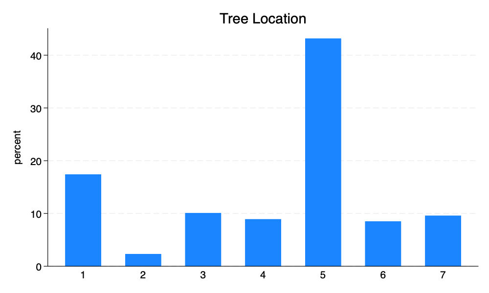
Tip
asyvars
The asyvars option is especially helpful with bar graphs to create bar graphs with different color bars.
graph bar, over(location) title("Tree Location") asyvars

graph export mybargraph_asyvars.png, width(2000) replace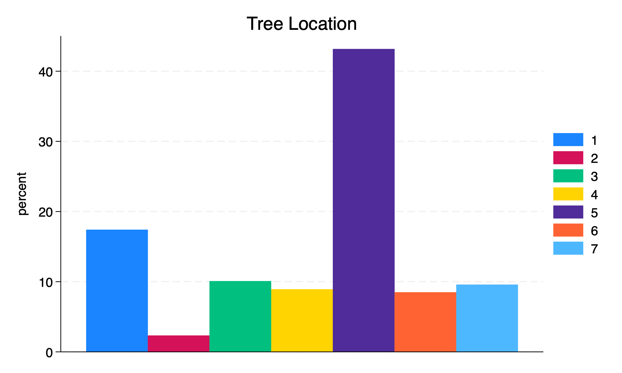
asyvarsContinuous by Continuous (twoway scatter y x)
twoway scatter height age_base, title("Tree Height by Age")

graph export myscatter.png, width(2000) replace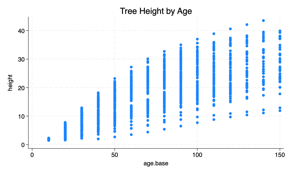
Categorical by Categorical (graph bar, over(x) over(y)) 1
graph bar, over(site) over(location) title("Tree Site Growth Quality by Location")

graph export mybargraph2.png, width(2000) replace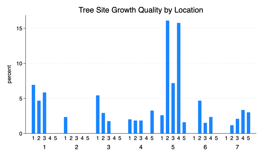
Continuous by Categorical (graph bar y, over(x)) 2
graph bar height, over(location) title("Tree Height by Location")

graph export mybargraph3.png, width(2000) replace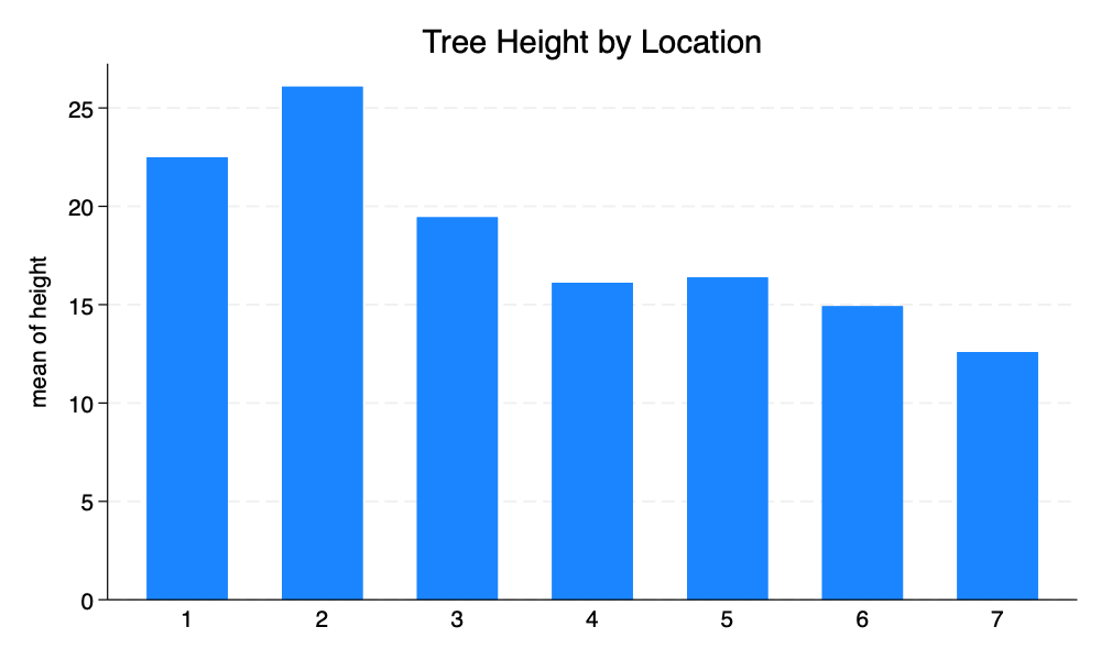
Schemes (,scheme(...))
Stata graph schemes can substantially change the look of a graph. Built in graph schemes include s1color, the new default scheme stcolor, the older default scheme s2color, sj, economist and s1rcolor.
I have written a Stata Michigan graph scheme that can be installed. Asjad Naqvi has written an excellent and comprehensive set of Stata graph schemes.
Continuous by Continuous (twoway scatter y x, scheme(...))
twoway scatter height age_base, title("Tree Height by Age") scheme(michigan)

graph export myscatterM.png, width(2000) replace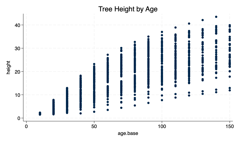
michigan Graph Schemetwoway scatter height age_base, title("Tree Height by Age") scheme(s1rcolor) msymbol(o)
graph export myscatterS1R.png, width(2000) replace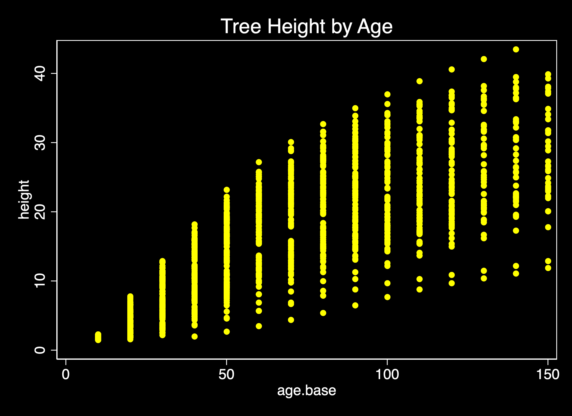
s1rcolor Graph Schemetwoway scatter height age_base, title("Tree Height by Age") scheme(s1color)
graph export myscatterS.png, width(2000) replace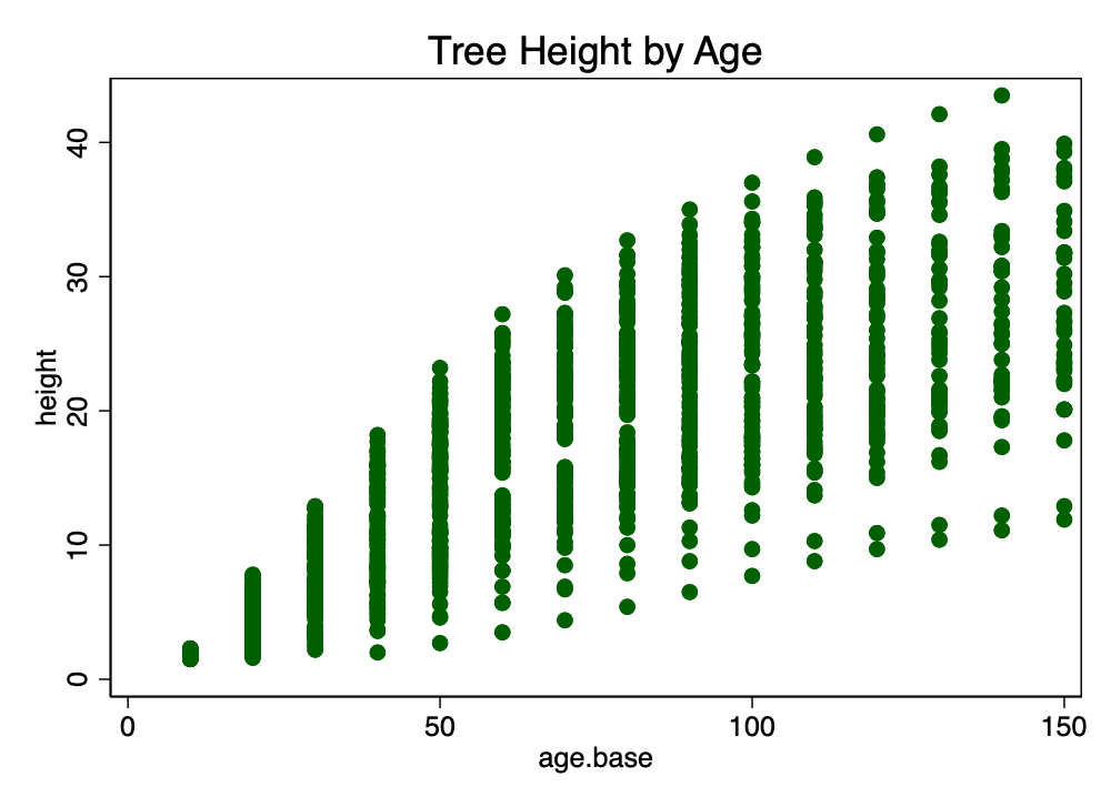
s1color Graph SchemeContinuous by Categorical (graph bar y, over(x) scheme(...))3
graph bar height, over(location) asyvars title("Tree Height by Location") scheme(michigan)

graph export mybarM.png, width(2000) replace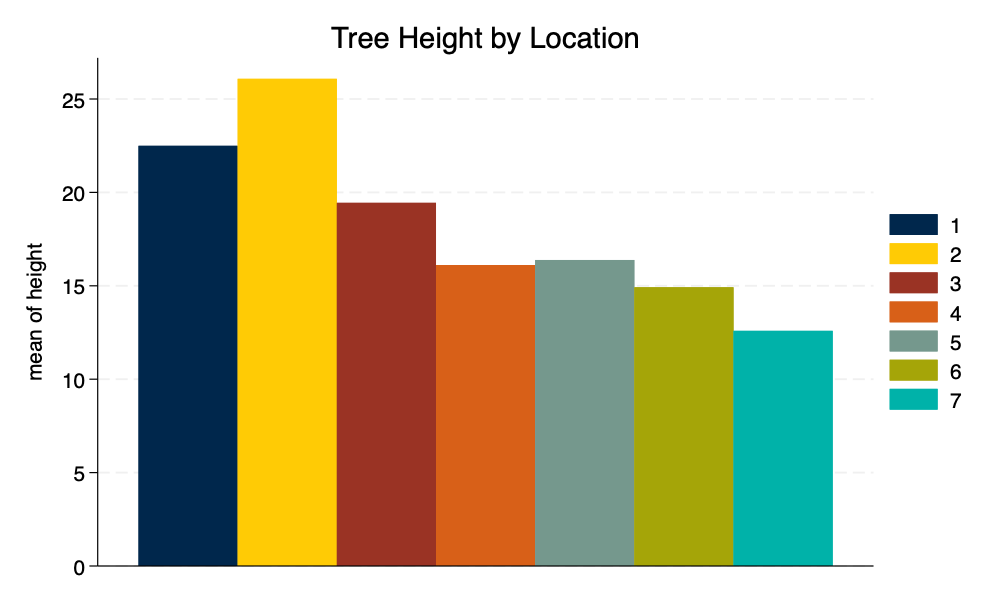
michigan Graph Schemegraph bar height, over(location) asyvars title("Tree Height by Location") scheme(s1rcolor)
graph export mybarS1R.png, width(2000) replace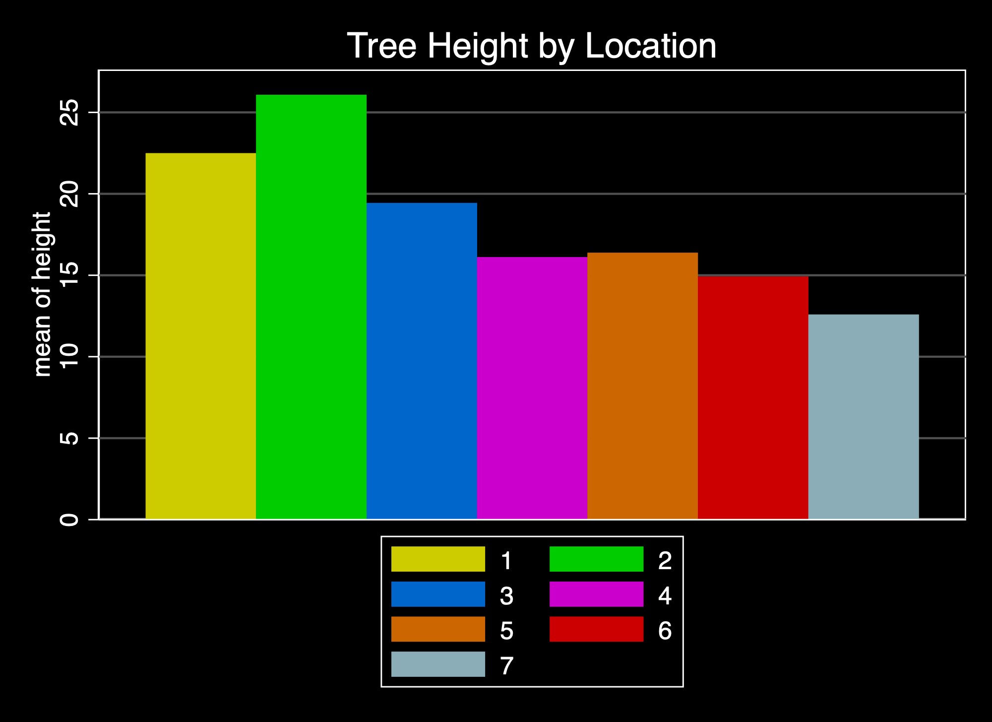
s1rcolor Graph Schemegraph bar height, over(location) asyvars title("Tree Height by Location") scheme(s1color)
graph export mybarS.png, width(2000) replace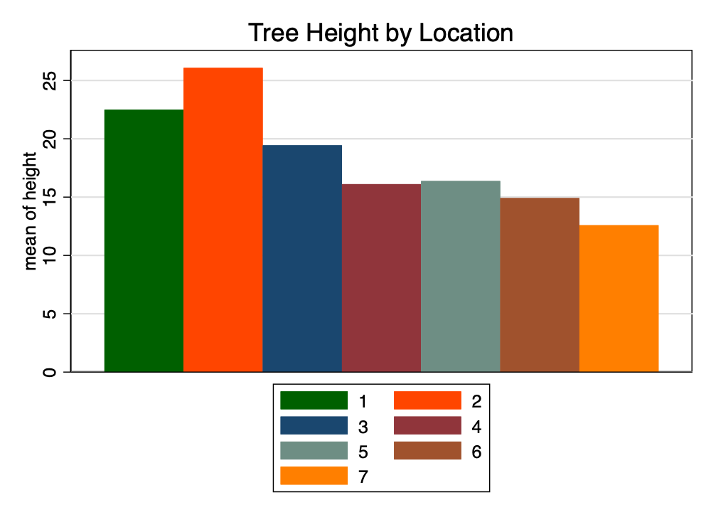
s1color Graph SchemeReferences
Robinson, A., & Hamann, J. (2020). FAwR: Functions and datasets for "Forest Analytics with R. https://doi.org/10.32614/CRAN.package.FAwR