Show the code
library(rnaturalearth) # natural earth data

library(sf) # simple (spatial) features

library(ggplot2) # beautiful plots

library(dplyr) # data wrangling and joinsA common task in mapping is that we have a shapefile (Chapter 8) or sf object (Chapter 7) of map data, but we want to merge in some external data from another source so that we can map that external data.
Often we want to use different colors to map that external data (Chapter 11).
Here, I use an sf object (Chapter 7) of countries of the world (Chapter 12), and merge that data with data from the World Bank World Development Indicators (Chapter 13).
This tutorial builds upon another tutorial on Mapping with ggplot(Chapter 14)
library(rnaturalearth) # natural earth data
library(sf) # simple (spatial) features
library(ggplot2) # beautiful plots
library(dplyr) # data wrangling and joinsI am using the rnaturalearth package to get map data on countries of the world. I read this data into an object called world.
mapdata <- ne_countries(scale = "medium", # medium scale
returnclass = "sf") # as sf objectI map the data with ggplot, and the special geom, geom_sf.
ggplot(mapdata) +
  geom_sf() +
  labs(title = "Demonstration Map With No Data")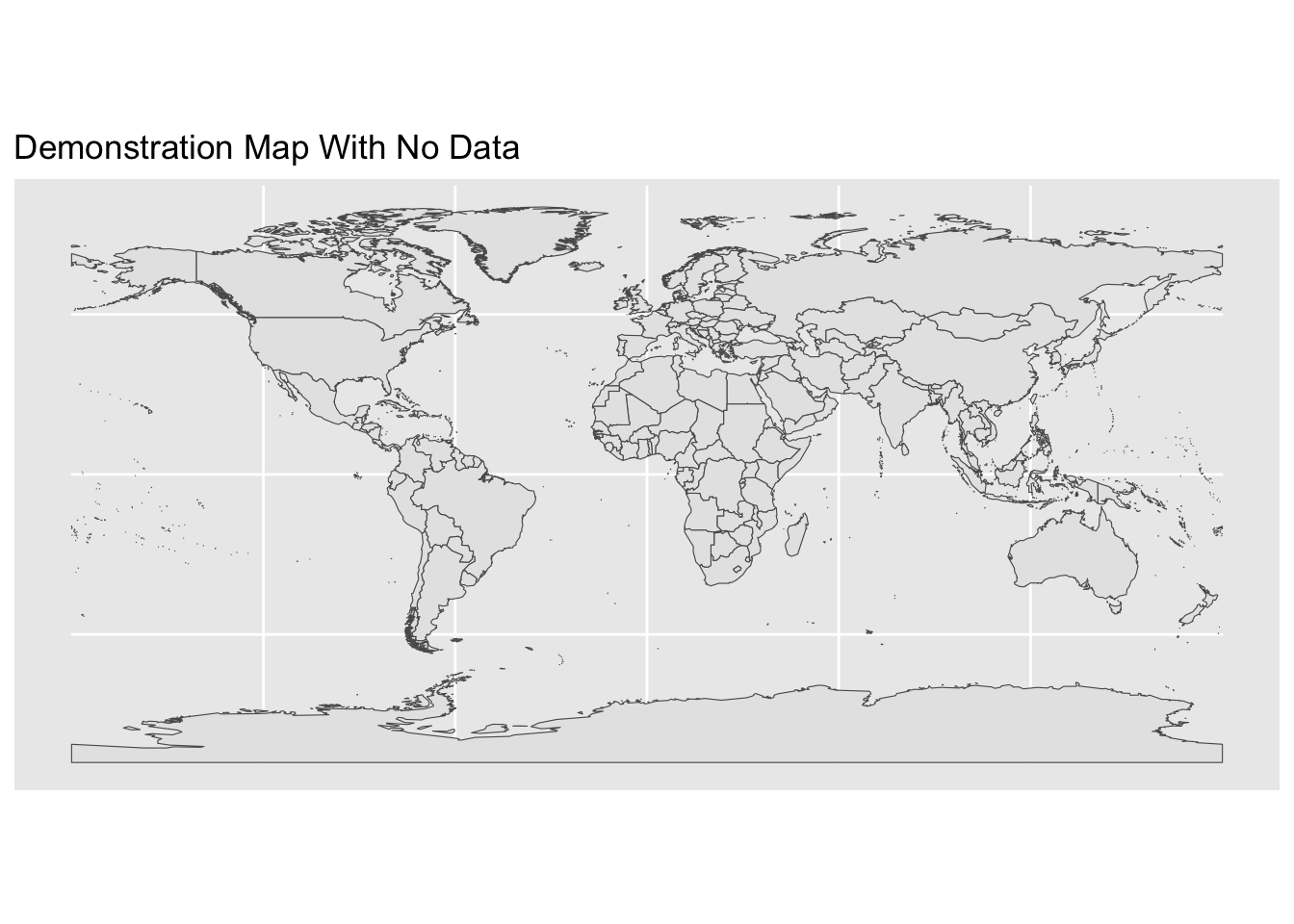
Here I load the World Bank Data (Chapter 13).
load("WorldBankData.Rdata")

head(WorldBankData) # replay data set
country iso2c iso3c year status lastupdated Gini GDP
1 Afghanistan AF AFG 2023 2024-10-24 NA NA
2 Africa Eastern and Southern ZH AFE 2023 2024-10-24 NA 1672.506
3 Africa Western and Central ZI AFW 2023 2024-10-24 NA 1584.333
4 Albania AL ALB 2023 2024-10-24 NA 8367.776
5 Algeria DZ DZA 2023 2024-10-24 NA 5260.206
6 American Samoa AS ASM 2023 2024-10-24 NA NA
adult_literacy life_expectancy population undernourishment
1 NA NA 42239854 NA
2 73.27511 NA 739108306 NA
3 60.50555 NA 502789511 NA
4 NA NA 2745972 NA
5 NA NA 45606480 NA
6 NA NA 43914 NA
region capital longitude latitude income
1 South Asia Kabul 69.1761 34.5228 Low income
2 Aggregates Aggregates
3 Aggregates Aggregates
4 Europe & Central Asia Tirane 19.8172 41.3317 Upper middle income
5 Middle East & North Africa Algiers 3.05097 36.7397 Lower middle income
6 East Asia & Pacific Pago Pago -170.691 -14.2846 Upper middle income
lending
1 IDA
2 Aggregates
3 Aggregates
4 IBRD
5 IBRD
6 Not classifiedI use left_join from the dplyr package to merge the spatial data in world with externaldata.
left_join is a function that keeps all observations in the data on the left (the shapefile), and only those matching observations in the data on the right (the external data), which is usually what I want in mapping.
I need a unique identifier for my rows of data, so here I use iso_a3, a unique 3 letter identifier for countries of the world.
First I need to make a copy of a variable in WorldBankData with a new name so that the identifiers will match exactly.
WorldBankData$iso_a3 <- WorldBankData$iso3c Then I merge the data using left_join.
newdata <- left_join(mapdata, # map data
                     WorldBankData, # table of indicators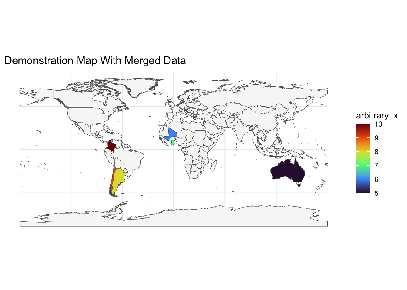
by = "iso_a3") # join byOnce I have the merged data, it is easy to map it with ggplot and geom_sf. Note that I need to specify an aesthetic for geom_sf. Here GDP is the fill color for countries on the map.
Data could also be mapped with another package like
leaflet(Chapter 19).
ggplot(newdata) +
  geom_sf(aes(fill = GDP)) + # adding a fill aesthetic
  scale_fill_viridis_c(na.value = "grey97", # value for NA
                       option = "viridis") + # viridis colors
  labs(title = "Demonstration Map With Merged Data") +
  theme_minimal() # better theme